Point-to-point Geo Adventures
Scenario: You need to visualize point-to-point geospatial data, such as routes from an origin location to destinations. The map region in Reporting Services (Report Designer or Report Builder) supports point-to-point mapping but more than likely your users would prefer an interactive report. As they stand, neither Power View nor Power Map support point-to-point mapping. Further down on the limitation list, Power View doesn’t support layers while Power Map does support layers but doesn’t support filtering, e.g. to allow the end user to select a specific origin. Point-to-point mapping is a frequently requested feature which I hope Microsoft will implement in a not so distant future. Meanwhile, you need to resort to workarounds.
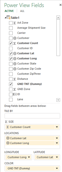
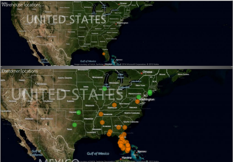
Workaround 1: If all the user wants to see is how far the destinations are located relative to a specific origin, consider creating a Power View report with two maps. The first map would allow the user to filter the origin and second map would plot the associated destinations. In the report below, the user has filtered a specific warehouse which is plotted on the first map. The second map shows the locations of the customers who receive shipments from that warehouse.
The following screenshot show you how the first and second maps are configured:
Workaround 2: If you prefer plotting both the origin and destinations on a single map, consider modifying your input dataset (Power Query can help automating this so you don’t have to do it manually) to append the distinct set of origins so you end up with both origins and destinations sharing the same latitude and longitude columns. In other words, you’ll append the origin set consisting of a distinct set of origins one more time to the original dataset. Then, you might want to introduce a Type column, e.g. with values Warehouse and Customer, to denote the type of each row. So that the origin stands out on the map, consider adding a DAX calculated column that does a distinct count over the destinations associated with that origin and use this column for the bubble size. Assuming a single dataset, this calculated column might use the following expression:
Customer Count:=IF([Type]=”Warehouse”, CALCULATE(DISTINCTCOUNT([Customer ID]), ALLEXCEPT(Table1, Table1[Warehouse ID])),BLANK())
Then, the map report can plot both origin and destinations.
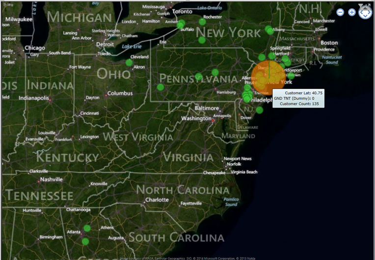
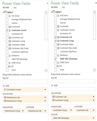
The following screenshot shows how the map is configured.