Indicators
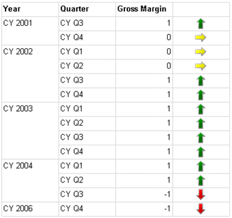
Often, reports need to show images that represent discrete values, such as an image that shows a KPI status. Previously, you didn’t have another option but to use images that are dynamically changed based on the field value. Indicators, a new R2 feature, make this much simpler. In Reporting Services, an indicator is a simplified gauge region that lets you associate images with states. Although you can use indicators as stand-alone regions, you would typically nest them in a tablix, as the following report [View:https://prologika.com/CS/cfs-file.ashx/__key/CommunityServer.Blogs.Components.WeblogFiles/blog/8712.IndicatorDemo.rdl] demonstrates. The right-most column of this report shows the Gross Margin KPI status as an indicator.
Authoring this report takes a few simple steps:
- Add a dataset that requests the Status property of the Financial Gross Profit Margin KPI from the Adventure Works 2008 Analysis Services cube grouped by Year and Quarter.
- Use a tablix region to show the KPI status with Year and Quarter row groups.
- Right-click the cell in an empty column and click Insert ð Indicator.
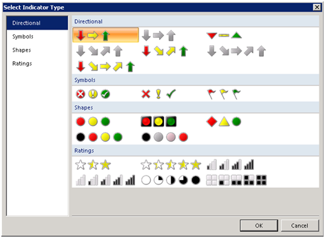
- In the Select Indicator Type dialog that follows, select the indicator type. In this case, I chose the default directional type.
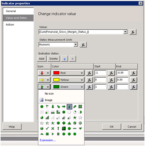
- Once the indicator region is added to tablix, right-click on it and click Indicator Properties. In the Indicator Properties dialog box, select the Value and States tab.
- Since in this case I display numeric values and not percentages, change the States Measurement Unit drop-down list to Numeric.
By default, the default directional indicator lets you defined three states, as shown below. However, you can add or delete states and use custom images if needed. In my case, I defined a range from -1 to 0.-99 for underperformance, 0 – 0.99 as acceptable performance, and 1 as good performance.

Indicators are simple but very useful enhancement to Reporting Services. They lets you visualize discrete values on reports.