Prologika Newsletter Spring 2013
Implementing Dashboards
 Many organizations are considering digital dashboards for a quick 1000-foot view of the company performance. In this newsletter, I’ll review at a high level the options available in the Microsoft BI Platform for implementing dashboards and discuss how they compare.
PerformancePoint Services
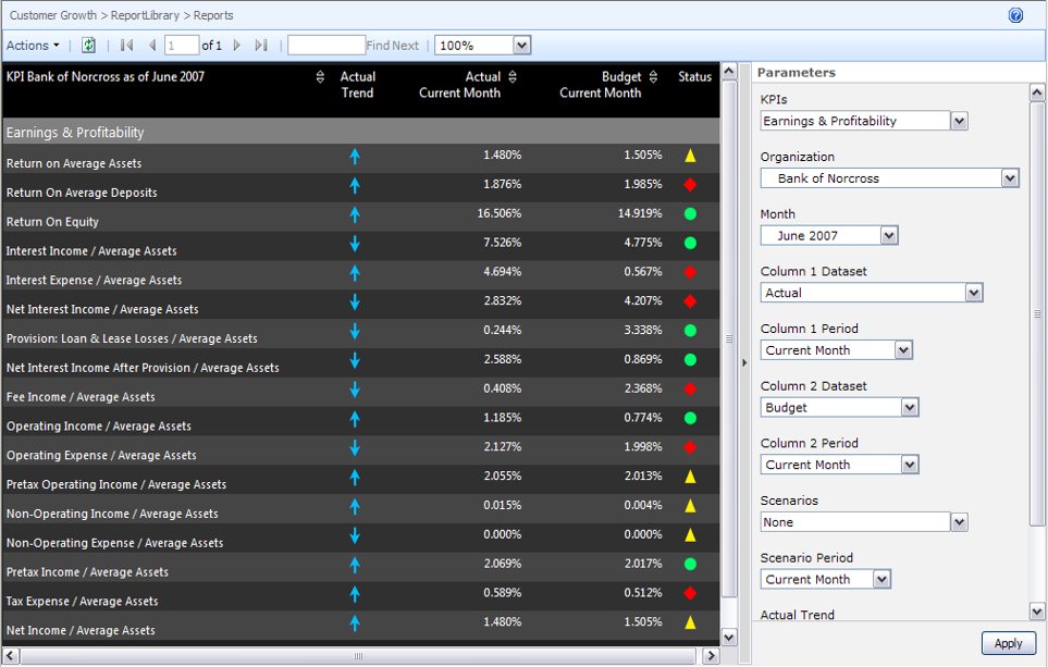
PerformancePoint Services has been the Microsoft’s premium tool for implementing dashboards and scorecards in the SharePoint environment. Geared toward BI pros, PerformancePoint allows you to assemble content from multiple data sources and display it in interactive web-based dashboard pages. The screenshot (click to enlarge) demonstrates a PerformancePoint-based dashboard that Prologika implemented for a document management company.
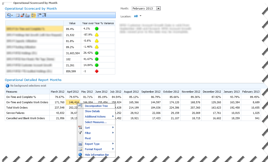
The Operational Scorecard by Month Scorecard displays a set of vital key performance indicators that are defined in an OLAP cube. The end user can filter the scorecard by month and territory, and SharePoint “remembers” the user selection. When the user selects a KPI row, the Operational Details Report Months section refreshes to show more context about that KPI. Moreover, the user can right-click a given cell of interest and initiate additional exploration. For example, the user can launch the Decomposition Tree to see how that value is contributed by other subject areas. The Show details menu drills through the cell and the Additional Actions menu allows the user to initiate a cube action (if defined in the cube). And, the user can change the report layout, such as switch from tabular to chart format, by using the Report Type menu. PerformancePoint requires SharePoint Server Enterprise Edition. It includes an authoring tool called Dashboard Designer which a BI pro can use to implement the dashboard.
Excel and Excel Services
If Excel pivot reports are sufficient to convey the dashboard message then look no further than Excel. You can connect Excel to an analytical layer, such as an OLAP cube or a Tabular model, and quickly assemble a dashboard consisting of PivotTable and PivotChart reports, such as this one.
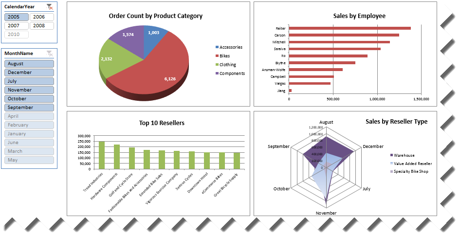
Once the dashboard design is complete on the desktop, you can upload the Excel file to SharePoint to publish the dashboard and make it available to other users. Thanks to Excel Services, SharePoint will render the dashboard in HTML and preserve its interactive features. And, in SharePoint 2013, end users can update the dashboard, such as by adding new fields to the pivot reports. Excel Services is available in SharePoint Server Enterprise edition.
Power View
Starting with SQL Server 2012, you have yet another option to design dashboards in SharePoint environment. Although the primary focus of Power View is ad hoc reporting, it can be used to implement highly-interactive dashboards connected to an analytical layer (Analysis Services Tabular and soon Multidimensional models). And, because it’s very easy to use, it allows business users with no BI or reporting skills to take the dashboard implementation in their own hands.
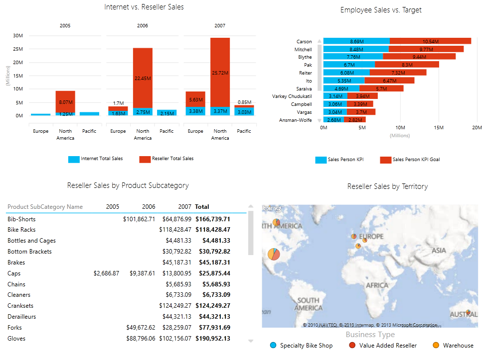
With a mouse click, end users can switch between visualizations, such as switching between a tabular report to a pie chart. Visualizing geospatial information, such as sales by region, has never been easier thanks to integration with Bing maps. And, maps are interactive to allow you to drill down, such from country to city. Power View requires SharePoint Server Enterprise Edition.
Reporting Services
Finally, don’t rule out Reporting Services reports. Although lacking in interactivity, operational reports gain in extensibility and customization. Moreover, this is the only implementation option in the Microsoft BI stack that doesn’t necessarily require SharePoint although you can deploy reports to SharePoint Foundation or higher edition.
Summary
The following table summarizes the four dashboard implementation options.
| Technology | Pros | Cons |
| PerformancePoint |  Designed for scorecards and KPIsSupporting viewsDecomposition treeCustomizable Designed for scorecards and KPIsSupporting viewsDecomposition treeCustomizable | BI pro-orientedNo “wow” effect |
| Excel | Familiar pivot reportsEasy to implementEnd-user oriented | Updatable views need SP13No “wow” effect |
| Power View | Highly interactiveEasy to implementEnd-user oriented | No extensibilityNo support for mobilityRequires Silverlight |
| Reporting Services | Highly customizableRich visualizationsDoesn’t require SharePoint | Require SSRS skillsCanned reportsNo “wow” effect |
To learn more about dashboarding with Microsoft BI, attend my “Building Dashboards with the MS BI Stack” presentation for SQL Saturday in Atlanta on May 18th.
As you know, the BI landscape is fast-moving and it might be overwhelming. If you have Software Assurance benefits, don’t forget that as a Microsoft Gold Partner and premier BI firm, Prologika can use your SA vouchers and work with you to help you plan and implement your BI initiatives, including:
- Analyze your current environment and determine a vision for a BI solution
- Define a plan to launch a BI reporting and analysis solution
- Upgrading or migrating to SQL Server 2012
Regards,
Teo Lachev, MVP (SQL Server), MCSD, MCT, MCITP (BI)
Prologika, LLC | Making Sense of Data
Microsoft Partner | Gold Business Intelligence
Upcoming Events
SQL Saturday: Building Dashboards with the MS BI Stack with Teo Lachev on May 18th
Atlanta BI Group: Data Warehouse Design Good Practices by Carlos Rodrigues on March 25th
Atlanta BI Group: Tableau BI by Jen Underwood on April 29th