A long-standing limitation of Power BI has been that Excel pivot reports connected to external Analysis Services models can’t be interacted with when uploaded to Power BI Service. You get the cached pivot report but any attempt to interact with the report online (that is in Excel Online), such as to change a slicer or filter, would result in an error complaining that the connection can’t be refreshed and there hasn’t been a workaround. Today, Microsoft partially lifted this limitation by supporting interactive pivots connected to Power BI datasets. Unfortunately, pivots connected to external Analysis Services models (both on-prem and cloud) still don’t support interactivity.
For some reason, this feature is called “connected PivotTable refresh” although a better name would be “interactive Excel pivots finally”. It works in Power BI Pro and Premium. Unlike the initial announcement that speculated that this feature would be available by simply uploading your Excel file to Power BI Service, it appears that it requires the Excel file to be uploaded to OneDrive or SharePoint Online. Here are the high-level steps that worked for me:
Create your Excel pivot using the Analyze in Excel feature or directly from Excel. Assuming you have a recent Office 365 build, the latter option allows you to open Excel on the desktop and click Insert->Pivot Table->From Power BI to connect to a Power BI dataset from within Excel Desktop.
Click Save As and save your workbook to OneDrive or SharePoint Online. Recall that you can specify a SharePoint site for storing workspace files in the Power BI workspace settings if you don’t want to upload the file to your personal folder.
Use the Power BI Service “Get data” feature to upload (not import) the Excel workbook in a Power BI workspace. Again, the Excel workbook must be located either in OneDrive or SharePoint online.
Interact with the report in Power BI Service, such by drilling down, drilling through, or even rebinding the report to different fields! As a bonus, when the underlying dataset refreshes, your pivot report will show the latest data as it connects live to the dataset.
The “connected PivotTable refresh” is a much-needed enhancement that brings the same interactive features to Excel pivot reports that users previously had in SharePoint Server. Now users who favor Excel pivots for interactive exploration can share their reports and the interactive features would be preserved when the report is rendered online. The feature requires storing the Excel workbook in OneDrive or SharePoint Online and using an Analyze in Excel connection. Unfortunately, it doesn’t work with Analysis Services models that are external to Power BI (not deployed to Power BI Service) which is another incentive to move your semantic models to Power BI as I’ve been advocating for some time.
https://prologika.com/wp-content/uploads/2016/01/logo.png00Prologika - Teo Lachevhttps://prologika.com/wp-content/uploads/2016/01/logo.pngPrologika - Teo Lachev2021-07-19 17:46:592021-07-20 08:14:17Interactive Excel Pivots in Power BI
Business Performance Management (BPM) is a methodology to help the company predict its performance. An integral part of a BPM strategy is creating and monitoring a scorecard with Key Performance Indicators (KPIs). In this newsletter, I’ll discuss how the newly released Power BI Goals can help you augmenet your BPM strategy. But before that, I’d like to share my excitement that Microsoft have recently awarded me FastTrack Recognized Solution Architect – Power BI! I’m one of the 33 individuals worldwide who got nominated by the Power Platform product engineering team for consistently exhibiting deep architecture expertise and creating high quality solutions for customers during project engagements.
Introducing Power BI Goals
A vital BI practice for every organization, performance management ensures that important metrics, such as Key Performance Indicators (KPIs), meet established goals. The typical artifact to do so is implementing a scorecard: a report that compares the current state with the desired state of these metrics. You might have also heard the term “balanced scorecard” which is an organization-wide scorecard that tracks several subject areas, such as Finance, Customer, and Operations. In the past, organizations would use different tools, such as the now deprecated PerformancePoint (included in SharePoint Server) to implement balanced scorecards. Realizing the importance of scorecards, Power BI introduced Goals that aim to simplify the process of implementing departmental and organizational scorecards. For more information on how Goals works, watch the “Goals in Power BI” presentation from the Microsoft Business Application Summit
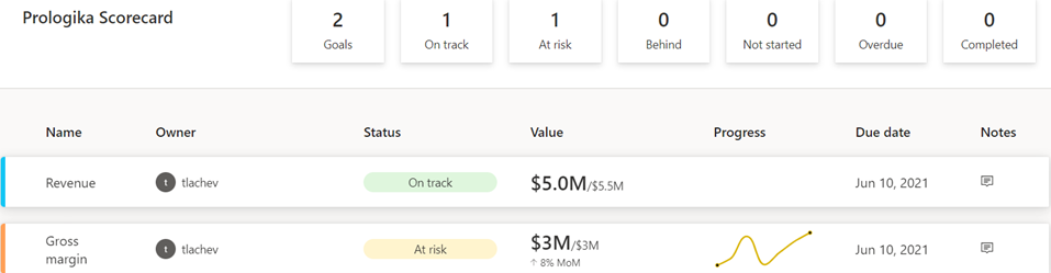
What’s to like As with anything Power BI, Microsoft has democratized scorecards so business users with no reporting experience can quickly assemble them from existing reports. Think of a goal as a line (or KPIs) in the scorecard. Here is scorecard with two goals:
Currently, Power BI supports two goal types:
Static – The goal creator manually enters and track the goal properties, such as current value, target value, and status. This could be useful for quick and dirty KPIs that are not backed by a data source, such as launching a new promotion campaign. In the scorecard above, I created the Revenue goal by entering 5M as the current value and 5.5M as the goal.
Data-driven – The goal current value and/or target value can be data-driven and bound to metrics from existing report(s). Coming from Analysis Services, I was initially surprised that Power BI doesn’t require implementing KPI measures, but I get it: Microsoft decided to source the metrics from reports so business users can easily apply filters. If the goal owner chooses a metric from a visual that has a Date field, such as a time series chart, Power BI automatically shows a sparkline for the goal progress over time. And, of course, when the report dataset is refreshed, the goal values are updated.
So, no modeling or Power BI Desktop required assuming that someone else, such as a data analyst, has delivered functional reports with the metrics. Even better, the goal current and target values can come from different reports (even a report in a different workspace if you have permissions), e.g. a report with actuals and another report with targets. So, there is plenty of flexibility here. To mimic a balanced scorecard that spans multiple subject areas, the owner can create subgoals. For example, the main goal could be Finance with subgoals Revenue, Margin, etc. Because like dashboards, goals are “pinned” from reports, the end user can navigate to the underlying report to examine the data in more detail. Users can also add notes to explain the goal behavior to the teammates.
A scorecard is a first-class Power BI citizen, and as such, it can be secured, endorsed, secured with sensitivity labels, annotated, and shared, such as sharing the scorecard to a Microsoft Teams channel. The scorecard data is saved in a Power BI dataset that users can connect to build custom reports. Moreover, Power BI automatically adds daily snapshots to the dataset allowing users to build up a history of the goals. For example, if the underlying report is refreshed daily, the updated goal values will be appended to the dataset. Developers can use the Power BI REST APIs to implement programmatic scorecard management solutions.
What’s not to like
Besides navigating to the underlying report, a goal is a one-liner in the scorecard. I can’t define a goal that shows me a metric sliced by dimension members, such as business unit. Further, subgoals are not currently aggregable, such as to sum or average values when rolling up to the main goal. Like limitations with dashboards, there is no way to apply a global filter to the scorecard, e.g. to filter all goals for the prior month.
Besides current and target values, no other goal properties can be data driven. For example, unlike Analysis Services KPIs, the goal status can’t be currently bound to a DAX measure. Changing the status requires proactive manual “check ins” although Microsoft mentions a forthcoming feature that will let users define rules to change the status, like how you can define rules for dashboard tile alerts. Speaking of data-driven properties, I don’t understand why you must use a date field to get the progress as opposed to any other field, such as Month, in your Date table.
Finally and unfortunately, Goals require Power BI Premium. If we really want to democratize features, shouldn’t we make them available in Pro?
Conclusion
Goals are a Power BI Premium feature aimed at making it easier to create scorecards and monitoring metrics from existing reports. They promote a “bottom-up” culture, where business users can create departmental scorecards without reliance on IT. Microsoft plans more features by the end of the year to make Goals more appealing, such as integration with Power Automate to trigger actions, rolling up subgoals, changing the goal tracking cycle (DoD, MoM, YoY), custom goal formatting, Power BI Mobile experience optimized for phones, providing a scorecard visual, and cascaded goals (hierarchy of goals).
If you find Power BI Goals somewhat inflexible or you don’t have budget to upgrade to Premium, you don’t have to use the Goals feature to implement scorecards. You can define KPIs and create dashboard-looking reports where you have complete control over the scorecard presentation.
Teo Lachev Prologika, LLC | Making Sense of Data Microsoft Partner | Gold Data Analytics
You should definitely switch your Power BI Premium capacities to Gen2 although you might wait until it goes GA because Gen2 is currently in preview if you’re risk-averse. I switched an enterprise client P2 node to Gen 2 a few months ago and here are the top benefits we observed:
Lower CPU utilization The Gen1 P2 node was under CPU pressure so the client was considering upgrading to P3. This went away after switching to Gen2 as the graph below shows. That’s because each operation essentially has access to all the cores on the node (which is essentially a P3 node). This can give you a nice boost to performance as well. This doesn’t mean that you get more cores for free. If Power BI detects that the CPU used by the capacity (across all its datasets/dataflows/etc.) is exceeding the CPU that you have purchased, then subsequent operations would be throttled (delayed).
More memory Imported models are memory-resident so memory is usually the most constraining factor. With Gen2, the capacity maximum memory applies to the resource itself and not collectively across all resources in the capacity. Let’s say you are on a P1 plan which has a maximum memory capacity of 25GB. With Gen 1, you won’t be able to have two datasets, let’s say 20GB and 10GB, loaded at the same time. However, Gen2 will apply the 25GB limit to each dataset. So, each resource (dataset, report, dataflow) will be boxed within 25 GB. This feat is possible because Gen2 uses a SaaS approach, which means datasets are scattered across multiple cluster nodes instead of being associated with a dedicated capacity. A potential downside, however, could be “noisy neighbor” because a P3 cluster node may co-host datasets from different customers.
Less “out of memory” refreshes Related to item 2, dataset refreshes now have more room. Assuming P1, a 10GB dataset is likely to refresh successfully regardless of other datasets loaded in the same capacity. As a rule of thumb, a dataset will require at least twice the memory to fully refresh, so a full refresh of the 20GB dataset is likely to run out of memory. However, you should be able to utilize less memory if you process specific partitions in large tables or configure them for incremental refresh.
Less management overhead All activities running on the cluster are metered so it’s easy to understand when the capacity is overutilized by using the Gen2 utilization app. This removes the need to monitor Gen1 capacities proactively for signs of overutilization. Further, capacity admins can subscribe for notifications.
No additional cost The best for last. You get all the above without paying more!
What I like to see improved in future:
Customized capacity limits, such as when more memory but less cores are needed.
More granular auto-scale. The current auto-scaling mechanism keeps the “ad hoc” cores for 24 hours. Ideally, I’d like to see the same auto-scaling mechanism as Azure SQL Database Serverless where the system auto-scales within minutes and can hydrate if database is not in use. Of course, this should apply to also removing provisioned cores, such as a P1 plan downgrading to less than 8 cores.
Better utilization monitoring app. The current app has left vast areas for improvement. For example, it doesn’t currently report the memory utilization at all. The app should report memory utilization per dataset and refresh so that you can answer the question “why my refresh ran out of memory”.
https://prologika.com/wp-content/uploads/2016/01/logo.png00Prologika - Teo Lachevhttps://prologika.com/wp-content/uploads/2016/01/logo.pngPrologika - Teo Lachev2021-06-17 12:55:212021-06-17 12:55:21Top 5 Reasons to Switch to Power BI Gen2
Power BI aggregations are meant to speed up queries to large DirectQuery tables, as a DBA would create summarized tables to speed up queries to large tables. The most appealing aspect of telling Power BI about these aggregations is that Power BI will automatically redirect the query to the aggregation cache if it determines that its dimensionality matches the dimensionality of the aggregated table, as explained in the documentation. However, there are a couple of limitations worth emphasizing that will prevent this from happening:
Power BI requires regular relationships with 1:M cardinality and uni-directional filter between the dimension table and aggregation table. Many-to-many cardinality (aka “limited” relationships in the documentation) won’t work. For example, you might have a Customer table related with 1:M to a CustomerFilter table. Queries involving the CustomerFilter table won’t hit the aggregation cache.
Dynamic relationship won’t hit the cache either. For example, as a workaround for the first limitation, you might attempt creating measures, such as Measure1 = CALCULATE([SomeMeasure], TREATAS(VALUES(CustomerFilter[Selection], Customer[CustomerName])), but this won’t work either.
Aggregation hits require active relationships or mappings based on replicated dimension values.
These limitations were showstoppers for using Power BI aggregations in a recent project. Instead, we rolled up a custom aggregation approach along the following lines:
We introduced an aggregation table just like with Power BI aggs and joined to the related dimensions.
We created two sets of measures:
On top of the aggregation table, e.g. Sales (Agg) = SUM(FactSalesAgg[SalesAmount])
On top of the DQ table, e.g. Sales (DQ) = SUM(FactSales[SalesAmount])
For reporting, when it was clear which report pages, such as dashboards, would hit only the aggregation table, we used the (Agg) measures. Detail pages, such as drill-through pages, use the DQ measures. To simplify the measure choice for end users interesting in their own reporting, you can introduce measure wrappers, such as: Sales = IF(ISCROSSFILTERED(FactSales[PrimaryKey or other low granularity column]), [Sales (DQ)], [Sales (Agg)])
https://prologika.com/wp-content/uploads/2016/01/logo.png00Prologika - Teo Lachevhttps://prologika.com/wp-content/uploads/2016/01/logo.pngPrologika - Teo Lachev2021-06-09 13:25:572021-06-09 13:28:29Power BI Aggregations: Limitations and Workarounds
A vital BI practice for every organization, performance management ensures that important metrics, such as Key Performance Indicators (KPIs), meet established goals. The typical artifact to do so is implementing a scorecard: a report that compares the current state with the desired state of these metrics. You might have also heard the term “balanced scorecard” which is an organization-wide scorecard that tracks several subject areas, such as Finance, Customer, and Operations. In the past you have probably used different tools, such as the now deprecated PerformancePoint (included in SharePoint Server) to implement scorecards.
Realizing the importance of scorecards, Power BI introduced Goals that aim to simplify the process of implementing departmental and organizational scorecards. For more information on how Goals works, watch the “Goals in Power BI” presentation from the Microsoft Business Application Summit.
The Good
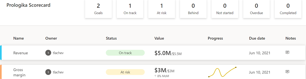
As with anything Power BI, Microsoft has democratized scorecards so business users with no reporting experience can quickly assemble them from existing reports. Think of a goal as a line (or KPIs) in the scorecard. Here is scorecard with two goals:
Currently, Power BI supports two goal types:
Static – The goal creator manually enters and track the goal properties, such as current value, target value, and status. This could be useful for quick and dirty KPIs that are not backed by a data source, such as launching a new promotion campaign. In the scorecard above, I created the Revenue goal by entering 5M as the current value and 5.5M as the goal.
Data-driven – The goal current value and/or target value can be data-driven and bound to metrics from existing report(s). Coming from Analysis Services, I was initially surprised that Power BI doesn’t require implementing KPI measures, but I get it: Microsoft decided to source the metrics from reports so business users can easily apply filters. If the goal owner chooses a metric from a visual that has a Date field, such as a time series chart, Power BI automatically shows a sparkline for the goal progress over time. An, of course, when the report dataset is refreshed, the goal values are updated.
So, no modeling or Power BI Desktop required assuming that someone else, such as a data analyst, has delivered functional and vetted reports with the metrics. Even better, the goal current and target values can come from different reports (even a report in a different workspace if you have permissions), e.g. a report with actuals and another report with targets. So, there is plenty of flexibility here. To mimic a balanced scorecard that spans multiple subject areas, the owner can create subgoals. For example, the main goal could be Finance with subgoals Revenue, Margin, etc.
Because like dashboards, goals are “pinned” from reports, the end user can navigate to the underlying report to examine the data in more detail. Users can also add notes to explain the goal behavior to the teammates.
A scorecard is a first-class Power BI citizen, and as such, it can be secured, endorsed, secured with sensitivity labels, annotated, and shared, such as sharing the scorecard to a Microsoft Teams channel. The scorecard data is saved in a Power BI dataset that users can connect to build custom reports. Moreover, Power BI automatically adds daily snapshots to the dataset allowing users to build up a history of the goals. For example, if the underlying report is refreshed daily, the updated goal values will be appended to the dataset. Developers can use the Power BI REST APIs to implement programmatic scorecard management solutions.
The Bad
Besides navigating to the underlying report, a goal is a one-liner in the scorecard. I can’t define a goal that shows me a metric sliced by dimension members, such as business unit. Further, subgoals are not currently aggregable, such as to sum or average values when rolling up to the main goal. Like limitations with dashboards, there is no way to apply a global filter to the scorecard, e.g. to filter all goals for the prior month.
Besides current and target values, no other goal properties can be data driven. For example, unlike Analysis Services KPIs, the goal status can’t be currently bound to a DAX measure. Changing the status requires proactive manual “check ins” although Microsoft mentions a forthcoming feature that will let users define rules to change the status, like how you can define rules for dashboard tile alerts. Speaking of data-driven properties, I don’t understand why you must use a date field to get the progress as opposed to any other field, such as Month, in your Date table.
The Ugly
Another premium teaser… If we really want to democratize features, shouldn’t we make them available in Pro?
Goals are a Power BI premium feature aimed at making it easier to create scorecards and monitoring metrics from existing reports. They promote a “bottom-up” culture, where business users can create departmental scorecards without reliance on IT. Microsoft plans more features by the end of the year to make Goals more appealing, such as integration with Power Automate to trigger actions, rolling up subgoals, changing the goal tracking cycle (DoD, MoM, YoY), custom goal formatting, Power BI Mobile experience optimized for phones, providing a scorecard visual, and cascaded goals (hierarchy of goals).
If you find Power BI Goals somewhat inflexible or you don’t have budget to upgrade to Premium, you don’t have to use the Goals feature to implement scorecards. You can define KPIs and create dashboard-looking reports where you have complete control over the dataset, filters, and scorecard presentation although this approach would require more advanced Power BI skills.
https://prologika.com/wp-content/uploads/2016/01/logo.png00Prologika - Teo Lachevhttps://prologika.com/wp-content/uploads/2016/01/logo.pngPrologika - Teo Lachev2021-05-12 15:36:122021-05-12 15:36:12A First Look at Power BI Goals
Power BI has made tremendous strides in features solidifying its position as a BI leader and increasing the feature distance over the competition (see latest Gartner report here). And rightfully so, considering that it’s much more than a visualization tool. However, you might find its advanced presentation capabilities still lagging. During a current BI assessment for a large mortgage company, the executive sponsor who have used before Tableau and Qlik told me that “some features that could be done in Qlik or Tableau in 10 minutes could take days with Power BI”. So much about “five seconds to sign up, five minutes to wow!” It’s hard to vow an audience that has seen better …
Here are the top 5 Power BI UX gaps to watch for especially if you’re migrating to Power BI from these two tools:
No dynamic binding – A long time ago, Microsoft promised that most of the Power BI properties would be expression-driven. Only title captions and conditional formatting currently support expressions. However, it’s not uncommon for dashboards to let the user specify what dimension and measures that want to see in a visual. Dynamics measures are not so difficult to implement with calculation groups (require Tabular Editor as today Power BI Desktop doesn’t have UI for calculation groups). Dynamic dimensions are much more difficult to implement. This gap could be solved elegantly if one day Power BI decides to support expressions for fields used in a visual.
No visual container support – It’s also not uncommon to organize visuals in a tabbed interface to save space. The current kludge is to use bookmarks to show or hide UI elements leading to such as a mess that no one can figure out and that should make Microsoft ashamed. So, a container interface to implement a visual that can host other visuals would allow the community to come up with creative gadgets that should make this easier.
No repeater visual – Want to embed a graph or sparkline that’s repeated for each row in a table? Can’t do today unless you use DAX measure that render HTML or SVG (both approaches require advanced DAX or UI skills). Microsoft should extend the Table and Matrix visuals (BTW, why do we have two visuals?) to allow nesting and repeating other visuals, like SSRS Tablix.
No asymmetric crosstab layouts – Currently, Matrix supports only symmetric layouts where the measure is repeated for each column forcing developers to use black belt techniques, such as the one I describe in my “Implementing Asymmetric Reports in Power BI“. Microsoft should enhance Matrix to support flexible layouts, like the SSRS Tablix control.
No Default members – Almost every dashboard requires defaulting the time period to a current period and automatically preselecting it when the period changes, such as when a new month starts. And of course, the user should be able to switch easily to a past period. A long-term Tabular limitation is that it doesn’t support default members. This limitation and the lack of dynamic binding forces developers to come up with workarounds, the most common being replacing the caption of the current period, e.g. “Current Month”, with the caveat that the user can’t see what the current period is. Tabular default members or expression-based slicer and filter default could help.
As you’ve seen, the prevailing theme of this rant is that I’d like Power BI to add more SSRS-like features, so we don’t look for the exit sign when management asks for more advanced and visually appealing reports.
https://prologika.com/wp-content/uploads/2016/01/logo.png00Prologika - Teo Lachevhttps://prologika.com/wp-content/uploads/2016/01/logo.pngPrologika - Teo Lachev2021-04-11 19:07:472021-04-11 19:10:15Top 5 Power BI UX Gaps
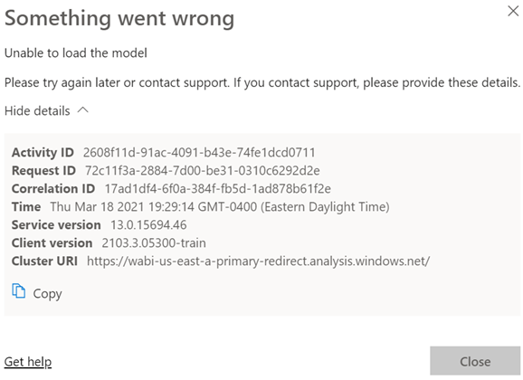
Scenario: You deploy a model to a Power BI workspace. You assign users to Members and Viewers roles. Everyone is happy. You later added a row-level security role and republish the model. Admins, Contributors and Members continue to view reports connected to the dataset as usual. However, Viewers report an error like the one shown below (didn’t Microsoft do an outstanding job explaining what went wrong with all of these guids?):
Analysis: Users with Administrator, Member, and Contributor permissions bypass any row-level security policies even if they assigned as role members. However, viewers are refused access unless they are added to a role that grants them the appropriate permissions. So, the likely culprit here is that there are some viewers that are not assigned to a role.
If viewers should have unrestricted access to an RLS-enabled dataset, create an Open Access role and add them to the role. As a best practice, you should create a security group and grant the group membership to the workspace and RLS.
https://prologika.com/wp-content/uploads/2016/01/logo.png00Prologika - Teo Lachevhttps://prologika.com/wp-content/uploads/2016/01/logo.pngPrologika - Teo Lachev2021-03-18 21:01:042021-05-20 17:16:46When Something Goes Wrong (Unable to Load the Model)
Amidst the COVID pandemic, the Houston Health Department (HHD) had another predicament to tackle. With lab results accumulating rapidly at one million cases per month, the vendor system they used for capturing and analyzing COVID data couldn’t keep up. In this newsletter, you’ll learn how Prologika implemented a BI solution powered by SQL Server and Power BI to solve technology challenges, and deliver fast and reliable insights.
Business Challenges
The vendor SQL Server database had large tables with normalized name-value pairs for each question and answer received from the patient, and for each investigation result. To facilitate reporting, the vendor system had scheduled ETL processes to extract data from the OLTP tables into denormalized tables. However, locking conflicts and large data volumes would crash the system and fail the ETL processes.
As a result, business analysts were not able to get timely data for reporting. HHD and the vendor tried to isolate the reporting loads by replicating the data to a reporting database but the issue with populating the denormalized tables remained
Solution
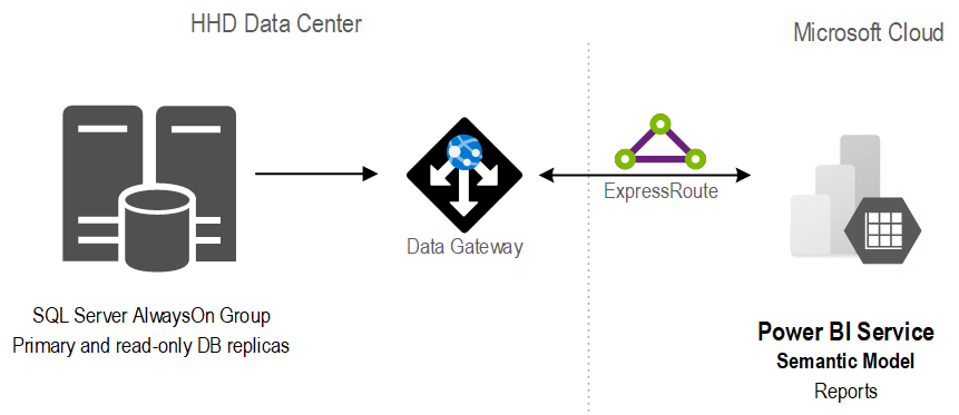
A good solution starts with a solid foundation. After assessing the current state and objectives, Prologika recommended and implemented the following architecture:
The stand-alone SQL database was replaced with an AlwaysOn availability group. Not only did this provide high availability, but it also isolated operational from reporting workloads.
In the client’s own words “we have compared the cluster server to the report server and cluster is vastly superior with regard to performance for regular queries. One simple run was 4x faster on cluster than the current report server. A much more complex run took four minutes on cluster and I stopped the same run on the report server after 87 minutes.”
Previously, data analysts would produce reports using different tools, ranging from SQL, Python, to Power BI reports. With scarce resources, HHD found it difficult to continue that path. Instead, Prologika implemented a semantic model that was hosted in Power BI.
Benefits
The new architecture and semantic model delivered the following benefits to HHD:
A single version of truth – Strategic data and business calculations were centralized on one place.
Fast insights – The Power BI reports crunching millions of rows were instantaneous.
Isolation – Report loads were isolated from the operational loads because the data was cached in the semantic model.
Standardization and centralization – Power BI became the reporting platform for delivering insights across the organization.
Teo Lachev Prologika, LLC | Making Sense of Data Microsoft Partner | Gold Data Analytics
Amidst the pandemic, the Houston Health Department (HHD) had another predicament to tackle. With lab results accumulating rapidly at one million cases per month, the vendor system they used for capturing and analyzing COVID data couldn’t keep up. The SQL Server database had large tables with normalized name-value pairs for each question and answer received from the patient, and for each investigation result. Read our case study to learn how Prologika implemented a BI solution powered by SQL Server and Power BI to help HHD gain reliable and timely insights from COVID lab results.
https://prologika.com/wp-content/uploads/2016/01/logo.png00Prologika - Teo Lachevhttps://prologika.com/wp-content/uploads/2016/01/logo.pngPrologika - Teo Lachev2021-02-26 14:19:222021-02-26 14:26:19State Health Department Gains Reliable and Rapid COVID Insights
Please join us online for the next Atlanta MS BI and Power BI Group meeting on Monday, March 1st, at 6:30 PM. Your humble correspondent will discuss the business value of semantic models and implementation options for self-service BI and organizational BI. For more details, visit our group page.
A semantic model is a layer between the data source and end user. Data analysts create self-service semantic models with Power BI Desktop or Excel. BI developers implement organizational semantic models with SSDT, Tabular Editor, and PBI Desktop. Join this session to:
· Learn what is a semantic model and how to choose between the self-service and organizational paths.
· Understand the implementation options for self-service BI models and best modeling practices.
· Find how organizational semantic models can help you achieve the “Discipline at the core, Flexibility at the Edge” tenant
· Learn how to choose a hosting platform and tool for implementing organizational semantic models.
· Learn how data analysts can extend organizational semantic models.
Speaker:
Teo Lachev is a consultant, author, and mentor, with a focus on Microsoft BI. Through his Atlanta-based company Prologika (a Microsoft Gold Partner in Data Analytics and Data Platform) he designs and implements innovative solutions that bring tremendous value to his clients. Teo has authored and co-authored several books, and he has been leading the Atlanta Microsoft Business Intelligence group since he founded it in 2010. Teo is one of the few FastTrack Recognized Solution Architects by Microsoft for Power BI in the world. Microsoft has also acknowledged Teo’s expertise and contributions to the technical community by awarding him the Microsoft Most Valuable Professional (MVP) Data Platform status for 15 years.
Prototypes without pizza:
Power BI Latest
https://prologika.com/wp-content/uploads/2016/01/logo.png00Prologika - Teo Lachevhttps://prologika.com/wp-content/uploads/2016/01/logo.pngPrologika - Teo Lachev2021-02-21 19:49:192021-02-27 13:58:50Atlanta MS BI and Power BI Group Meeting on March 1st
 Business Performance Management (BPM) is a methodology to help the company predict its performance. An integral part of a BPM strategy is creating and monitoring a scorecard with Key Performance Indicators (KPIs). In this newsletter, I’ll discuss how the newly released Power BI Goals can help you augmenet your BPM strategy. But before that, I’d like to share my excitement that Microsoft have recently awarded me