Posts

Tableau Prep vs. Power Query

After a few years of extensive development and beta testing, Tableau announced its data preparation tool (Tableau Prep) for “redefining your data prep experience”. Previously, Tableau relied on other vendors, such as Alteryx, for self-service data preparation. Naturally, I wanted to take it for a spin and compare it with the Microsoft Power Query (available for free in Power BI Desktop and Excel), which has been around since January 2013. Power Query was initially introduced as an Excel add-on but now it’s available in both Excel and Power BI Desktop. For those of you pressed for time, here is the gist:

CriteriaPower QueryTableau Prep
PriceFree$70/user/month for Creator bundle
IntegrationIntegrated with Power BI and ExcelStand-alone (with preview in Tableau Desktop)
Prepackaged Connectors7026
Custom ConnectorsYesNo
Row-level transformationsKeep rows, remove rows, remove duplicates, promote headers, group by, merge, append, pivot, transpose, combine filesPivot, join, union
Column-level transformsCopy, remove, duplicate, column from example, calculated column, remove, remove duplicates, remove errors, change type, rename, transform (lower, upper, trim, etc.), replace values, replace errors, split column, index column, group by, fill, pivot, move, format, extract, number column (statistics, standard, scientific, math), date and time column, R scriptFilter (formula required), group and replace, clean (upper, lower, trim, remove characters), split, rename, remove, calculated field
Interactive graphical step flowNo (static Query Dependencies diagram)Yes
ParametersYesNo
Use R for data prepYesNo
User-created tablesYesNo
Detect and expand relationships in data sourceYesNo (one data source at the time)
Functions (to centralize common logic)YesNo
Script (all transformations in one place)YesNo
Calculation languagePower Query M languageTableau calculation language
Output destinationDirectly into PBI data model, Excel sheet (Power Query in Excel only)Save as TDE, Hyper, CSV, preview in Desktop
Output optionsOne table in the model per query (typically)One output from Tableau Prep file (Tableau model can’t handle multiple tables)

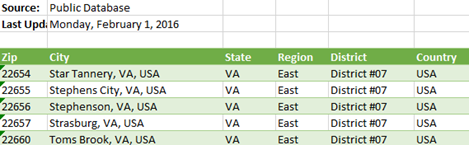
It’s clear that Tableau Prep is far behind the Power Query capabilities and has a lot of catching up to do. I took Tableau Prep for a quick ride to do simple data prep. The goal was to cleanse the geo table in the bi_dimensions Excel file that Microsoft provides as sample data for Dashboard in a Day (DIAD) workshops.

042618_2356_TableauPrep1.png

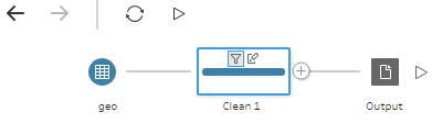
The geo table has a small (but common) issue because it has some extra rows that appear before the main dataset. These rows needs to be removed and the labels in the forth row needs to be promoted as column headers. Simple right?

042618_2356_TableauPrep2.png

In Power Query, you can quickly filter out top or bottom rows. No formulas or functions required. There wasn’t such a feature in Tableau Prep. I had to use a column filter (requires an expression) to filter out the top three rows. So much about “a drag-and-drop visual experience” and “no scripting required”. I also couldn’t find a feature to quickly promote column headers. In my opinion, Power Query is by far more user friendly than Tableau Prep.

After enough wrangling to do what’s simple in Power Query but complicated in Tableau Prep, I wanted to save the results. In Power BI Desktop and Excel, you can conveniently load the transformed data directly into the data model. Then, to reflect the changes in the data source, such as when you get a new file with the same spec, you just refresh to re-import and transform the data. No such integration with Tableau Prep. It’s designed to run the flow manually. And to me the biggest limitation of the tool, which stems from the limitation in the Tableau modeling capabilities, is that everything falls apart when you need multiple tables in your data model. Tableau’s mentality remains “one dataset at the time”.

I’ve noticed people excited about the Tableau Prep graphical interface. While it does help visualizing the flow I’m not sure how much value it really adds given that the steps are sequential, and the tool doesn’t support conditional constraints and branches. But you have pretty icons…without much behind.

While testing the tool, I couldn’t help but ask myself “Why pay hundreds of dollars per user/per year for Tableau Creator when Power BI Desktop is better and free?”

I shared more thoughts about Tableau vs Power BI in my blogs Power BI vs. Tableau (Part 1), Power BI vs. Tableau (Part 2), Power BI vs. Tableau (Part 3), and Tableau Hyper vs. Power BI xVelocity. As usual, I welcome your comments. Tableau fans are welcome too.

Tableau Hyper vs. Power BI xVelocity

pbivstableau

To compete more effectively with Power BI, Tableau acquired a database technology called HyPer. Like the Microsoft xVelocity in-memory technology (formerly known as VertiPaq), which powers Analysis Services Tabular, Power BI, and SQL Server Columnstore, HyPer is an in-memory database system. Hyper was initially developed as a research project at the Technical University of Munich. Tableau explains that “with Hyper, transactions and analytical queries are processed on the same column store, with no post-processing needed after data ingestion. This reduces stale data and minimizes the connection gap between specialized systems. Hyper’s unique approach allows a true combination of read-and write-heavy workloads in a single system. This means you can have fast extract creation without sacrificing fast query performance. (We call that a win-win.)”. Tableau shipped Hyper with Tableau v10.5. Here, we have a statement that Tableau claimed that Hyper achieved 3x faster data extraction and 5x increase in query performance compared to the old TDE data extracts.

Intrigued, I ran some tests to compare xVelocity, which has been around for more than a decade (since Excel 2007), with Hyper, and I wanted to share the results. My tests focused only the speed of data extraction and compression. I used Tableau 10.5.1 and Power BI Desktop February 2018 release. The tests loaded data from the ContosoRetailDW SQL Server database hosted on my laptop. Of course, there are many other factors that can influence the data ingestion speed, such as the query performance, driver, etc.

Loading One Table

The first test loaded a single table, FactOnlineSales, with over 12 million rows. Tableau data extract finished in 160 seconds while Power BI Desktop finished faster in 140 seconds. Interestingly, Tableau compressed data better. This should warrant some additional investigation, but I don’t know of a Tableau tool that can show the data compression ratio per column. It looks though the Hyper compression algorithm does a better job compressing numeric data types and no so much with text-based columns.

Loading Tree Tables

In the second test, I loaded three tables (FactOnlineSales, DimCustomer, and DimDate). Tableau uses by default an inner join among tables, resulting in a single SQL query that joins all three tables. To achieve the equivalent in Power BI Desktop, I used the same query that Tableau generated (another way would be to merge the tables in the Query Editor, which probably would have resulted in faster data load). Again, Power BI finished loading data faster but this time it compressed the data better.

Three Tables Normalized

In the third test, I wanted to leave the three tables loaded separately but joined with relationships. Surprisingly, Hyper focused apparently on performance alone and left the Tableau data modeling limitations. Tableau is still limited to a single dataset, unless you go for the weird and limited data blending, requiring a primary and secondary data source. Power BI has been supporting normalized schemas (a best practice) since it was initially released more than a decade ago. So, I couldn’t do the third test with Tableau. But out of curiosity, I ran the test with Power BI Desktop. Power BI data load was comparable with the first test, plus some additional time to create the relationships. And the data load size was comparable with the first test.

As far as query performance, both tools felt very responsive when slicing and dicing data and queries would complete within milliseconds. Once we have some officials query stats from Tableau, I’ll compare against xVelocity.

Conclusion

While Hyper might improve data load and query performance compared to the old Tableau data technology, don’t expect it to be any faster than xVelocity. This probably explains why Tableau is shy of touting Hyper too much.

Hyper didn’t remove the Tableau data modeling limitations. Tableau still lags by far the xVelocity data modeling capabilities. As a result, the more data you load, the larger the data footprint would be, and the slower it would be to load the data compared to multi-table Power BI schemas. Not to mention that having all the data merged into a single dataset is not a best practice for a variety of reasons.


Power BI vs. Tableau (Part 3)

pbivstableau

Feeling the heat, Tableau has come up with an updated Power BI vs. Tableau battle card as one of my clients pointed out. This time designed as a video. I guess the previous “10 Ways Power BI Falls Short” slide deck, which I discussed in the part 1 and part 2 of my “Power BI vs. Tableau” blog , wasn’t effective enough. I concur given the large number of customers abandoning the tool. Tableau is desperately trying to breathe new life into their aging software by a series of acquisitions to stay competitive but they’re now fighting an uphill battle. And their marketing materials should have a timestamp because Power BI improves every month and points get outdated quickly (see the first part 1 of my blog).

But let’s take a look at the latest battle card so we are better positioned to answer the question asked by Tableau “Which one helped me answer my questions faster?”

  1. 2:17 minute – Tableau shows a bar multiple by Year and Region, with the narrative “it’s surprising that other tools can’t do that”. Here is a similar visual with Power BI.
  2. 4:00 minute – Maps. OK, Tableau is very excited about lassoing points on the map like it’s the Holy Grail of geospatial analytics. What about other features that in my opinion are more important, such as using authoritative spatial data, like ArcGIS? Because Tableau its proprietary visualization framework that doesn’t natively support plugins, this is what you have to do to get it with Tableau integrated with ArcGIS. With Power BI, it’s built in a custom visual, which by the way supports lassoing. So, which one helped me answer my questions faster?
  3. 5:30 minute — The high-density outlier pitch. Alas, this time isn’t taking the central stage. As explained here, as of 9/30 all Power BI visuals except maps are high density so it’s a mute point. UPDATE 1/8/2017: As of the December 2017 update of Power BI, maps are high-density too.
  4. 7:11 minute – Tableau pitches that the tool can connect to lots of, lots of data but shows less connectors than Power BI. Power BI has 80 connectors and more are added every month.
  5. 8:00 minute – Tableau discusses collaboration and how easy it should be to share with coworkers by deploying to on-premises Tableau server. Well, I’d argue that it’s easier to deploy to the cloud, or even better, give the user the choice to deploy to a PaaS platform or to on-premises server. I also find it amusing that a tool that was once considered a “gold standard” for data visualization has run out of  visualization strengths, and harps on collaboration from this point on.
  6. 10:00 minute – I’m losing the pitch as Tableau is demonstrating how dashboards have full fidelity when published. So, do Power BI reports.
  7. 11:00 minute – Recipients personalizing shared reports and dashboards by creating views. Tableau has a point here, the Power BI sharing story needs consistency. Previously, organizational content packs allowed users to create personal read-write copies but apps, which supersede content packs, don’t have this feature (they are read-only to the recipient). About filtering, users can pass filters on the report URL. And users can create reports from scratch if they have access to the dataset, such as members of a workspace.
  8. 13:12 minute – Sandboxing and lifecycle management. The current Power BI Service story is to use workspaces for different environments, but Power BI Premium would most likely improve on this. On premises, you can use DEV and QA report servers which don’t require licensing. Try to get a free server with Tableau for QA/DEV!
  9. 14:00 minute – Auditing. Power BI supports usage metrics on report and dashboard level. Power BI also has comprehensive and integrated auditing with Office 365.
  10. 15:00 minute – More pitch about the Tableau Server governance. Well, SSRS/Power BI Report Server had this for a long time. But it also supports SSRS traditional reports, Excel reports, and Power BI reports. Speaking of a centralized report management, can you deploy anything else than Tableau reports to the Tableau report server, so it becomes an enterprise report portal for different report types?
  11. 16:00 minute – More about auditing. SSRS/Power BI Report Server has an execution log for this.

Then at the bottom of the page, we have a study by someone ex-Gartner, citing lower TCO for Tableau compared to Power BI. I can’t be reading this right. From the Gartner’s 2017 Magic Quadrant for Business Intelligence and Analytics Platforms, “On an annualized basis, Microsoft Power BI is roughly one-third of the license cost of a three-year perpetual BI license, but 80% lower than other cloud BI products. Low total cost of ownership was cited as the second most important reason for reference customers choosing Microsoft Power BI.” Yet, this researcher has found that “Microsoft Power BI’s total cost of ownership (TCO) to be 29% higher than Tableau”? Pick who to trust. And should business users deal with 20 GB datasets to start with? What about the novel idea of putting all of this data into a centralized semantic layer so we don’t have datasets moving around? Wait, isn’t a Tableau model limited to a single dataset with “data blending” capabilities? What’s the TOC then for all these isolated Tableau spreadmarts?

When you talk to Tableau about Power BI, get them to answer also the points I made in Part 2 of “Power BI vs. Tableau” blog.

Power BI vs. Tableau (Part 1)

As I mentioned in my blog “Why Business Like Yours Choose Power BI Over SiSense”, expect attack from other vendors to intensify as they find themselves fighting an increasingly uphill battle against Power BI. As we’ve seen, Power BI has indeed disrupted their sales cycles. In this blog, I’m reviewing the “10 Ways Power BI Falls Short” presentation that Tableau has published on their site. Tableau, of course, is a fine tool for what it’s designed to do – mainly self-service BI. But as we’ve all seen tools come and go as seasons. A few years ago it was all about Qlik, then Tableau, and now 2016 seems to be the year of Power BI. My advice has always been that the focus should be on sound strategy, data integration, and data quality, and not tools. The last thing you want is a “cool” tool that over promises but under delivers and you’re left with nothing when you decide to move on (and some of the vendors really cross the line during their sales pitch). So, we have to keep them honest!

Anyway, let’s take a look at some the claims that Tableau has made by going through their slides. This is, of course, a one-sided perspective that extolls the Tableau virtues. I plan a future post “10 Ways Tableau Falls Short” to fill in the gap. Also, Tableau should get in the habit to update this document frequently given the fact that Power BI changes weekly and some of the claims are no longer valid.

  1. Missing outliers are lost insights – Tableau has a point here. For some obscure reason, Power BI developers has decided to apply a data reduction algorithm to favor performance over details. True, this might result in lost outliers with thousands of data points. I recommend Microsoft allow end users to adjust the data reduction settings. I know this limitation is high on the wish list and I expect it to be addressed/lifted really soon. UPDATE 9/13/2017 – As of this date, all Power BI visuals except map supports rendering of all data points. UPDATE 1/8/2017 – As of the December 2017 update of Power BI, maps are high-density too.
  2. Difficult to answer easy questions – This refers to the fact that currently Power BI doesn’t support auto-generating common calculations. Fair enough, Power BI doesn’t support this yet but the statement “you’ll need to learn DAX first” is somewhat overloaded. There are plenty of DAX examples online of how to implement common calculations so there isn’t that much to learn. And DAX is much more powerful than Tableau expressions. UPDATE 10/1/2016 – Power BI introduced Quick Calc with the Percentage of Total being the only one currently available. UPDATE 4/3/2017 – Better yet, Power BI introduced Quick Measures, which supports various prepackaged calculations and show the DAX formula.
  3. No trends or forecasting available – Power BI just added trendlines. For now, forecasting needs to be done either in Excel or R. I don’t know why Power BI still hasn’t picked the linear forecasting capabilities that Power BI for Office 365 had. Another feature that is very high on the wish list so I don’t expect you have to wait long for forecasting. UPDATE 10/1/2016 – Power BI added time series forecasting. It also added Explain Increase/Decrease machine learning algorithms in Power BI Desktop.
  4. You can’t compare several categories – If I understand this correctly, it refers to ability to drill down across multiple categories. Power BI matrix reports should get the job done. Also, Power BI has recently added the ability to drill through chart data points.
    050416_0229_PowerBIvsTa1.png
  5. Filtering is tough – Tableau is correct that Power BI doesn’t support context filtering but the statement “You’d have to take the time to filter everything around it, one-by-one, instead” is overloaded. It shouldn’t be that difficult to filter out values using visual-level, page, or report filters. It might take a few more clicks, but I won’t consider this to be a major limitation.
  6. Half the details = Half the insight. True, Power BI tooltips are not yet customizable. Should important information be in tooltips though and require hovering from one point to next? UPDATE 10/1/2016 – Tooltips are now customizable.
  7. Organizing your data is difficult – True, Power BI doesn’t support dynamic groups, e.g. by lassoing some scatter points. I personally haven’t heard users complaining or asking about it so I don’t consider it to be a major limitation. Power BI does support hierarchies. UPDATE 11/1/2016 Power BI Desktop October Release introduced dynamic groups and binning in charts.
  8. No offline iterations allowed – “In Power BI, you can do some basic web editing, but you can’t download it to your desktop or work offline” This is incorrect. First, web report editing it’s on a par with desktop editing. Second, a best practice is to create your reports in Power BI Desktop and upload to powerbi.com. If you do this, you can download the pbix file and work offline. Moreover, Tableau web editing has more limitations than Power BI.
  9. You can’t tell a story – Outdated. Power BI added a Narratives for Power BI. Coupled with Quick Insights, these features surpass the Tableau capabilities. UPDATE 10/9/2017 Power BI also added bookmarks, selection pane, and spotlight.
    050416_0229_PowerBIvsTa2.png
  10. You can’t ask what-if questions – True, Power BI doesn’t support What-If natively yet. If this is important, you can export the visual data to Excel and use the Excel what-if, goal seek, and scenario capabilities. UPDATE 9/13/2017 – August release introduced What-If parameters and analysis

Overall, I believe that some of the points Tableau makes are insignificant while Power BI has already addressed others. Agree? Stay tuned for a “10 Ways Tableau Falls Short” blog.