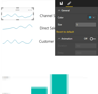
A sparkline is a miniature graph, typically drawn without axes or coordinates. Commonly used on dashboards, sparklines typically visualize trends over time, such as to show profit over the past several years. Although other Microsoft reporting tools, such as Excel and Reporting Services include sparkline elements, Power BI doesn't have one. That is until now. I contributed a "classic" sparkline custom visual to the Power…
Those of you who had to generate programmatically Tabular models or make changes to the schema would agree that it was more complicated that it should have been. That's because Tabular borrowed the schema from Multidimensional so objects had to be defined in different places and in the SSAS MD terminology (dimensions, DSVs, etc). SQL Server 2016 CTP3 brings a new and much more simplified…
Continuing the line of thought from my previous blog "Microsoft Unveils BI Roadmap", one nagging question still remains. What to do with all these Excel files now that SSRS came with a vengeance and has been promoted to THE on-premises BI platform? It looks like Microsoft is thinking along these lines. Interestingly, Excel Services will be removed from SharePoint Server 2016 and replaced with Office…