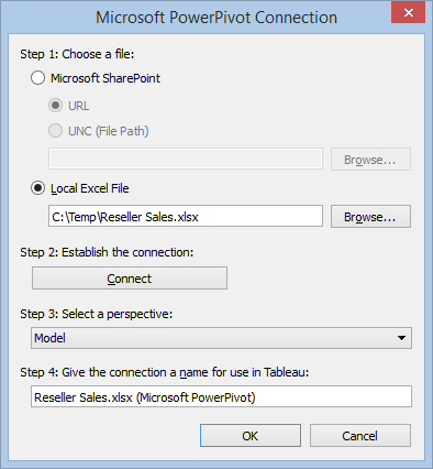
Now that Tableau has been highly praised by Gartner, you might be looking for ways to make the best of both self-service BI tools: the great data modelling capabilities and programming richness of Power Pivot and the visualization strengths of Tableau. Interestingly, besides published to SharePoint Power Pivot workbooks, Tableau can connect to local Power Pivot models and send MDX queries (as it does when connected to Multidimensional and Tabular).
This works thanks to the Tableau PowerPivot Connector wrapper (Microsoft SQL Server 2012 PowerPivot for Excel) that you can install from the Tableau website. Read this document to decide which one to use.
https://prologika.com/wp-content/uploads/2016/01/logo.png00Prologika - Teo Lachevhttps://prologika.com/wp-content/uploads/2016/01/logo.pngPrologika - Teo Lachev2014-02-24 20:06:002021-02-16 04:29:48Analyzing Power Pivot Models with Tableau
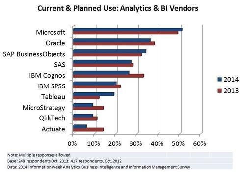
While Microsoft has fallen a bit in the Gartner’s eye, according to InformationWeek, it’s the hottest BI vendor in 2014. I guess the reason is that Gartner focuses predominantly on visualization, which is just one of the BI manifestations, while InformationWeek looks at the entire BI ecosystem.
https://prologika.com/wp-content/uploads/2016/01/logo.png00Prologika - Teo Lachevhttps://prologika.com/wp-content/uploads/2016/01/logo.pngPrologika - Teo Lachev2014-02-24 19:25:002016-02-15 07:59:052014 BI Outlook: Who’s Hot, Who’s Not
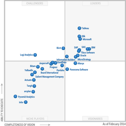
Gartner released the 2014 update of the Business Intelligence and Analytics Platforms Magic Quadrant. Interestingly, Gartner moved the predictive capabilities to a new Magic Quadrant for Advanced Analytics Platforms and dropped scorecards. The most interesting aspect of this report for me was the Market Overview section at the end. According to Gartner, the most prevalent future BI trends will be:
7% BI annual growth all the way until 2017
Visual data discovery
Easier data preparation
Collaboration and social analysis
Growth in Cloud BI
Real-time BI
Deemphasizing the BIG DATA hype
Join me at the Atlanta MS BI Group meeting tonight to discuss item 5 and at SQL Saturday in Atlanta on May 3rd to talk about item 6.
https://prologika.com/wp-content/uploads/2016/01/logo.png00Prologika - Teo Lachevhttps://prologika.com/wp-content/uploads/2016/01/logo.pngPrologika - Teo Lachev2014-02-24 19:15:002016-02-15 08:51:03Gartner’s Magic Quadrant for Business Intelligence and Analytics Platforms 2014 Released
Join us for the next Atlanta MS BI Group meeting on Monday, February 24th. Lance England will present “introduction to MDX”. Computer Associates will sponsor our meeting and show us the latest Erwin release. I’ll also talk briefly and present Power BI now that it went live. Spread the word and invite your coworkers but RSVP on our website so we can plan food accordingly. Also, don’t forget to register for the SQL Saturday precons that will take place on May 2nd, the day before SQL Saturday Atlanta.
Main Presentation:
MDX Fundamentals
Level: Intermediate
Date:
Monday, February 24th, 2014
Time
6:30 – 8:30 PM ET
Place:
South Terraces Building (Auditorium Room)
115 Perimeter Center Place
Atlanta, GA 30346
Overview:
MDX is a powerful language, but the price of that power is a higher degree of complexity. The key to understanding MDX is to learn the fundamental concepts and have a mental model of how it works. This presentation is for anyone who has struggled with the MDX learning curve, or is interested in starting down the MDX path.
Speaker:
Lance England is an Atlanta-area data professional specializing in data warehouse and business intelligence with a Microsoft-focus. He welcomes learning and networking with others. His blog is at http://lance-england.com and Twitter-handle is @lanceengland.
Sponsor:
CA Technologies
CA Technologies’ portfolio of software and services helps our customers speed time to value, ensure critical application performance and simplify security and operations so they can drive innovation and quality for their customers. CA ERwin Data Modeler is an industry-leading data modeling solution that provides a simple, visual interface to manage your complex data environment both on premises and cloud.
https://prologika.com/wp-content/uploads/2016/01/logo.png00Prologika - Teo Lachevhttps://prologika.com/wp-content/uploads/2016/01/logo.pngPrologika - Teo Lachev2014-02-21 15:35:002016-02-15 08:53:28Atlanta MS BI Group Meeting on February 24th
In my “Optimizing Dimension Data Security” blog, I’ve mentioned that converting static sets to dynamic could reduce the connection initialization time. To my surprise, using Excel to connect to the cube triggered the executing of dynamic sets and end users reported long wait times for the connection to initialize. It turned out that when Excel connects to the cube, it issues DISCOVER statements to query the metadata. One of these statements queries MDSCHEMA_SETS to find out what sets are available in the cube. For some obscure reason, this triggers the actual set evaluation for dynamic sets. If the set is expensive, e.g. touches all partitions, the DISCOVER statement can surely delay the connect time.
It turned out that other users are experiencing the same issue even if security is not applied. Greg Galloway found a workaround and extended the Analysis Services Stored Procedure project with a CurrentCommandIsDiscover method. You can use this method to check if the tool sends a DISCOVER command in your dynamic set definition and short-circuit the set evaluation, like so:
Create Dynamic Set CurrentCube.[Top 25 Selling Products] As
IIf(
ASSP.CurrentCommandIsDiscover(),
Head([Product].[Product].[Product].Members,0),
TopCount
(
[Product].[Product].[Product].Members,
25,
[Measures].[Sales Amount]
)
),
Display_Folder = ‘Sets’;
https://prologika.com/wp-content/uploads/2016/01/logo.png00Prologika - Teo Lachevhttps://prologika.com/wp-content/uploads/2016/01/logo.pngPrologika - Teo Lachev2014-02-19 00:54:002016-02-15 08:56:45When Dynamic Sets Are Not Dynamic
As you’ve probably head, Office 2013 supports now two installation options: the traditional MSI-based installation and the new Click-To-Run streaming installation. Chris Webb mentioned about it here and Melissa Coates describes how it works in more details here. The MSI setup is a perpetual one (you pay for a version once and you’re entitled to fixes for it) while the C2R setup is a subscription-based Office 365 setup (you continuously pay for using the software and you’re entitled to fixes and the latest features within the SKU you’re subscribed to). Perpetual installations will get updates (cumulative updates and service packs) just like they’re used to but they are meant primarily to be fixes rather than features. On the other hand, Office 365 subscribers have the benefit of getting fixes and new features as long as their subscription is active. Currently, there is no way to switch your existing Office installation from MSI to subscriber-based or vice versa. You must uninstall Office 2013 and reinstall. Once you do this, you’ll find that there is no difference as far as user experience. C2R still installs Office on the desktop although in different location.
The C2R setup has important ramifications on self-service BI. C2R users will have an always up-to-date service allowing Microsoft to add new functionality to the Office applications at a much faster rate. We’ve already seen this with the synonyms feature that are used for natural queries, aka Q&A (Q&A requires Power BI). Although I’ve initially dismissed the streaming installation, the C2R option now seems very attractive. I’ve already have an Office 365 subscription for e-mail and SharePoint. Shelving a few more bucks to upgrade to Power BI and stay on the latest and greatest seems like a good value proposition because I don’t have to wait for Office.NEXT to get the latest and greatest. More information about Office 365 plans can be found here. As an extension to Office 365, Power BI charges a premium as explained here.
A roadmap of C2R planned features is currently in the works so customers know the details of what’s coming up and when.
More and more organizations are planning and adopting dashboards. And, the question “which visualization tool is the best for dashboarding?” has been asked more frequently. The visualization aspect of BI has been rapidly evolving. There are plenty of vendors and plethora of tools out there. And, they keep on leap-frogging each other and each one has its strong sides and limitations. More than likely, the darlings of today will be forgotten in a few years. So, a quest to find the perfect tool that does it all is likely to fail or it will be short-lived.
I’m not a visualization expert. When it comes to visualizations, I listen to guidance from experts. If you navigate to slide 30 of my “Best Practices for Implementing Enterprise BI Solution”, you’ll see a mockup of a sales dashboard by Stephen Few that is taken from his excellent “Information Dashboard Design” book. This is an example of a pixel-perfect layout with a lot of customizations, such as conditional formatting. No fancy gauges, no bouncing needles, the focus is on intuitive interpretation of data and not on the visualization fluff. If you decide to adopt such visualization standards, you probably already own a great tool for implementing dashboards – SQL Server Reporting Services – which supports bullet graphs, sparklines, as well as a high level of customization.
So, instead of investing in a myriad of tools and hoping that they will solve your BI challenges, my advice would be to spend your money on a solid architecture that would easily allow you to support multiple visualization tools and swap tools as new ones come on board. For example, if you like and decide to adopt Tableau for interactive data visualization and exploration, you’ll find that integrates nicely with SSAS. Here is a dashboard that was done without asking end users to take care of the data logistics and business calculations since this work has already been taken care of in the backend layer. You could also easily implement a similar interactive dashboard with Power View which might not have all visualizations that third-party tools now have but gains in other areas. Please don’t take this dashboard as a best practice, it was meant to only show the possibility of tool integration.
But you don’t have time and budget for beautiful architectures, right? Since you don’t get much help on the IT side of things (if you have IT at all), you want to delegate BI and let Business to take things in their own hands. However, no matter what visualization vendors would tell you, soon or later you’ll find that self-service BI still requires a proper foundation, as Key Unkroth explains nicely in his “Self-Service Business Intelligence Governance” presentation. At minimum, a department would need some sort of data repository that integrates and cleans the data before letting end users in. But if you’ve gone that far, before implementing dashboards, why not add a semantic layer that centralizes business logic and it’s supported by most popular visualization tools out there?
Although it might not be immediately obvious, Power View supports various options for exploring data in more details. Although some scenarios are not natively supported, workarounds could be available.
Drilling Down
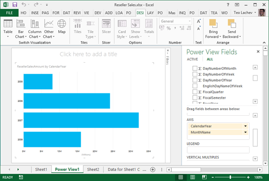
Drilling down involves navigating through multiple fields from the same or different dimensions to explore data at a lower granularity. Every interactive tool supports drilling down (and drilling up) and Power Pivot is no exception. For example, if you have a visualization that has multiple fields in a given zone, such as the AXIS zone, you can double-click a series to drill down to the next level. In the example below, I can double-click the Year series to see the data by Month.
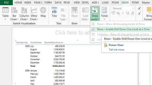
Drilling down is not automatically enabled for Table and Matrix visualizations because by default they show all fields in separate columns. What if you want one column but still be able to drill down?
If you haven’t done this already, convert the Table visualization to a Matrix visualization.
Expand the Show Levels button and click “Rows-Enable Drill Down One Level at a Time” assuming you want to drill down on fields placed on rows.
This will collapse all row fields to a single column. However, when the user clicks a field value, a down arrow indicates that this field is drillable. The user can click the arrow or double-click the field value to drill down or up if the field has been drilled to a lower level already.
Drilling Through
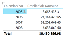
While drilling down is typically performed in the context of dimension tables, drilling through allows the user to see the details behind an aggregated value which is typically a numeric measure from a fact table. For example, Analysis Services and Power Pivot supports default drillthrough allowing the user to double-click on a cell in an Excel pivot report to see the individual rows as they were loaded from the data source, such as the sales transactions loaded from a ResellerSales fact table. As it stands, Power View doesn’t support Analysis Services actions and the user cannot double-click an aggregated value, such as on a field placed in the Values zone. Nor it allows the report to be extended with additional SSAS actions.
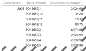
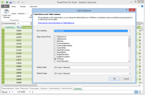
If you want to see the individual rows and the table includes a unique identifier, such as Transaction ID, you can simple drag that field on the Rows zone of a Table or Matrix report. If the table doesn’t have a unique identifier, you can manufacture one by concatenate multiple columns together. For example, the LineNumberID field in the screenshot below uses the DAX expression =[SalesOrderNumber] & “|” & [SalesOrderLineNumber].
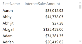
Sometimes, you may have duplicate field values, such as two customers who have the same first name. By default, Power View will show the distinct values and aggregate the results. For example, the following report shows a single row for Aaron although there are multiple customers whose first name is Aaron.
The modeler can use the Power View Table Behavior feature to instruct the client tools not to aggregate results across specific fields. For example, with the changes shown in the following screenshots, the report now will show as many Aaron rows as the number of customers that have Aaron as a first name.
Drilling Across
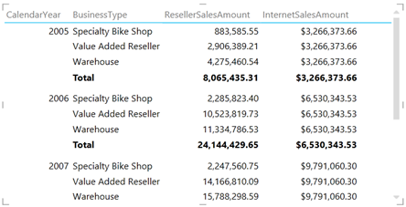
Drilling across allows us to analyze data across multiple fact tables at the same level of granularity assuming there are common (conformed) dimensions that join the fact tables. As a result, we can create a consolidated report that shows both ResellerSalesAmount from the ResellerSales table and InternetSalesAmount from the InternetSales table grouped by common subject areas, such as Date and Product. What happens if the report has to include a field that is related to only one of the fact tables? Power View will repeat the fact aggregates that are not related. For example, in the report below, InternetSalesAmount is repeated across BusinessType because this field is from the Reseller table which is not related to the InternetSales table.
NOTE Drilling across fact tables could be more challenging due to the way dimension relationships work. In SSAS and Power Pivot, relationships represent inner joins. Suppose you have two tables: FactOrdersPlaced and FactOrdersShipped. Both of them are joined to a Date dimension table. Let’s say that the user drills down to a particular order in FactOrdersPlaced and wants to see the transactions in FactOrdersShipped associated with the that order. Even if you have an Order Number dimension that joins FactOrdersPlaced and FactOrdersShipped, you won’t be able to get the expected results because the date when the order was placed will probably be different than the ship date. What you really need here is an outer join between fact tables. A workaround that works across all reporting tools is to add a consolidated fact table that combines the two fact tables. Another workaround that applies only to tools that support actions, such as Excel and PerformancePoint, is to create an SSRS report that queries directly the data warehouse.
https://prologika.com/wp-content/uploads/2016/01/logo.png00Prologika - Teo Lachevhttps://prologika.com/wp-content/uploads/2016/01/logo.pngPrologika - Teo Lachev2014-02-11 23:08:002016-02-15 09:12:46Drill Your Way with Power View
Data is your biggest asset and today’s currency but the data can be messy. You know it and we’ve seen it. The messier the data, the bigger the headache. At Prologika, we believe that data quality issues should be addressed as early as possible and the validation process should start with the source systems. You need a solution to detect possible duplicated entries without ETL, custom validation code, and exhaustively hard-coded rules. This is why I’m excited to announce today the availability of Prologika Match!
Data is “dirty” because of misspellings, truncations, missing or inserted tokens, null fields, unexpected abbreviations, and other irregularities. Prologika Match uses approximate string matching (fuzzy lookup) to detect potential duplicate entries to help you improve data quality at the point of data entry. When the user attempts to save a data entry that is similar to what’s already in the database, Prologika Match can detect the issue with a certain level of confidence. Then, the source system can notify the operator about potential data duplication. As a result, the data is cleaned at the point of entry and duplicated data is avoided.
Duplicated data is a serious issue with many industries, such as healthcare or insurance. Suppose that your company sells products to individual customers. Further, suppose that there is no easy way to identify a customer. When a customer contacts your company, the operator responsible for the data entry enters the customer information in the system. However, the data operator might misspell the customer name or its address. As a result, if this issue remains undetected, the system will create a new record for that customer. However, Prologika Match is capable of detecting such duplicated entries by predicting their similarity and notifying the operator.
Sounds interesting? Give Prologika Match a try now!
The next Atlanta SQL Saturday will be on May 3rd. I’m doing a “Deep Dive into the Microsoft BI Semantic Model (BISM)” pre-conference session on May 2nd. You can register using this link. The organizers set up a promotion code for $10 off registration, good for the first 10 users – the code is “AtlantaBI”.
Teo Lachev: Deep Dive into the Microsoft BI Semantic Model (BISM)
SQL Saturday #285 – Atlanta
Friday, May 2, 2014 from 9:00 AM to 4:30 PM (EDT)
“The chances are that your organization has a centralized data repository, such as ODS or a data warehouse, but you might not use it to the fullest. Join this insightful full-day event to understand the importance of having a semantic layer that bridges users and data. In the Microsoft BI world, BISM consists of Power Pivot, Tabular, and Multidimensional.
We’ll start by comparing these technologies to understand their usage scenarios, strengths and shortcomings. Next, we’ll put our business user’s hats and see how Power Pivot and the rest of the Microsoft self-service BI stack helps you integrate data from multiple data sources, implement self-service BI data models with Excel to ideate and promote divergent thinking.
Next, we will follow the BI continuum and see how to share these models and reports with your teammates by deploying them to SharePoint. Business intelligence professionals will discover how to build scalable and secure organizational solutions powered by Tabular and Multidimensional that deliver supreme performance with large data volumes and promote a single version of the truth.”
I submitted also a session proposal “Real-time BI with StreamInsight” for Saturday. It’ll be a busy SQL Saturday for me.
https://prologika.com/wp-content/uploads/2016/01/logo.png00Prologika - Teo Lachevhttps://prologika.com/wp-content/uploads/2016/01/logo.pngPrologika - Teo Lachev2014-02-01 03:20:002016-02-15 09:17:40Presenting at SQL Saturday Atlanta