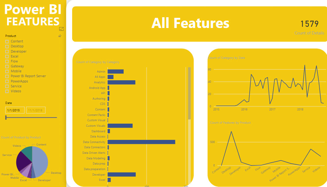
Want to know what Power BI features were released in a certain time period? Check out the Power BI Features report. After some delay, you should see the report embedded on the page but please be patient. If no patience, you can also download the pbix file from the same page. Then, use the slicer on the first page to filter your date range. In the “Count of Category” bar chart, right-click the category and then click See Records to see to the actual features. Once you drill through the category, there is a link next to each feature that redirects you to the corresponding blog to learn more.
https://prologika.com/wp-content/uploads/2016/01/logo.png00Prologika - Teo Lachevhttps://prologika.com/wp-content/uploads/2016/01/logo.pngPrologika - Teo Lachev2018-09-26 13:42:192018-09-26 13:52:42Power BI Features Report
How expensive is an xVelocity relationship? The answer depends on several factors, such as column cardinality, DAX calculations, and query itself. But it general, a relationship can add a significant overhead. Consider two tables: Customer (7.1 million rows) and Account Snapshot (187 million rows) and a relationship ‘Account Snapshot'[CustomerKey] -> Customer[CustomerKey]. I’ll use two queries for the test. The Relationship query uses the ‘Account Snapshot'[CustomerKey]->Customer[CustomerKey] relationship, while the No Relationship query scans directly the Account Snapshot table bypassing the relationship.
Each of these DAX queries results in two significant queries sent to the storage engine. The first calculates the measure for each customer and the second returns the selected customers (the filter clause in the query). In the case of the Relationship query, this is what the first SE call looks like:
SELECT
‘Customer'[CustomerKey],
SUM ( ‘Account Snapshot'[Balance Base] )
FROM ‘Account Snapshot’ LEFT OUTER JOIN ‘Customer’ ON ‘Account Snapshot'[CustomerKey]=’Customer'[CustomerKey]
And, of course, there is no join for the No Relationship query. The statistics below the queries shows the query execution for 1 and 1,000 customers (customer identifiers were comma-separated and added to the IN clause). The first number shows the overall execution time in the storage engine while the number in parenthesis show the breakdown of the two SE queries.
As we can see, for one customer the relationship adds more than twice of overhead (181 vs 84 milliseconds). But for 1,000 customers, the overall execution time for the No Relationship query is higher 1,194 vs 901. How come? The first storage query is still faster (almost x2) but the second SE query is a way slower. As it turns out, the storage engine locates 1,000 rows in the smaller table (Customer) much faster than in the snapshot table when it executes the filter query. However, if we add more measures than at some point the No Relationship query would become faster. In a real-life project where the query requested some 200 measures, queries without relationship executed x3 faster than the ones with relationships.
xVelocity relationships between large tables could be expensive especially when the query requests many measures. If your query semantics allows it, consider denormalizing attributes from large dimension tables into fact tables to eliminate relationships.
One case where the query semantics might require a relationship is if it requests measures from multiple fact tables. But if you find that eliminating the relationship results in a significant performance boost, consider breaking down the query to request measures from each table and then union the result.
Semantics relates to discovering the meaning of the message behind the words. In the context of data and BI, semantics represents the user’s perspective of data: how the end user views the data to derive knowledge from it. A modeler translates the machine-friendly database structures and terminology into a user-friendly semantic model that describes the business problems to be solved. To address this need, you create a semantic model. In my “Why Semantic Layer?” newsletter I explained the advantages of an organizational semantic model. In this newsletter, I’ll discuss how Power BI extends semantic modeling and converges it on a single platform. But before I go into details and speaking of semantic models, I’m excited to announce the availability of my new “Applied DAX with Power BI” workshop and its first in-person and public enrollment class on Oct 15-16 in Atlanta! Space is limited so RSVP today.
Semantic Model Flavors
In Microsoft BI, you can implement a semantic model using Power BI Desktop, Excel (Power Pivot) and Analysis Services (Multidimensional and Tabular). The first two are typically used by data analysts, while Analysis Services is considered a professional technology. Thus, we can classify semantic models into two broad categories: personal (self-service) and organizational. Behind the scenes, Power BI Desktop, Power Pivot and Analysis Services Tabular use the same foundation and storage engine. Nevertheless, up to now there have been feature differences and a strict division between these two types.
Personal
Organizational
Author
Data analyst
BI Pro
Tool
Power BI Desktop, Excel (Power Pivot)
SSDT and Analysis Services
Scope
Narrow (usually to solve specific need)
Wide (multiple subject areas)
Implementation effort
Short
Longer (data warehouse, ETL, model, testing)
Data capacity
Limited (up to a few million rows)
Larger (millions or billions of rows)
Data quality
Trust author
Trust modeler and testers
Data centralization
May lead to data duplication
Single version of truth
Deployment
Power BI Service, Power BI Report Server
SSAS (on premises)
Azure Analysis Services (cloud)
Consumers
Department, project
Potentially entire organization
How Power BI Changes Semantic Modeling
Power BI will blur the boundary between the personal and organizational aspects of semantic modeling. First, we’ve already seen how Microsoft introduced the following “pro” features in Power BI that don’t even exist or more difficult to implement with Analysis Services:
Incremental refresh – Delivers the ability to refresh portions of a larger dataset, such as the last 7 days. Currently, the largest dataset size supported by Power BI Premium is 10 GB, but Microsoft has already announced that soon Power BI will support larger datasets. What this means for you is that you’d be able to deploy organizational semantic models to Power BI Premium and schedule them for incremental refresh. My blog “Notes on Power BI Incremental Refresh” provides the details on this feature.
Composite semantic models – A composite model has heterogenous storage, such as some tables are imported and some are DirectQuery, as I discussed in my blog “Power BI Composite Models: The Good, The Bad, The Ugly“. This brings a lot of flexibility to how you connect to data.
Aggregations – Aggregations are predefined data summaries to speed up queries with very large models. My blog “A First Look at Power BI Aggregations” covers Power BI aggregations.
On the tooling side of things, Power BI Desktop will also pick “pro” features, such as perspectives and displays folders. Microsoft hopes that in time Power BI Desktop will serve the needs of both data analysts and BI pros. However, the lack of extensibility and source control, as well as performance issues caused by committing every model change to the background Analysis Services instance, makes me skeptical that pros will embrace Power BI Desktop. But because Microsoft announced plans to open the Power BI Tabular management endpoint (recall that published Power BI datasets are hosted in a “hidden” Tabular server), pros can still use SSDT and community tools, such as Tabular Editor, to design and deploy their models to Power BI Premium.
In time Power BI Premium will become a single cloud platform for hosting Microsoft BI artifacts (semantic models and reports) and facilitating the continuum from personal to organizational BI. This is a great news for BI practitioners frustrated by tooling and deployment differences. At the end, the personal and organizational paths will converge without feature discrepancies. The only difference would be the scope of your organizational model and how for you want it to become “organizational”.
Teo Lachev
Prologika, LLC | Making Sense of Data
Microsoft Partner | Gold Data Analytics
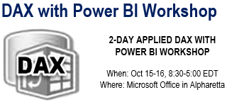
Struggling with DAX? Data Analysis Expressions (DAX) is the expression language of Power BI, Power Pivot, and Analysis Services Tabular. It’s very powerful but it’s usually perceived as complex and requiring a steep learning curve. Taught by an established expert, this two-day workshop is designed to help you become proficient with DAX. Think of this workshop as advanced Power BI training. Reserve your seat today to attend this insightful 2-day workshop for only $999, when Teo Lachev (CEO of Prologika and Microsoft Data Platform MVP) teaches you the necessary DAX skills that you can immediately apply to your job.
Work with advanced relationships and data security
Learn how to troubleshoot performance issues
Brainstorm your DAX puzzles
and much more…
https://prologika.com/wp-content/uploads/2016/01/logo.png00Prologika - Teo Lachevhttps://prologika.com/wp-content/uploads/2016/01/logo.pngPrologika - Teo Lachev2018-09-18 08:58:112018-09-18 08:58:112-Day Applied DAX with Power BI Workshop in Atlanta (Oct 15-16)
SQL Saturday BI in Atlanta is around the corner. Prologika will deliver two sessions at this event on September 22nd:
Bridge Analytics and Developer Worlds with Power BI and PowerApps by your humble correspondent, starting at 9 AM
One of the Power BI most prominent strengths is that it’s a part of the much broader Microsoft Data Platform that spans various on-premises and cloud offerings for data storage, processing, and analysis. Join me to learn how to integrate Power BI with PowerApps and discover exciting new possibilities that redefine the meaning of a report. During this entirely hands-on, no-slides session, I’ll walk you through the steps to implement a popular report requirement for writeback, that Power BI doesn’t natively support.
Data Quality – Plain & Simple by our master data management guru, Neal Waterstreet, starting at 12:30 PM
Data quality is a subject that comes up over and over again in many organizations. Most executives are concerned about the quality of the information used in their decisions. We talk about “good data” and “bad data” but what do those terms mean? In this presentation, we will first define what data quality is and look at how to measure it with data quality dimensions. Then, we’ll explore common causes for data quality issues and how to perform a data quality assessment. Finally, we’ll review the results and discuss some strategies and tools that can help improve the quality of the data in your organization.
Speaking of data quality, you should attend our next group meeting on Sep 25th at the Microsoft Office in Alpharetta where Profisee will present “Mastering data with Microsoft Master Data Services (MDS) for strategic advantage”.
I hope to meet you at one of these two events!
https://prologika.com/wp-content/uploads/2016/01/logo.png00Prologika - Teo Lachevhttps://prologika.com/wp-content/uploads/2016/01/logo.pngPrologika - Teo Lachev2018-09-16 18:07:502021-02-17 01:01:57Prologika at SQL Saturday BI in Atlanta
Data Analysis Expressions (DAX) is the expression language of Power BI, Power Pivot, and Analysis Services Tabular. It’s very powerful but it’s perceived as complex, requiring a steep learning curve. I’m excited to announce a new 2-day “Applied DAX with Power BI” workshop that I designed to help you become proficient with DAX. You’ll learn practical skills that will help you tackle a wide range of reporting requirements. We’ll start with DAX fundamentals, such as calculated columns and measures, and then progress to more advanced concepts, including such as context transitions, variables, filters, time intelligence, advanced relationships, row-level security, query optimization, and much more. Think of this workshop as Advanced Power BI and the next level from my “Applied Power BI” class. The target audience is data analysts and BI developers wanting to hone their DAX skills with Power BI, Power Pivot, or Tabular.
Here is my entire training catalog with a brief description and link to each course page.
This two-day workshop is designed to help you become proficient with Power BI and acquire the necessary skills to work with online and on-premises data, implement data models on a par with professional models created by BI pros, unlock the power of data by creating interactive reports and dashboards, and share insights with other users. No prior data modeling or reporting knowledge is assumed. Students are welcome to bring their own data to the second day of the class.
Data Analysis Expressions (DAX) is the expression language of Power BI, Power Pivot, and Analysis Services Tabular. It’s very powerful but it’s usually perceived as complex requiring a steep learning curve. This two-day class is designed to help you become proficient with implementing business calculations with Data Analysis Services (DAX).
Targeting BI developers, this intensive 5-day onsite class is designed to help you become proficient with Analysis Services and acquire the necessary skills to implement Tabular and Multidimensional semantic models. Use the opportunity to ask questions and study best practices that will help you achieve a single version of the truth by implementing scalable and secure organizational models. Bring your organizational BI to the next level by learning these two powerful BI technologies in one class!
SQL Server is the most deployed and popular database today. Different types of users need to query data stored in SQL Server data structures. This 2-day instructor led course provides you with the necessary skills to query Microsoft SQL Server databases with Transact-SQL. This course starts with the basics of a SELECT statement and its syntax, and progresses to teach you how to join, aggregate, and convert data.
This four-day class is designed to help you become proficient with the Microsoft BI toolset and acquire the necessary skills to implement an organizational BI solution. You’ll learn how to design a star schema, use SQL Server Integration Services to transform data, and implement a Tabular semantic model. Depending on the students’ skillset, it can be customized, such as to reduce coverage of specific technologies, replace them with other topics of interest, such as Multidimensional instead of Tabular, or cover additional topics, such as Power BI or Reporting Services.
Microsoft SQL Server Reporting Services has evolved into a sophisticated reporting platform that lets you present and analyze data consistently, quickly, and reliably. This intensive 3-day class is designed to help you become proficient with Reporting Services and acquire the necessary skills to author, manage, and deliver reports.
This intensive four-day class is designed to help you become proficient with Analysis Services (Multidimensional) and acquire the necessary skills to implement OLAP and data mining solutions. Learn how to build a cube from scratch. Use the opportunity to ask questions and study best practices!
If your organization have Analysis Services Multidimensional cubes or Tabular models and you want to gain valuable insights from them in Excel, then this course is for you. Designed as a step-by-step tour, this course teaches business users how to become data analysts and unlock the hidden power of data. You’ll learn how to apply the Excel desktop BI capabilities to create versatile reports and dashboards for historical and trend analysis.
Power BI is a suite of products for personal business intelligence (BI). It brings the power of Microsoft’s Business Intelligence platform to business users. At the same time, Power BI lets IT monitor and manage published models to track their usage, security, and estimate hardware and software resources. With Power BI, anyone can easily build personal BI models using the most popular tool – Excel and share them on premises or the cloud.
This two-day class is designed to help you learn the visualization tools that are included in the Microsoft Data Analytics Platform. We’ll start by exploring the Excel reporting capabilities that include pivot (PivotTable and PivotChart) and Power View reports. Then, you’ll learn how to explore data interactively with Power BI Desktop. During the second day of the class, we’ll focus on learning how to create paginated reports with Reporting Services. The class can be customized to discuss other tools, such as SSRS mobile reports or Power Map reports.
This two-day class is designed to help you become proficient with Master Data Services (MDS) and Data Quality Services (DQS). IT and business users learn how to design MDS models and extend them with business rules, attribute groups, and hierarchies. IT will learn how to integrate MDS with upstream and downstream systems and how to enforce secured access. Business users will learn how to use Excel to manage data with the tool they love most!
2
https://prologika.com/wp-content/uploads/2016/01/logo.png00Prologika - Teo Lachevhttps://prologika.com/wp-content/uploads/2016/01/logo.pngPrologika - Teo Lachev2018-09-12 08:23:172018-09-12 11:15:20New “Applied DAX with Power BI” Workshop
Scenario: DAX has its own share of idiosyncrasies that can humble both novice and experienced users. Consider a common example where a measure attempts to return sales for the last date in the Date table. What makes this common is that many real-life calculations require measures that evaluate as of the user-specified date (as of date), which is what MAX(‘Date'[Date]) returns.
As innocent and logically correct this measure is, it fails with “A function ‘MAX’ has been used in a True/False expression that is used as a table filter expression. This is not allowed.” It’s also amusing to see even Microsoft struggling to explain the reason of this error which at some point was on the internal top 10 Microsoft list for DAX “ease of use”. This is what the documentation states about this error:
“The filter expression, MAX(‘Date'[CalendarYear]) attempts to return the largest numeric value in the CalendarYear column. However, in context of the measure expression, it cannot be passed as a table filter expression to the CALCULATE function, causing an error.”
This of course is incorrect. First, the MAX function doesn’t return a table but a scalar value. Second, the CALCULATE function is perfectly capable of taking Boolean expressions. The actual issue is that the Boolean expression is surrounded by a hidden CALCULATE and it’s ambiguous in what context the maximum date should be evaluated. To be consistent with the way filters propagate, it should be in the filter context outside of CALCULATE, but in the row context of the as-of date, which becomes a filter context with MAX expression. But this is not what you would expect, so DAX fails safe with the error.
The workaround suggested by the documentation is to filter the Date table and pass it as a table filter to calculate. This requires ignoring first the filter context on the Date table, only to overwrite it later with the ‘as of date’.
Because the EOP variable is evaluated where it’s defined there is no hidden context and the measure works. Unfortunately, as it stands today, DAX doesn’t allow us to create a global session variable for such scenarios. So, you’d need to include this variable in every measure that requires it.
Speaking of issues with the DAX documentation and variables, here is another example (last example on that page) that doesn’t work:
YoY% = var Sales = SUM(SalesTable[SalesAmount]) var SalesLastYear=CALCULATE(Sales, SAMEPERIODLASTYEAR(‘Calendar‘[Date])) return if(Sales, DIVIDE(Sales – SalesLastYear, Sales))
This doesn’t work because the SalesLastYear var attempts to overwrite the context of the Sales var. In other words, it attempts to treat it as a measure but SalesLastYear would always return this year sales. The correct example should be:
YoY% = var Sales = SUM(SalesTable[SalesAmount]) var SalesLastYear=CALCULATE(SUM(SalesTable[SalesAmount]), SAMEPERIODLASTYEAR(‘Calendar‘[Date])) return if(Sales, DIVIDE(Sales – SalesLastYear, Sales))
The documentation should say that although one variable can reference another, it can’t overwrite its context. Also, to avoid a logical bug, the example should actually be:
YoY% = var Sales = SUM(SalesTable[SalesAmount]) var SalesLastYear=CALCULATE(SUM(SalesTable[SalesAmount]), SAMEPERIODLASTYEAR(‘Calendar‘[Date])) return if(AND(Sales, SalesLastYear), DIVIDE(Sales – SalesLastYear, Sales))
Because it’s meaningless to calculate YoY if this year or last year sales are missing.
As Microsoft announced in the “Distribute insights across the organization with Microsoft Power BI” presentation (forward to the Nikhil Gaekwad part starting at the 32 min), they’ve been releasing the following set of features to improve the end user experience in Power BI Service:
Home (not yet available) – Personalized landing page
Personal bookmarks (not yet available) – End users can create their own bookmarks
Persistent filters (already available) – Remembers filters and slicers set by end users
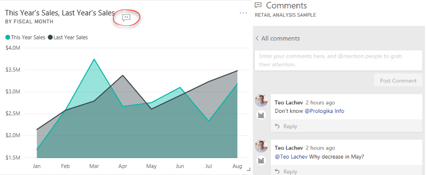
Conversations (dashboards conversations are available) – Dashboard and report discussions
Sharing with filters (not yet available) – Propagates the current filters when sharing individual reports and dashboards
I’ve noticed that the dashboard conversations are now available. Just open a Power BI dashboard and click the Comments menu. This will open a Comments pane when you can post comments related to the entire dashboard. You can also post comments for a specific tile by clicking the tile ellipsis menu and then choosing “Add a comment”. You know that a tile has comments when you see the “Show tile conversations” button that floats on the tile. Clicking this button brings to the Comments pane to see and participate in the discussion.
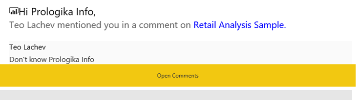
For tile-related comments, you can click the icon below the person in the Comments pane, to navigate to the specific visual that comments are associated with. Conversations are available in Power BI Service and Power BI Mobile. To avoid posting a comment and waiting someone to see it to act on it, you can @mention people as you can do on Twitter. For example, in my first comment I referenced @Prologika Info. Then that user will get an email that looks like this:
Collaboration features are not new to Power BI. Workspaces backed by O365 groups (the old-style workspaces) have supported email-based conversations. Power BI Mobile lets users annotate reports or tiles with text and emotions, and then send a screenshot to another user. Dashboard and report conversations bring collaboration a step further by allowing end users to collaborate in the context of a specific report, dashboard, or even a visual.
Usage scenario
Limitations
Workspace conversations
Workspace-level email-based collaboration
The workspace needs to be backed by O365 group.
Power BI Mobile annotations
Send annotated screenshots to other users
Power BI Mobile only; no discussion thread
Dashboard and report conversations
Discussion thread on dashboard/report/tile
Comments don’t save the state of the visual or include a screenshot of the visual if it changes after data refresh


 Semantics relates to discovering the meaning of the message behind the words. In the context of data and BI, semantics represents the user’s perspective of data: how the end user views the data to derive knowledge from it. A modeler translates the machine-friendly database structures and terminology into a user-friendly semantic model that describes the business problems to be solved. To address this need, you create a semantic model. In my “