A First Look at DAX Visual Calculations: the Good, the Bad, and the Ugly

The February 2024 release of Power BI Desktop includes a preview of visual calculations. As its name suggests, a visual calculation is a visual-scoped DAX measure that works at the aggregate (visual) level.

The Good

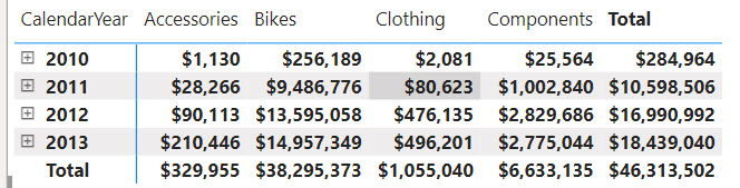
Visual calculations make previously difficult tasks much easier. Consider the following matrix:

Suppose you need a measure that calculates the difference between the product categories in the order they were sorted in the visual. Implementing this as a regular DAX measure is a challenge. Yet, if we had a way to work with the cells in the visual, we can easily find a way to get this to work. Ideally, this would work similar in Excel, but DAX doesn’t know about relative references. However, visual calculations do (kind of).

Let’s right-click on the visual and select “New calculation”. In the visual-level DAX formula bar, enter the following formula:

Category Diff = [Sum of SalesAmount] - PREVIOUS([Sum of SalesAmount], COLUMNS)

The Category Diff measure computes the difference between the current “cell” and the cell for the previous category. For example, for Bikes it will be $9,486,776-$28,266 (Accessories value).

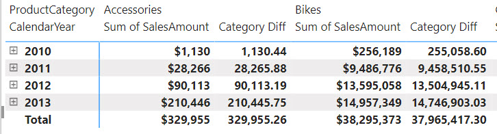
Notice the use of the PREVIOUS function which is one the new DAX functions specifically designed for visual calculations. Notice also that the PREVIOUS function has additional arguments and one of them is the AXIS argument which specifies if the function should evaluate cells positionally on columns or rows. Finally, notice that visual-level formulas can only reference fields or measures placed in the visual.

The Bad

Among the various limitations, the following will cause some pain and suffering:
1. A visual calculation effectively disables exporting the visual data.
2. Drillthrough is disabled.
3. Can format visual calculations unless the visual supports it (the matrix visual does support measure formatting).
4. Can’t apply conditional formatting.
5. Can’t change sort order.
6. Can’t use field parameters.

The Ugly

The way Microsoft advertises this feature is that it is “easier than regular DAX”. My concern is that tempted by that promise, users will start abusing this feature left and right, such as for creating visual calculations that can be better implemented as regular DAX measures, e.g. for summing or averaging values. And not before long, such users would find themselves into an Excel-like spreadmart hell which is what they tried to avoid by embracing Power BI.

Therefore, please use these visual calculations only when regular DAX measures will not suffice. Business metrics should be centralized and should return consistent results, no matter the reporting tool or visual they are placed in. This is important for achieving the elusive single version of truth.

Atlanta Microsoft BI Group Meeting on March 4th (Navigating Microsoft Fabric – Choosing the Right Workload for Your Needs)

Atlanta BI fans, please join us in person for the next meeting on Monday, March 4th at 6:30 PM ET. The famous Patrick LeBlanc (Guy in the Cube) will take a deep dive into the Microsoft Fabric ecosystem, from Lakehouse to Warehouses and Power BI, ensuring you can make informed decisions about your data processing needs. Your humble correspondent will help you catch up on Microsoft BI latest. CloudStaff.ai will sponsor the event. For more details and sign up, visit our group page.

Presentation: Navigating Microsoft Fabric – Choosing the Right Workload for Your Needs

Delivery: In-person

Date: March 4

Time: 18:30 – 20:30 ET

Level: Beginner/Intermediate

Food: Pizza and drinks


Agenda:

18:15-18:30 Registration and networking

18:30-19:00 Organizer and sponsor time (events, Microsoft BI latest, sponsor marketing)

19:00-20:15 Main presentation

20:15-20:30 Q&A

Overview: As businesses transition to the cloud and leverage advanced analytics, understanding the nuances of data infrastructure becomes paramount. Microsoft Fabric offers a suite of powerful tools designed to handle various data workloads, but the key to harnessing its full potential lies in understanding which tool to use and when. This session provides a deep dive into the Microsoft Fabric ecosystem, from Lakehouse to Warehouses and Power BI, ensuring that participants can make informed decisions about their data processing needs. We’ll also look at current limitations that will help guide you.

Speaker: Patrick LeBlanc is a currently a Principal Program Manager at Microsoft and a contributing partner to Guy in a Cube. Along with his 15+ years’ experience in IT he holds a Master of Science degree from Louisiana State University. He is the author and co-author of five SQL Server books. Prior to joining Microsoft, he was awarded Microsoft MVP award for his contributions to the community. Patrick is a regular speaker at many SQL Server Conferences and Community events.

Sponsor: CloudStaff.ai

PowerBILogo

Nothing in Excess: Deciphering Data Architectures by James Serra

In my last post, I talked about the lessons learned from the ancient Greeks. The second inscription on the temple of Apollo in Delphi was “Nothing in Excess.” Yet, inspired to be modern and embracing vendor’s propaganda, it’s my experience that companies tend to overdo their data architectures. I talked about this in this newsletter. Another excellent resource that could help you strike a balance is the James Serra’s latest book “Deciphering Data Architectures.” I was privileged to know James Serra for a while, have him multiple times present to our Atlanta BI Group, and be an early reviewer of this book.

Besides consolidating the wealth of information from his excellent blog, James took a vendor-neutral approach to various patterns. Each pattern describes the architecture followed by pros and cons analysis.

After all, the right architecture and “best practice” is what works for you given your specific circumstances and restrictions. Nothing more, nothing less. And you’ll still be “modern”, whatever that means.

How do I personally avoid excess in my data architectures? By keeping them simple. Although there are exceptions when it makes sense, the general tenants for most implementations are:

  1. Stage only the data I need instead of staging all source tables. Yes, this requires joining tables at the source, which is what the relational databases are designed to do (usually that’s the source).
  2. If the data is hosted in relational databases, stage directly to the cloud data warehouse and bypass intermittent staging to a lake. In general, I hate working with files.
  3. If the data is provided as files, such as reference data or source data downloaded or uploaded as files, stage it to a data lake.
  4. Avoid REST APIs of cloud vendors like the plague unless there is no other way.
  5. Do incremental data extraction when necessary (e.g. above a few million rows) and possible.
  6. Embrace the ELT pattern.

Know Thyself: Power BI Source Control

Last year my wife and I did a tour of Greece, and we had a blast. Greece, of course, is the place to go if you are interested in ancient history and the origin of democracy. One of the places we visited was Delphi. The ancient Greeks believed it to be the center of the universe. Now not much was left of it except lots of ruins and imagination. But back then it was magnificent. People from all over the world would come to consult with the Oracle of Delphi. She delivered her prophecies from the temple of Apollo, which had three inscriptions, with one of them being “Know thyself”. The practical benefit for the oracle was that if you believed her cryptic prophecy wasn’t fulfilled then your interpretation was wrong. Therefore, the problem was in you because you didn’t know yourself.

How does this translate into BI? I see clients overly excited about Microsoft Fabric/Power BI Premium, believing that bundling features will solve all their issues. But knowing your organization, ask yourself if your users would use all these features to justify the premium price. A case in point: Power BI source control via workspace Git integration: a feature that appear to be created from developers for developers. Kristyna Hughes did a great presentation for our Atlanta BI Group on Monday covering how developers can take the most of this feature.

Given the self-service focus of Power BI, however, I doubt that data analysts would subject themselves to learning Azure DevOps, Visual Studio Code, and Git CI/CD. Yet, Power BI source control has been in demand since the beginning with the most common ask – the ability to roll back changes.

Here is my take to simplify Power BI source control for regular users:

Power BI Premium/PPU/Fabric clients

  1. If you are on Power BI Premium, set up a branch for each workspace that you want to put under source control, and configure the workspaces for Git integration.
  2. Let business users publish changes as usual.
  3. Periodically and as a part of the change management process, the workspace admin approves the changes and commits them to source control. I hope one day Power BI would transparently commit changes to Git as Azure Data Factory does it, without requiring explicit synchronization. Meanwhile, the admin must manually commit.
  4. Someone privileged to Azure DevOps would need to roll back changes if needed. Again, I hope one day history review, compare, and roll back will be baked in Power BI.

Power BI Pro clients

  1. Once this feature is generally available, embrace Power BI Desktop projects.
  2. When significant changes are made, back up report and model.bim json files to some location, such as OneDrive which has built-in version control.
  3. Replace the project files when you need to roll back changes. Again, this “poor man” source control emphasizes simplicity and saves premium licenses.