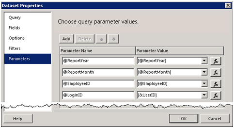
Sparklines and Data Bars
Besides indicators, R2 adds sparklines and data bars to the arsenal of data visualization features. Sparklines are small graphics embedded in a context of words, numbers, and images. They help end users visualize simple trends. You could implement sparklines and simple data bars in the previous versions of Reporting Services but you had to go through many steps to strip down the chart or gauge regions. R2 makes the process much simpler. Let’s see what it takes to author a sparkline report with R2 that is similar to the Sparklines report included in my book source code. [View:https://prologika.com/CS/cfs-file.ashx/__key/CommunityServer.Blogs.Components.WeblogFiles/blog/6175.Sparklines-R2.rdl]
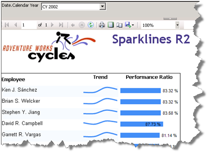
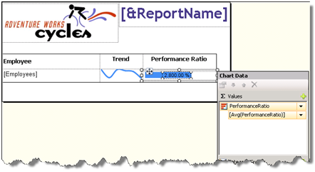
This report helps the user visualize the performance of the Adventure Works sales persons. For each person, the report shows the employee’s trend based on the reseller sales made over four quarters and his performance ratio which is defined as the actual sales made by the employee divided by his sales quota. The report gets the data from the Adventure Works 2008 Analysis Services cube.
Configuring Sparklines
In Reporting Services, a sparkline is a scaled-down chart region. Configuring a sparkline takes a few simple steps.
1. Right-click on a tablix cell and click Insert ð Sparkline.
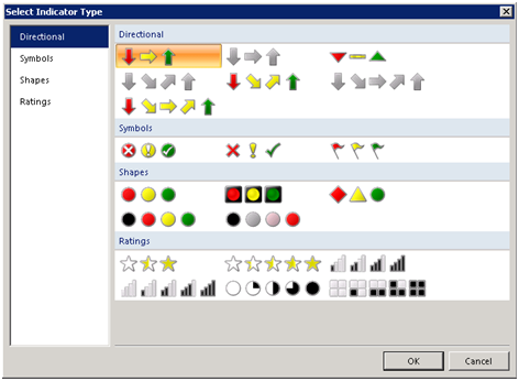
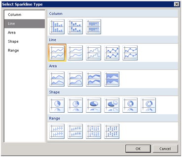
2. In the Select Sparkline Type dialog box that follows, select the Line sparkline type.
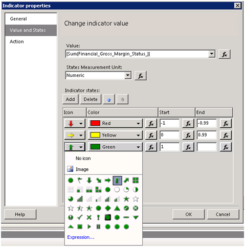
3. Double-click the sparkline region to open the Chart Data panel which is another new design feature in R2.
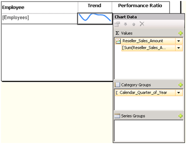
4. Click the plus sign in the Values pane and select the Reseller_Sales_Amount to configure the sparkline series.
5. Click the plus sign in the Category Groups pane to add the Category_Quarter_of_Year field to configure the category groups.
That’s it! I’ve made a few more minor adjustments to finalize the sparkline, such as removing the chart border, setting the chart background for the “green bar” effect and increasing the line width.
Configuring Data Bars
To demonstrate data bars, I implemented the employee’s performance ratio using a data bar region. Similar to a sparkline, a data bar is a simplified chart.
- Right-click on a cell and click Insert ð Data Bar. I actually, configured the data bar outside tablix first by embedding it inside the rectangle and copying and pasting it inside the tablix cell. I did that to make the bar narrower so it doesn’t occupy the entire cell height.
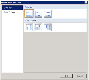
- On the Select Data Bar Type, leave the default Bar type selected.
3. In the Chart Data panel, click the plus sign in the Value pane to add the PerformanceRatio field and set its aggregation function to Avg.
That’s pretty much it to set up the initial data bar although I had to go through a few more steps to configure the bar labels and appearance.
Although not revolutionary features, Indicators, sparklines and data bars will save you time when you need to enhance your report with simple graphics. Sean Boon from the Reporting Services team has written an interesting blog post that demonstrates more sparkline features to implement a win-loss sparkline.