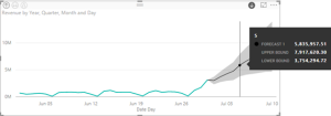
The September update of Power BI Desktop adds one of the most requested features – time series forecasting on single line charts. You can control the confidence interval and seasonality. To use forecasting, make sure that you add a field of Date data type to the chart axis. Only when a date field is used, then you'll see the Forecast section added to the Analytics…
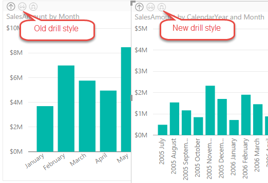
In the latest Power BI Desktop update, Power BI introduced a new drill-down option. Previously, after enabling drill-down on a chart and clicking the double-arrow icon, the chart will drill down to the next field in the Axis area (or to the next level of a hierarchy if a hierarchy is added to the Axis area). A student attending my Power BI class asked me…
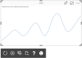
One of the most prominent Power BI benefits is its extensible architecture that allows developers to integrate Power BI with custom apps and extend its capabilities, such by creating custom visuals. Having contributed one of the first custom visuals, the Sparkline custom visual, I can tell from experience that Microsoft does its part to ensure that the submitted visuals meets quality, security, and functionality best…
Larger organizations are naturally interested in established procedures for data governance, retention, search and taxonomy. With the rising important of data analytics, such policies are equally important for BI artifacts. For example, a large organization wants to restrict users to access Power BI only from approved devices and/ or on premises. Although it doesn't match yet the SharePoint data governance features, Power BI is making…
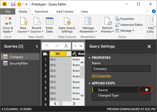
Power BI Desktop has a very useful feature that lets you create tables by manually entering the data. This could be useful in a variety of scenarios, such as entering some reference data, defining KPI goals, creating simple lookup tables, or prototyping some data. If you're familiar with creating tables in Power Pivot by copying and pasting tabular data, think of Enter Data as the…
Are you looking for an agile self-service platform that doesn't require reporting and query skills to get basic analytics done without reliance on IT? Or, perhaps you've heard or evaluating Power BI but not sure where to start or how to take the most out of it? If so, this workshop is for you. A year ago Microsoft unveiled the new Power BI platform consisting of…
A year ago Microsoft unveiled the new Power BI platform consisting of the PowerBI.com cloud service, Power BI Desktop, and Power BI Mobile. Since then, Prologika has helped organizations of all sizes to plan and adopt Power BI. Packed with features, Power BI supports a dizzying variety of features and integration scenarios but it might be difficult to understand how Power BI fits in your data analytics ecosystem.…
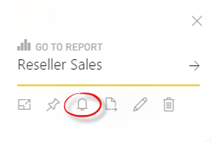
Currently in preview, Microsoft Flow is a cloud service for creating automation flows without writing code, similar to Zapier's "zaps" and IFTTT's "recipes". How is this useful for BI? Let's consider an example. Power BI has recently introduced data-driven alerts in Power BI Service (previously alerts were supported on iPhone only). Currently, alerts can be created only on single-card and gauge dashboard tiles that are connected to…
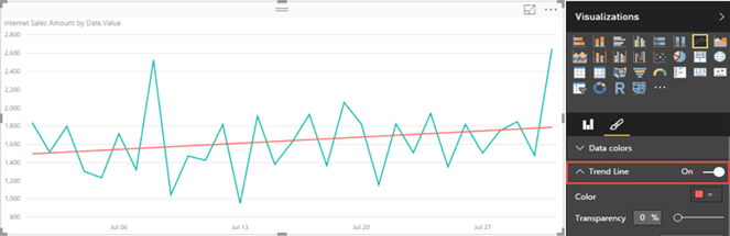
Recently, Power BI charts introduced trend lines. However, they require numeric or date values on X-axis, which must have a continuous type. In fact, if you use a text field for the X-axis, a warning indicator will be displayed in the top left corner of the chart to warn you that non-numeric values are used. This requirement presents issues if the report is connected to…
One great feature of Microsoft BI has been the continuum from personal BI to organizational BI. For example, a business user can start small with an Excel Power Pivot model which IT can restore at some point to a scalable Tabular model. In fact, if you know Microsoft personal BI (Power Pivot or Power BI Desktop), you already know 80% (or even more) of SSAS…