The Dazzling R2 Report Manager
In this and future blogs I’ll cover the most important new features in the forthcoming release of Reporting Services which will be included in SQL Server 2008 R2 (code-named Kilimanjaro or KJ for short). Let’s start with the most obvious new feature: the all new Report Manager UI.
SharePoint-like UI
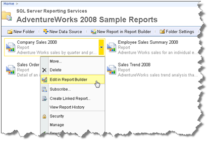
The moment you open Report Manager, you will notice that significant work was done to make the UI more intuitive, a la SharePoint.

For example, similar to SharePoint, a drop-down context menu pops up when you hover on a report item that lets you quickly access relevant tasks.
Simplified UI
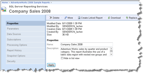
The management pages also received facelift. Microsoft has reduced the number of buttons and changed the tab styling so you are sure which tab is selected.

Although seemingly minor, I am sure you’d love the new look and feel. For example, I like the fact that I don’t have run a report or switch to Details mode just to get to the report properties.
Report Builder 3.0 ClickOnce
Another welcome enhancement is that opening a report in Report Builder, launches Report Builder 3.0 (more on it in another post) by default. Report Builder 1.0 is still installed but it’s not the default reporting client. You see the writing on the wall. Report Builder 1.0 days are counted and you better embrace the future.
AJAX Report Viewer
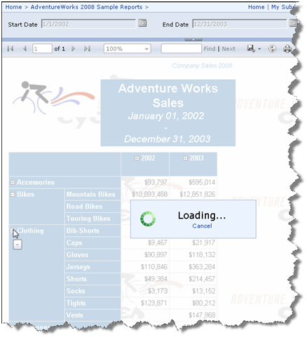
Another major enhancement is the debut of an AJAX-enabled ReportViewer control (developers will get the Visual Studio counterpart in Beta 2 of Visual Studio 2010). The control eliminates visible page reposts when interactive actions, such as drilldown, are initiated. The page fades out but it stays in place and a spinny lets the user know that an interactive action is taking place.

All in all, end users and administrators will enjoy the new Report Manager. You won’t have to switch to SharePoint integration mode just to get a SharePoint-like UI.


