Heat Maps as Reports
Continuing my intrepid journey through the new Reporting Services R2 enhancements, in this blog I’ll demonstrate some of the cool map features. As you’ve probably heard, R2 brings a brand new map control that lets you visualize spatial data on your reports. Since mapping is the one of the major enhancements in R2, there will be plenty of resources to cover it in details. For example, Robert Bruckner has written a great blog to get you started with mapping. The SSRS R2 forum adds more resources.
But what if you don’t need to visualize geospatial data, such as restaurants in the Seattle area? You shouldn’t bother with the map, right? Not so fast. What’s interesting is that the map supports the two spatial data types in SQL Server: geography and geometry. The latter lets you visualize everything that can be plotted on the planar coordinate system. That’s pretty powerful when you get to think about it. If you have the item coordinates, you can map pretty much everything. A few weeks ago, for example, I saw a Microsoft sample map report that plotted floor layout. Today, I’ll show you a report that I whipped out during the weekend that demonstrates how to visualize a heat map.
The Heat Map Report
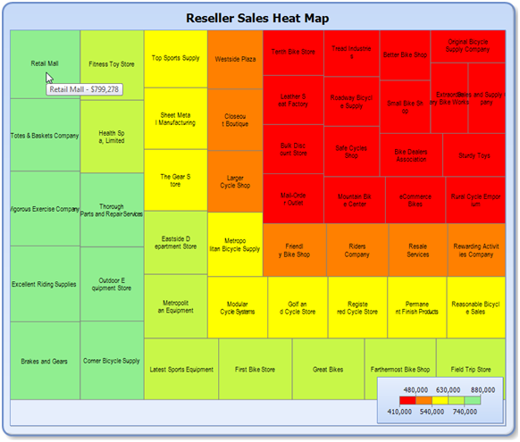
A heat map is a graphical representation of data where the values taken by a variable in a two-dimensional map are represented as colors. The most basic variation of a heat map is a tree map that lets you visualize data trends presented as nested rectangles. In our case, the sample report shows the Adventure Works reseller sales. As shown in the screenshot, the larger the rectangle is the more sales were contributed by that reseller. The same can be observed by analyzing the rectangle color which ranges from green (most sales) to red (less sales). The greener the color is, the more sales that reseller has. I chose to use the sales as a color variable although I could have used another measure, such as number of employees, profit, etc. You can download the source code from here.
Limitations
I’ll be quick to point out the following limitations of this reporting solution:
- As it stands, producing the report requires a two-step approach. First, you need to prepare the dataset and save it in a SQL Server table. Second, you run the report from the saved data. Unfortunately, the ReportViewer control doesn’t support RDL R2 which means it doesn’t support maps, so you cannot bind the dataset and run the report in one shot. While we are waiting for Microsoft to update ReportViewer, you can use a server-side custom data extension that exposes the ADO.NET dataset with the spatial data as a report dataset. This approach will et you bind the ADO.NET dataset to a server report. Chapter 18 in my book source code includes such an extension.
- The performance of the algorithm that I use to calculate the coordinates of the nested rectangles degrades after a few hundred rows in the dataset. If you need to map more results, you may need to revisit the algorithm to see if you can optimize it.
Understanding Rectangle Geometry
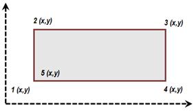
SQL Server describes polygons in Well-Known Text (WKT) standard sponsored by Open Geospatial Consortium. For instance, a polygon is described as five (surprise) points on the coordinate system, as shown below. The fifth point is the same as the first point.
You can convert WKT to the SQL Server geometry data type by using the STPolyFromText method, such as:
geometry::STPolyFromText(‘POLYGON ((0 0, 0 125.6331, 115.0095 125.6331, 115.0095 0, 0 0))’, 0)
Calculating the Coordinates
To calculate the nested rectangle coordinates, I used the excellent Squarified Treemaps algorithm by Jonathan Hodgson. Jonathan explains in details how the algorithm works. My humble contribution added the following changes:
- I decoupled the algorithm from his Silverlight solution to a C# console application.
- Instead of loading the sample dataset from a XML file, I load it from the Analysis Services Adventure Works cube. Specifically, the MDX query returns the top fifty resellers order by Reseller Sales.
- I added Console.WriteLine statements to output insert queries which you can execute to populate the Test table.
CREATE TABLE [dbo].[Test](
[ID] [int] IDENTITY(1,1) NOT NULL,
[Name] [varchar](50) NULL,
[Shape] [geometry] NOT NULL,
[Size] [decimal](18, 5) NULL,
[Area] AS ([Shape].[STArea]()),
CONSTRAINT [PK_Test] PRIMARY KEY CLUSTERED
(
[ID] ASC
)WITH (PAD_INDEX = OFF, STATISTICS_NORECOMPUTE = OFF, IGNORE_DUP_KEY = OFF, ALLOW_ROW_LOCKS = ON, ALLOW_PAGE_LOCKS = ON) ON [PRIMARY]
) ON [PRIMARY]
GO
insert into test(Shape, Size, Name) values (geometry::STPolyFromText(‘POLYGON ((0 0, 0 125.6331, 115.0095 125.6331, 115.0095 0, 0 0))’, 0), 877107.2, ‘Brakes and Gears’)
insert into test(Shape, Size, Name) values (geometry::STPolyFromText(‘POLYGON ((0 125.6331, 0 247.9348, 115.0095 247.9348, 115.0095 125.6331, 0 125.6331))’, 0), 853849.2, ‘Excellent Riding Supplies’)
…
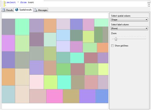
Once you execute the INSERT statements to populate the Test table, you can use the SQL Server spatial data visualizer to view the results:
Authoring the Report
Once you have the data, authoring the report is easy.
- Create a new report in Report Builder 3.0 Add a dataset that uses the following query:
SELECT * FROM Test - Click the Map icon to start the Map wizard.
- On the Choose a Source for Spatial Data step, choose the SQL Server Spatial Query option and click Next.
- On the Choose the Dataset step, select the Dataset from step 1.
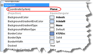
- On the Choose Spatial Type, the map wizard should identify the Shape column as a geometry data type. At this point, the pre-release Report Builder 3.0 shows an empty map because it doesn’t recognize the coordinate system as Planar. Don’t worry, we’ll fix this later.
- On the Choose Map Visualization, select the Color Analytical Map option.
- On the Choose the Analytical Dataset step, select the same dataset because it has a Size column (reseller sales) that we will use for the color visualization.
- On the Choose Color Theme step, choose =Sum(Fields!Size.Value) for a field to visualize and Red-Green as a color rule because the resellers with less sales will be coded red. Click Finish to exit the wizard.
- In design mode, select the map and change the Viewport CoordinateSystem property to Planar.
Once you’ve changed the coordinate system, the polygons should magically appear. I’ve made a few more changes but you should be able to understand them by examining the map properties.
During my Reporting Services Tips and Tricks TechEd 2009 presentation, one of my most important tips was to encourage you to write more reports and less custom code. I showed a cool SharePointb-ased dashboard that we built by assembling report views. Following this line of thought, consider report maps instead of writing custom code when you need to visualize spatial data of any kind.


