Top 5 Reasons to Switch to Power BI Gen2

You should definitely switch your Power BI Premium capacities to Gen2 although you might wait until it goes GA because Gen2 is currently in preview if you’re risk-averse. I switched an enterprise client P2 node to Gen 2 a few months ago and here are the top benefits we observed:

    1. Lower CPU utilization
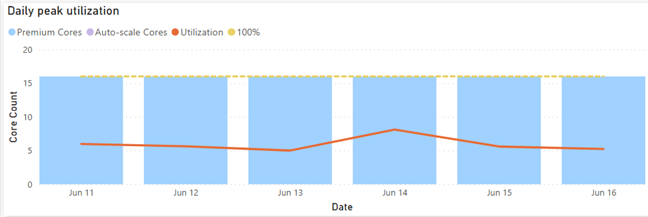
      The Gen1 P2 node was under CPU pressure so the client was considering upgrading to P3. This went away after switching to Gen2 as the graph below shows. That’s because each operation essentially has access to all the cores on the node (which is essentially a P3 node). This can give you a nice boost to performance as well. This doesn’t mean that you get more cores for free. If Power BI detects that the CPU used by the capacity (across all its datasets/dataflows/etc.) is exceeding the CPU that you have purchased, then subsequent operations would be throttled (delayed).
    2. More memory
      Imported models are memory-resident so memory is usually the most constraining factor. With Gen2, the capacity maximum memory applies to the resource itself and not collectively across all resources in the capacity. Let’s say you are on a P1 plan which has a maximum memory capacity of 25GB. With Gen 1, you won’t be able to have two datasets, let’s say 20GB and 10GB, loaded at the same time. However, Gen2 will apply the 25GB limit to each dataset. So, each resource (dataset, report, dataflow) will be boxed within 25 GB. This feat is possible because Gen2 uses a SaaS approach, which means datasets are scattered across multiple cluster nodes instead of being associated with a dedicated capacity. A potential downside, however, could be “noisy neighbor” because a P3 cluster node may co-host datasets from different customers.
    3. Less “out of memory” refreshes
      Related to item 2, dataset refreshes now have more room. Assuming P1, a 10GB dataset is likely to refresh successfully regardless of other datasets loaded in the same capacity. As a rule of thumb, a dataset will require at least twice the memory to fully refresh, so a full refresh of the 20GB dataset is likely to run out of memory. However, you should be able to utilize less memory if you process specific partitions in large tables or configure them for incremental refresh.
    4. Less management overhead
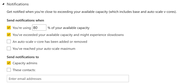
      All activities running on the cluster are metered so it’s easy to understand when the capacity is overutilized by using the Gen2 utilization app. This removes the need to monitor Gen1 capacities proactively for signs of overutilization. Further, capacity admins can subscribe for notifications.
    5. No additional cost
      The best for last. You get all the above without paying more!

What I like to see improved in future:

    1. Customized capacity limits, such as when more memory but less cores are needed.
    2. More granular auto-scale. The current auto-scaling mechanism keeps the “ad hoc” cores for 24 hours. Ideally, I’d like to see the same auto-scaling mechanism as Azure SQL Database Serverless where the system auto-scales within minutes and can hydrate if database is not in use. Of course, this should apply to also removing provisioned cores, such as a P1 plan downgrading to less than 8 cores.
    3. Better utilization monitoring app. The current app has left vast areas for improvement. For example, it doesn’t currently report the memory utilization at all. The app should report memory utilization per dataset and refresh so that you can answer the question “why my refresh ran out of memory”.

Power BI Aggregations: Limitations and Workarounds

Power BI aggregations are meant to speed up queries to large DirectQuery tables, as a DBA would create summarized tables to speed up queries to large tables. The most appealing aspect of telling Power BI about these aggregations is that Power BI will automatically redirect the query to the aggregation cache if it determines that its dimensionality matches the dimensionality of the aggregated table, as explained in the documentation. However, there are a couple of limitations worth emphasizing that will prevent this from happening:

  1. Power BI requires regular relationships with 1:M cardinality and uni-directional filter between the dimension table and aggregation table. Many-to-many cardinality (aka “limited” relationships in the documentation) won’t work. For example, you might have a Customer table related with 1:M to a CustomerFilter table. Queries involving the CustomerFilter table won’t hit the aggregation cache.
  2. Dynamic relationship won’t hit the cache either. For example, as a workaround for the first limitation, you might attempt creating measures, such as Measure1 = CALCULATE([SomeMeasure], TREATAS(VALUES(CustomerFilter[Selection], Customer[CustomerName])), but this won’t work either.

Aggregation hits require active relationships or mappings based on replicated dimension values.

These limitations were showstoppers for using Power BI aggregations in a recent project. Instead, we rolled up a custom aggregation approach along the following lines:

  1. We introduced an aggregation table just like with Power BI aggs and joined to the related dimensions.
  2. We created two sets of measures:
    1. On top of the aggregation table, e.g. Sales (Agg) = SUM(FactSalesAgg[SalesAmount])
    2. On top of the DQ table, e.g. Sales (DQ) = SUM(FactSales[SalesAmount])
  3. For reporting, when it was clear which report pages, such as dashboards, would hit only the aggregation table, we used the (Agg) measures. Detail pages, such as drill-through pages, use the DQ measures. To simplify the measure choice for end users interesting in their own reporting, you can introduce measure wrappers, such as:
    Sales = IF(ISCROSSFILTERED(FactSales[PrimaryKey or other low granularity column]), [Sales (DQ)], [Sales (Agg)])

Atlanta MS BI and Power BI Group Meeting on June 7th

Please join us online for the next Atlanta MS BI and Power BI Group meeting on Monday, June 7th, at 6:30 PM.  Stacey Jones (Principal Data Solutions Architect with Microsoft) will introduce us to Azure Purview. And I’ll cover the Power BI latest enhancements. For more details and sign up, visit our group page.

Presentation:Data Governance with Azure Purview
Date:June 7th
Time:6:30 – 8:30 PM ET
Place:Click here to join the meeting
Overview:Have auditors asked for a report detailing sensitive data in your Company? Are you having trouble finding out where all your data resides? Are Data Scientists and analysts wasting time finding the right data? What will be impacted if I change this column in a table? Where is personnel data stored? Are we in compliance with information security standards that apply to us? If you answered yes to any of these or related questions, you need an Enterprise Data Discovery and Cataloging tool. Come find out how Microsoft’s new Azure Purview tool can create this valuable perspective on your data, making it much more useful and valuable!
Speaker:Stacey Jones specializes in mentoring and guiding firms in their efforts to build a modern Data, AI & BI governance programs that empower their business with Self-Service BI and Data Science capabilities. He currently serves as the Principal Data Solutions Architect with Microsoft at the Atlanta Microsoft Technology Center (MTC).
Prototypes without pizza:Power BI Latest by Teo Lachev

PowerBILogo

Tracing Anonymous Logons

In a recent project, I had to execute an SSIS package deployed to the catalog from a stored procedure. The package uses Windows authentication to connect to the data sources. When executing the package from the catalog or from the stored procedure, the package immediately fails and the following two errors are logged:

DTS_E_CANNOTACQUIRECONNECTIONFROMCONNECTIONMANAGER. The AcquireConnection method call to the connection manager “Source” failed with error code 0xC0202009. There may be error messages posted before this with more information on why the AcquireConnection method call failed.

OLE DB error has occurred. Error code: 0x80040E4D.
An OLE DB record is available. Source: “Microsoft SQL Server Native Client 11.0” Hresult: 0x80040E4D Description: “Login failed for user ‘NT AUTHORITY\ANONYMOUS LOGON’.”.

The culprit of course is that this scenario requires Kerberos delegation because of the two-hop authentication required:

  1. From SSMS on my development machine to the server where the SSIS package is executed
  2. From the SSIS server to the data source.

By default, the SSIS server doesn’t have the calling user’s password and the request to the data source goes under the anonymous logon. The easiest way to confirm this is to remote in to the SSIS server and execute the package there by right-clicking the package in the catalog and clicking Execute. If it works then configuring Kerberos delegation is in order. The process is simple but requires some assistance from your helpful system services department and specifically from your AD administrator because it requires a small change to the calling Windows account (yours and other accounts that will be used to run the stored procedure).

Other possible workarounds:

  • Change all data sources to use standard security (SQL login and password)
  • Executing the package under the SQL Agent where you can specify a Windows proxy account. This works because there is a single hop involved in this case.

A First Look at Power BI Goals

A vital BI practice for every organization, performance management ensures that important metrics, such as Key Performance Indicators (KPIs), meet established goals. The typical artifact to do so is implementing a scorecard: a report that compares the current state with the desired state of these metrics. You might have also heard the term “balanced scorecard” which is an organization-wide scorecard that tracks several subject areas, such as Finance, Customer, and Operations. In the past you have probably used different tools, such as the now deprecated PerformancePoint (included in SharePoint Server) to implement scorecards.

Realizing the importance of scorecards, Power BI introduced Goals that aim to simplify the process of implementing departmental and organizational scorecards. For more information on how Goals works, watch the “Goals in Power BI” presentation from the Microsoft Business Application Summit.

The Good

As with anything Power BI, Microsoft has democratized scorecards so business users with no reporting experience can quickly assemble them from existing reports. Think of a goal as a line (or KPIs) in the scorecard. Here is scorecard with two goals:

Currently, Power BI supports two goal types:

  • Static – The goal creator manually enters and track the goal properties, such as current value, target value, and status. This could be useful for quick and dirty KPIs that are not backed by a data source, such as launching a new promotion campaign. In the scorecard above, I created the Revenue goal by entering 5M as the current value and 5.5M as the goal.
  • Data-driven – The goal current value and/or target value can be data-driven and bound to metrics from existing report(s). Coming from Analysis Services, I was initially surprised that Power BI doesn’t require implementing KPI measures, but I get it: Microsoft decided to source the metrics from reports so business users can easily apply filters. If the goal owner chooses a metric from a visual that has a Date field, such as a time series chart, Power BI automatically shows a sparkline for the goal progress over time. An, of course, when the report dataset is refreshed, the goal values are updated.

So, no modeling or Power BI Desktop required assuming that someone else, such as a data analyst, has delivered functional and vetted reports with the metrics. Even better, the goal current and target values can come from different reports (even a report in a different workspace if you have permissions), e.g. a report with actuals and another report with targets. So, there is plenty of flexibility here. To mimic a balanced scorecard that spans multiple subject areas, the owner can create subgoals. For example, the main goal could be Finance with subgoals Revenue, Margin, etc.

Because like dashboards, goals are “pinned” from reports, the end user can navigate to the underlying report to examine the data in more detail. Users can also add notes to explain the goal behavior to the teammates.

A scorecard is a first-class Power BI citizen, and as such, it can be secured, endorsed, secured with sensitivity labels, annotated, and shared, such as sharing the scorecard to a Microsoft Teams channel. The scorecard data is saved in a Power BI dataset that users can connect to build custom reports. Moreover, Power BI automatically adds daily snapshots to the dataset allowing users to build up a history of the goals. For example, if the underlying report is refreshed daily, the updated goal values will be appended to the dataset. Developers can use the Power BI REST APIs to implement programmatic scorecard management solutions.

The Bad

Besides navigating to the underlying report, a goal is a one-liner in the scorecard. I can’t define a goal that shows me a metric sliced by dimension members, such as business unit. Further, subgoals are not currently aggregable, such as to sum or average values when rolling up to the main goal. Like limitations with dashboards, there is no way to apply a global filter to the scorecard, e.g. to filter all goals for the prior month.

Besides current and target values, no other goal properties can be data driven. For example, unlike Analysis Services KPIs, the goal status can’t be currently bound to a DAX measure. Changing the status requires proactive manual “check ins” although Microsoft mentions a forthcoming feature that will let users define rules to change the status, like how you can define rules for dashboard tile alerts. Speaking of data-driven properties, I don’t understand why you must use a date field to get the progress as opposed to any other field, such as Month, in your Date table.

The Ugly

Another premium teaser… If we really want to democratize features, shouldn’t we make them available in Pro?

Goals are a Power BI premium feature aimed at making it easier to create scorecards and monitoring metrics from existing reports. They promote a “bottom-up” culture, where business users can create departmental scorecards without reliance on IT. Microsoft plans more features by the end of the year to make Goals more appealing, such as integration with Power Automate to trigger actions, rolling up subgoals, changing the goal tracking cycle (DoD, MoM, YoY), custom goal formatting, Power BI Mobile experience optimized for phones, providing a scorecard visual, and cascaded goals (hierarchy of goals).

If you find Power BI Goals somewhat inflexible or you don’t have budget to upgrade to Premium, you don’t have to use the Goals feature to implement scorecards. You can define KPIs and create dashboard-looking reports where you have complete control over the dataset, filters, and scorecard presentation although this approach would require more advanced Power BI skills.

Atlanta MS BI and Power BI Group Meeting on May 3rd

Please join us online for the next Atlanta MS BI and Power BI Group meeting on Monday, May 3rd, at 6:30 PM.  James Serra will overview Azure Synapse for implementing a data lakehouse. And I’ll cover the Power BI latest enhancements. For more details and sign up, visit our group page.

Presentation:Azure Synapse Analytics Overview: A Data Lakehouse
Date:May 3rd
Time:6:30 – 8:30 PM ET
Place:Click here to join the meeting
Overview:Azure Synapse Analytics is Azure SQL Data Warehouse evolved: a limitless analytics service that brings together enterprise data warehousing and Big Data analytics into a single service. It gives you the freedom to query data on your terms, using either serverless on-demand or provisioned resources, at scale. Azure Synapse brings these two worlds together with a unified experience to ingest, prepare, manage, and serve data for immediate business intelligence and machine learning needs. In this presentation, James will talk about the new products and features that make up Azure Synapse Analytics and how it fits in a modern data warehouse, as well as provide demonstrations.
Speaker:James Serra is a Data Platform Architecture Lead at EY.  He is a thought leader in the use and application of Big Data and advanced analytics. Previously, James was an independent consultant working as a Data Warehouse/Business Intelligence architect and developer. He is a prior SQL Server MVP with over 35 years of IT experience. James is a popular blogger (JamesSerra.com) and speaker. He is the author of the book “Reporting with Microsoft SQL Server 2012”.
Prototypes without pizza:Power BI Latest

PowerBILogo

Use Edge Dev Profiles

If you need a convincing reason to use Edge Dev, user profiles might be it. I need access to various Power BI tenants that I need to log in. Or, your organization might have multiple Power BI tenants, such as a byproduct of acquisitions. Previously, I had to either use multiple browsers, open an incognito session (the caveat is that you can’t have two incognito sessions with different credentials), or install browser extensions to support simultaneous open sessions to Power BI. Now, all I have to do is to create a profile for each client. To do so:

  1. Open Edge Dev.
  2. Click the Profile icon in the top right and then click Add Profile.
  3. Follow the steps to log in using the needed credentials.

Once the profile is created, click the profile icon and then click the desired profile. This will open a new normal (not incognito) session side by side with the other Edge DEV window. Now you have two session connected to two different Power BI tenants!

Top 5 Power BI UX Gaps

Power BI has made tremendous strides in features solidifying its position as a BI leader and increasing the feature distance over the competition (see latest Gartner report here). And rightfully so, considering that it’s much more than a visualization tool. However, you might find its advanced presentation capabilities still lagging. During a current BI assessment for a large mortgage company, the executive sponsor who have used before Tableau and Qlik told me that “some features that could be done in Qlik or Tableau in 10 minutes could take days with Power BI”. So much about “five seconds to sign up, five minutes to wow!” It’s hard to vow an audience that has seen better …

Here are the top 5 Power BI UX gaps to watch for especially if you’re migrating to Power BI from these two tools:

  1. No dynamic binding – A long time ago, Microsoft promised that most of the Power BI properties would be expression-driven. Only title captions and conditional formatting currently support expressions. However, it’s not uncommon for dashboards to let the user specify what dimension and measures that want to see in a visual. Dynamics measures are not so difficult to implement with calculation groups (require Tabular Editor as today Power BI Desktop doesn’t have UI for calculation groups). Dynamic dimensions are much more difficult to implement. This gap could be solved elegantly if one day Power BI decides to support expressions for fields used in a visual.
  2. No visual container support – It’s also not uncommon to organize visuals in a tabbed interface to save space. The current kludge is to use bookmarks to show or hide UI elements leading to such as a mess that no one can figure out and that should make Microsoft ashamed. So, a container interface to implement a visual that can host other visuals would allow the community to come up with creative gadgets that should make this easier.
  3. No repeater visual – Want to embed a graph or sparkline that’s repeated for each row in a table? Can’t do today unless you use DAX measure that render HTML or SVG (both approaches require advanced DAX or UI skills). Microsoft should extend the Table and Matrix visuals (BTW, why do we have two visuals?) to allow nesting and repeating other visuals, like SSRS Tablix.
  4. No asymmetric crosstab layouts – Currently, Matrix supports only symmetric layouts where the measure is repeated for each column forcing developers to use black belt techniques, such as the one I describe in my “Implementing Asymmetric Reports in Power BI“. Microsoft should enhance Matrix to support flexible layouts, like the SSRS Tablix control.
  5. No Default members – Almost every dashboard requires defaulting the time period to a current period and automatically preselecting it when the period changes, such as when a new month starts. And of course, the user should be able to switch easily to a past period. A long-term Tabular limitation is that it doesn’t support default members. This limitation and the lack of dynamic binding forces developers to come up with workarounds, the most common being replacing the caption of the current period, e.g. “Current Month”, with the caveat that the user can’t see what the current period is. Tabular default members or expression-based slicer and filter default could help.

As you’ve seen, the prevailing theme of this rant is that I’d like Power BI to add more SSRS-like features, so we don’t look for the exit sign when management asks for more advanced and visually appealing reports.

Awarded FastTrack Recognized Solution Architect

Microsoft awarded me FastTrack Recognized Solution Architect – Power BI! This prestigious recognition is conferred by the Power Platform product engineering team for consistently exhibiting deep architecture expertise and creating high quality solutions for customers during project engagements. I’m one of the 33 individuals worldwide who must meet the following criteria:

  • Must have a minimum of 2 years of experience with Power BI and a minimum of 5 years of experience with Enterprise BI solutions
  • Must have a minimum of 2 years of experience as an Enterprise BI architect
  • Must be working for a partner with Gold certification in Data Analytics MPN competency
  • Must have been lead architect for at least 2 Power BI in-production implementations with at least 200 active users (Preferably for CAT managed customers)

I might be also featured in a short video during the James Phillip’s keynote on May 4th at the Microsoft Business Application Summit.

When Something Goes Wrong (Unable to Load the Model)

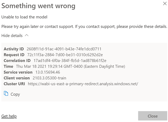
Scenario: You deploy a model to a Power BI workspace. You assign users to Members and Viewers roles. Everyone is happy. You later added a row-level security role and republish the model. Admins, Contributors and Members continue to view reports connected to the dataset as usual. However, Viewers report an error like the one shown below (didn’t Microsoft do an outstanding job explaining what went wrong with all of these guids?):

Analysis: Users with Administrator, Member, and Contributor permissions bypass any row-level security policies even if they assigned as role members. However,  viewers are refused access unless they are added to a role that grants them the appropriate permissions. So, the likely culprit here is that there are some viewers that are not assigned to a role.

If viewers should have unrestricted access to an RLS-enabled dataset, create an Open Access role and add them to the role. As a best practice, you should create a security group and grant the group membership to the workspace and RLS.