Power BI Dynamic Measure Tooltip
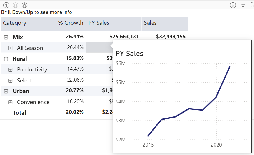
Happy New Year with oldies but goodies…especially given that this technique might be hard to find elsewhere! How do you implement a tooltip page that shows only the measure the end user hovers over? Consider this matrix with three measures on columns grouped by product categories on rows. The user wants to see a trend chart for the measure they hover over.
Understanding the challenge
Power BI has long supported custom tooltip pages. Passing member context, such as the selected product category, is not an issue. However, passing the selected measure won’t work without some blackbelt magic because measures are not field members.
And so, we will have to turn the measures used in the matrix in a dimension. Then, instead of adding measures to the matrix as you would typically do, you would use the dimension. You can probably follow a similar implementation approach using Power BI field parameters, but since I’m a purist, I went with a regular table.
As a disclaimer, I’d rather show the trends in separate graphs side by side on a real-life dashboard, so the end user can see everything at a glance instead popping up tooltips and because I’ll have more control and flexibility over the visualization setup. But, just in case you must use tooltips…
Adding a measure “dimension”
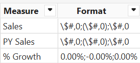
Start by adding a new table to the model either way you want. In this case, I used the Power BI Enter Data feature to create a MatrixMeasures table. This table lists the measures that will be added to the matrix. The format column will be used for dynamic formatting later on.
Then, I added a DAX measure to the MatrixMeasures table as follows:
SelectedMeasure =
VAR _measure = SELECTEDVALUE(MatrixMeasures[Measure])
RETURN
SWITCH(TRUE(),
_measure = "Sales", [Sales],
_measure = "PY Sales", [PY Sales],
_measure = "% Growth", [% Growth],
[Sales]
)
This formula switches dynamically the DAX measure based on the “current” matrix column. For example, the Sales column will use the existing [Sales] measure. If nothing is selected, it piggy backs on the [Sales] measure. This default provides data to work with when you’re configuring the tooltip chart (otherwise, nothing will be shown because the matrix doesn’t pass the context).
While we are in the DAX rabbit hole, let’s add one more measure for dynamic tooltip chart title:
SelectedTitle = SELECTEDVALUE(MatrixMeasures[Measure])
Making report changes
Next, remove all the individual measures from the matrix and add only the SelectedMeasure measure to the matrix Values well. At this point, the matrix should look like before, except that the measure format settings would be lost.
Tip: If the measures need to be sorted in a specific way, add a new column to the MatrixMeasures table that defines the custom sort order. Then, sort the Measure column by this new column.
To fix formatting:
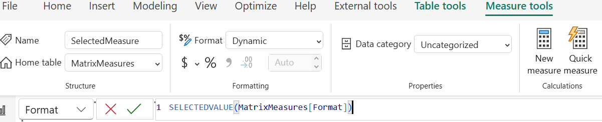
- Select the SelectedMeasure field in the Data pane.
- In the Measure Tools ribbon, change the Format dropdown to Dynamic.
- In the formula bar, enter this formula to dynamically change the measure format using the format specified in the Format column of the MatrixMeasures table:
SELECTEDVALUE(MatrixMeasures[Format])
Then, implement the tooltip page and hook it up to the page with the matrix, as explained here. To change the chart title dynamically in the tooltip page, bind it to the SelectedTitle measure.
There you have it. With some wizardry and DAX, you have a measure context-aware tooltip.