Power BI SandDance Visual
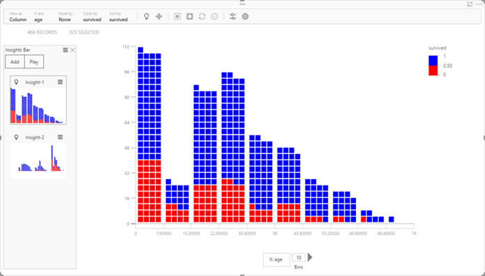
One of the announcements from the Data Insights Summit was the SandDance custom visual. Originating from Microsoft Research and coded in SVG, it not only allows you to visually explore data in versatile ways but it also demonstrates how far your custom visuals can go. This is a super visual that combines multiple visualizations, including column chart, grid, scatter chart, density chart, stack chart, and squarify chart (similar to Treemap) visualization. It also demonstrates animations and storytelling with data. You can test the visual outside Power BI with some predefined datasets by going to https://sanddance.azurewebsites.net. Or, you can download it from the Power BI Gallery and try it with your data in Power BI Desktop and Power BI service.
When you compare visualization tools, pay attention to how open their capabilities are. Power BI provides several extensibility features. Custom visuals let any web developer extend the Power BI visualization features with “widgets” that can leverage popular visualization frameworks, such D3.js and SVG. Do other vendors let you do this?


