Quick Insights Coming to PBI Desktop
The September release of Power BI Desktop brings Quick Insights in the form of the very nice Explain Increase/Decrease feature (in preview). Suppose you have a column chart and you see a sudden increase or decrease in the chart series. You can now right-click on the bar and then click Analyze, Explain the Decrease menu. This runs the Quick Insights machine learning algorithms to predict what caused the anomaly. As in Power BI Service, Quick Insights produces several reports.
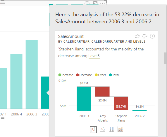
In this case, one of the Quick Insights visuals informs me that most of the decrease is contributed to the bad performance of one of the sales reps (Stephen Jiang). I could have sliced and diced all day long but I could have found this myself. If I find a particular Quick Insight visual useful, I can add it to the report. From that point, I can use just like any other visual on the report.
The Power BI Desktop Explain Increase/Decrease helps you performing root cause analysis in a blink of an eye.
Currently in the preview, the feature is rough around the edges. For example, I was able to get it to work only if I add a field from a Date table, such as Calendar Year, to the chart. Other limitations include:
You can’t use it if your visual includes:
- TopN filters
- Include/exclude filters
- Measure filters
- Non-additive measures and aggregates
- Show value as
- Filtered measures (it’s the new thing we use for scatter chart in insights)
- Categorical columns on X-axis unless it defines a sort by column that is scalar. If using a hierarchy, then every column in the active hierarchy has to match this condition
- Non-numeric measures: Model measure support is limited to sum and count only right now.
There are also limitations in data connectivity:
- Direct query
- Live connect
- On-prem RS
- Embedding