A False Sense of Data Security

UPDATE 11/26/2020: After the latest update to tenant settings, I’m glad that the new “Export to …” settings don’t affect external connections anymore. There is now a new setting “Allow live connections” to control external connectivity. Read “Updated Export Settings” to learn more.

The Power BI “Export data” setting is horrible. I wish Microsoft never came up with it and no other Microsoft tool has it. Apparently, the premise here is to prevent users from exporting data behind the report so it does not end up in wrong hands. But all it accomplishes is a false sense of data security and does more damage than good. Like users can’t take screenshots and share them wherever they please. Or print and mail reports. Unless of course, you disable printing reports too, but where is that path of not trusting your users going? Why don’t you just disallow them from viewing reports at all? “No data, no problem”, right?

Besides “exporting” data, this setting effectively disables all external connections to published datasets. Therefore, the following Power BI features won’t work:

  1. Creating reports from published datasets, which is a best practice.
  2. Publishing semantic models from Visual Studio via the Power BI Premium XMLA endpoint. Even if you enable the XMLA endpoint for read/write, “Export data” will overwrite it because it’s highest level overwrite
  3. Connecting other tools to published datasets, such as SSMS, Tabular Editor, DAX Studio, Profiler, and third-party reporting tools.
  4. Using the “Analyze in Excel” feature for creating Excel reports connected to published datasets.

So, leave “Export data” enabled. If you really want to prevent sensitive data outside your organization, consider applying sensitivity labels which integrate with Office 365 information protection.

A Gateway to Hell

“Life is suffering and suffering is unavoidable”. Buddha must have dealt with data gateways. Two “gotchas” that surfaced recently after countless hours of troubleshooting:

  1. A bug in the data gateway AD lookup cache – In my “Gateway AD Lookups” post, I described a very useful gateway feature to look up the on-prem user identity from a cloud identity so that you don’t have to create explicit mappings. The gateway maintains an internal dictionary cache so that it doesn’t have to look up Windows Active Directory for every query. This cache can’t be disabled. The issue is that If you have an older gateway build, e.g. December 2019, there is a bug (and a security vulnerability) with concurrent access to cache which may cause the gateway to map the interactive user to a wrong AD user under heavy load. The issue was fixed in a later build, but the fix introduced another issue by imposing a very coarse lock (probably the entire cache) which may reduce concurrency with many users running reports. In other words, under a heavy load user requests queue up to wait for the cache lock to be released. This issue will be fixed in the next July 2020 gateway build.
  2. Beware stale data sources registered in the gateway – Now that we’ve addressed the concurrency bug, the same client reported a new issue where every hour or so users can’t render reports connected to the gateway for a couple of minutes and then the issue resolves itself. The culprit turned out to be neglected Analysis Services data sources registered in the gateway. By default, Power BI dashboards will query these connections every hour to cache tile data (the frequency can be changed on the dataset settings page, but it can’t be disabled). The problem was that the master account used to connect to Analysis Services changed its password. While the team updated the connections in the actively used data sources, it did not do so for the neglected data sources (no one is using them, right?). However, the dashboards still submit queries to update the tile cache and the gateway asks AD to authenticate the master account.  Then, the domain controller locks the master account for a few minutes after a certain number of attempts since it rejects the logon attempt with the old password. The solution was to remove unused data sources from the gateway.

Designing Responsive Power BI Reports

I’m currently providing advisory services to an enterprise client for architecting and implementing an executive dashboard. As a typical dashboard, the UX design included various KPIs that look like these:

The Power BI report implementation followed the design and the above visualization was implemented as four cards and two textboxes. Including other UX elements, such as icons, labels, etc., the most important summary page of the report ended up having more than 100 visuals. It took 25 seconds to render the page on average, which is horrible performance. Performance Analyzer showed that DAX queries are very fast and most of the time was spent in the “Other” category. This means that because JavaScript is single-threaded, visual rendering is sequential. Indeed, the SQL Server Profiler revealed that out of 25 seconds, the first 15 seconds were spent elsewhere before Analysis Services Tabular starts receiving DAX queries. The Performance Analyzer document provides the essential coverage about how Power BI renders visuals, but the bottom line is this:

The more visuals the page has, the slower it will be. If you find that most of the time is spent in the “Other” category on page refresh, more than likely this is caused by Power BI serializing the visual rendering. If this is the case, the best course of action would be to reduce the number of visuals.

For example, the above visualization can be rendered with one visual only (Matrix) and some blackbelt visualization techniques. Matrix supports rendering measures on rows (in the Values section of the Format tab, turn on “Show on rows”). Spacing the rows can be achieved by increasing row padding. And icons can be rendered with conditional formatting. Another technique for reducing visuals and faster rendering is eliminating many labels with a page background image. What didn’t help was disabling visual interactions although it doesn’t hurt disabling it if you don’t need it. We’ve also found that browsers differ in how fast their render visuals. Internet Explorer was the slowest while Chrome and the new Edge were the fastest.

How fast did their report get after applying such optimizations? Between 50 and 60% faster.

True, Power BI has report design limitations. Developers with SSRS background will miss more advanced features, such as nesting visuals (e.g. bullet graph inside a matrix) and asymmetrical crosstab layouts. Still, techniques as the one I shared above will help you create more responsive reports.

Prologika Newsletter Summer 2020

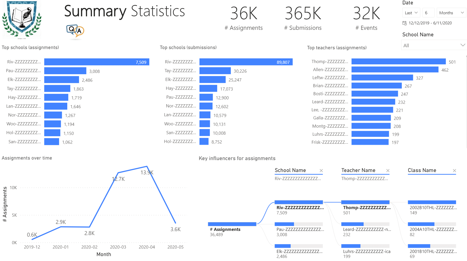
More and more organizations are switching to Microsoft Teams mostly for online meetings. However, Microsoft Teams can deliver much more than that and it will be unjust to compare it with other popular meetings apps. In this newsletter you’ll learn how Prologika helped a public school district gain important insights from Microsoft Teams. Learn more and try an interactive Power BI report in the related case study.

Teams for Education

What Microsoft has done with Teams is amazing! Now that I got to study and program Microsoft Teams, I have found it a powerful and extensible platform. For example, Microsoft has provided add-ons for common verticals, such as Teams for Education. Microsoft Teams can be further enriched with apps and can be used to centralize all these Excel spreadsheets that are floating around. And the best of it: most of the Microsoft Teams data is exposed via a single data source: Microsoft Graph API, with the caveat that it is not that easy to get it out.

During the COVID-19 crisis, Fulton County Schools (FCS) transitioned from traditional classroom content delivery to online digital teaching and learning. FCS adopted Microsoft Teams for Education as an online platform to foster collaboration between teachers and students. However, FCS struggled for a long time trying to obtain the necessary data from Microsoft Teams to analyze how effectively teachers and students utilize Microsoft Teams in these challenging times. The Microsoft-provided Office 365 Usage Analytics for Power BI didn’t provide the depth of information FCS needed, such as to analyze counts of assignments that teachers give to students and submissions that students prepare for an assignment. FCS also wanted to understand about how often teachers and students meet and for how long.

Solution

Prologika developed a custom app to extract the required data by calling the Microsoft Graph APIs. The app supported a configurable degree of parallelism to process data in parallel. This reduced the duration for the full load to less than 7 hours. In addition, incremental daily ETL decreased the extraction time even further. The data was saved in a relational database consisting of several entities, such as Schools, Classes, Assignments, Submissions, and Events. Data availability led to data analytics. Power BI reports were implemented to deliver important insights, such as the report below.

Our BI solutions help clients implement a digital feedback loop and act upon the data. The process starts with acquiring the necessary data and designing a comprehensive data model that can answer important business questions. Then, the client applies the insights to improve their processes. This leads to a powerful feedback mechanism where outputs are routed back as inputs to business.

Links to Power BI Mobile Reports or Apps

You have deployed your Power BI reports/apps and now management is eager to use them. But how do you provide an easy one-tap shortcut for them to launch a specific report or app on mobile devices and open them in Power BI Mobile? For example, in a recent project, we had to provide executives with an easy “button” to see their executive dashboard on iPhone/iPad. To make things more interesting, the ask was to auto-provision “the button” so the users don’t have to create it manually.

Each approach has specifics controlled by the operating system on the device. Your best option will probably be Siri or Android shortcuts.

  1. Siri or Android shortcuts – Use this option when you want the user to initiate the link either by clicking on it or by speaking the associated phrase. For more information, read “Using Siri Shortcuts in Power BI Mobile iOS App” and “Use Android app Shortcuts in the Power BI Android app” The downside of this approach is that Apple doesn’t currently have shortcut APIs so you can’t provision the shortcuts, such as by using Microsoft Intune or AirWatch. In other words, the user must manually create the shortcut within Power BI Mobile. However, they can send the shortcut to other users as “untrusted shortcut”.
  2. Redirect links – Use this option when you want the device to prompt the user to install the app if it is not already installed. For more information, read “Create a link to a specific location in the Power BI mobile apps“. The steps to create a shortcut are device specific. In this project, the client used AirWatch to provision “weblink/webclip” icons to launch the redirect links. The caveat for using redirect links is that the user will be always prompted to “close” the prompt or open the app, and as far as I know, there is no way to bypass this prompt.
  3. Universal links – Luckily, Power BI supports iOS universal links. Just navigate to the report in the browser, copy the link, and associate it with an icon. The old way to create the link, which is still supported, was to use the mspbi scheme, such as mspbi://app/OpenReport?appId=1f3d811e-8d6c-4708-9034-ad5c2db1615b&reportObjectId=16c484cd-d2b2-40ab-bddc-3cb97b62e518. Choose this option when you want to bypass the prompt asking the user to open the app. Universal links work if the link is in email message, Siri shortcut or some other app, such as Notes. The downside is that if the user creates a “weblink/webclip” shortcut with the link using the “Add to Home screen” feature or auto-provision with AirWatch, the shortcut will always open in the browser and bypass Power BI Mobile. In other words, the link won’t work when launched from a “weblink/webclip” shortcut.

Let’s summarize the three approaches.

OptionProsCons
Siri or Android shortcuts

(Recommended)

No prompt, can be voice activatedSince there are no APIs to work with shortcuts, they can’t be automatically provisioned
Redirect “deep” linksAsk the user to install the app if not presentAlways prompts the user to “close” or open Power BI Mobile.
Universal linksDon’t prompt the userDon’t work from “weblink/webclip” shortcuts