DAX Calculation Groups
Just when I started thinking that there won’t be any new BI features in SQL Server 2019, Christian Wade announced DAX calculation groups in CTP 2.3. His excellent post helped me try them out with Tabular Editor and Power BI Desktop and whip out this cool report.
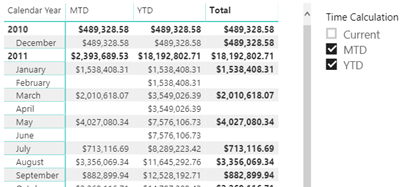
As Chris Webb pointed out, DAX calculation groups let us implement time calculations as in Multidimensional with a “shell” time dimension. They probably won’t help you reducing the number of measures because you’d still need to flatten the “shell” dimension for maximum flexibility and avoid forcing the user to use the Time Calculations slicer to select the time calculations they want on the report. So, you would still have to project Sales Amount YTD as a separate measure:
[Sales Amount YTD] = CALCULATE (SUM ( 'Reseller Sales'[Sales Amount] ), 'Time Intelligence'[Time Calculation] = "YTD")
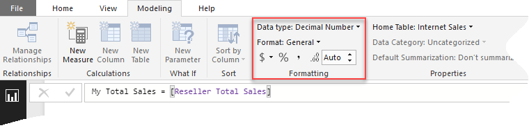
What calculation groups help with is avoiding copying and pasting the time intelligence formulas all over the place. A future CTP will also help centralize measure formatting where you’ll have the option to inherit the current measure format string (by leaving it blank), or override it.
To me, DAX calculation groups is a nice to have feature, which I could have happily traded for more significant ones. Speaking of which, I hope Microsoft adds more important enhancements to Tabular 2019.
Here is my top 10:
- Anything that can help the poor developer debug and understand in what context a DAX expression is evaluated as DAX tends to have more exceptions than rules.
- DAX script – to show and organize all measures in one place. I miss also the MD scope assignments.
- Better Excel support
- Aggregations as in Power BI
- Composite models as in Power BI
- Recursive DAX measures
- Writeback
- Default members
- Actions (or make the JSON schema extensible so the community can fill in blanks)
- Full support for Tabular in Power BI, including Quick Insights, explain Increase/decrease, etc. My blog “Power BI Feature Discrepancies for Data Acquisition” has the details.