A Couple of Direct Lake Gotchas
I’m helping an enterprise client modernize their data analytics estate. As a part of this exercise, a SSAS Multidimensional financial cube must be converted to a Power BI semantic model. The challenge is that business users ask for almost real-time BI during the forecasting period, where a change in the source forecasting system must be quickly propagated to the reporting the layer, so the users don’t sit around waiting to analyze the impact. An important part of this architecture is the Fabric Direct Lake storage to eliminate the refresh latency, but it came up with a couple of gotchas.
Performance issues with calculated accounts
Financial MD cubes are notoriously difficult to convert to Tabular/Power BI because of advanced features that aren’t supported in the new world, such as Account Intelligence, scope assignments, parent-child hierarchies, and calculated dimension members. The latter presented a performance challenge. Consider the following MDX construct:
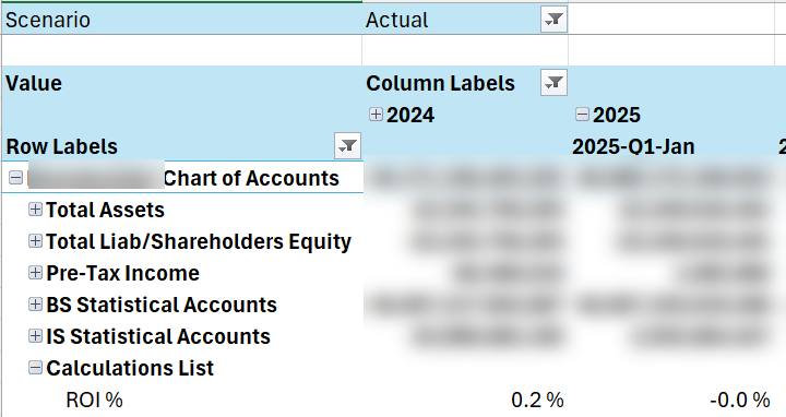
CREATE MEMBER CURRENTCUBE.[Account].[Accounts].&[1].[Calculations List].[ROI %]
AS IIF([Account].[Accounts].&[1].[Calculations List].[Average Invested Capital] = 0, NULL, ..,
FORMAT_STRING = "#,##0.0 %;-#,##0.0 %",
This construct adds an expression-based account as though the account is physically present in the chart of accounts. MD evaluates the MDX expression only for that account.
No such a construct exists in Tabular. To provide a similar reporting experience, I attempted to overwrite the Value measure conditionally based on the “current” account, such as:
VAR _Level03 = SELECTEDVALUE ('Account'[Level 03])
RETURN
IF (_Level03 <> "Calculations List",
       [Value],
       VAR _Level04 = SELECTEDVALUE ('Account'[Level 04])
       RETURN
            SWITCH (
               Level04,
               "ROI %", [ROI],
               "Economic Profit", [Economic Profit],
…
However, no matter what I tried, the report performance got a big dent (from milliseconds to 10+ seconds) even when the Calculations List account was excluded. Interestingly, report performance in Direct Lake fared 2-3 times worse than an equivalent Power BI imported model.
So, we had to scrap this approach in favor of one of these workarounds:
- Pre-calculating the calculated accounts values (materializing)
- Pros: same reporting behavior as MD, faster performance compared to MDX expressions
- Cons: effort shifted to ETL, potentially impacting real-time forecasting if calculations must be recomputed with each change.
- Separate DAX measures
- Pros: formulas applied at runtime as MD, no impact on ETL
- Cons: different report experience
Excel dropping user-defined hierarchies
Excel never fails to disappoint me. Sad, considering its potential as an alternative reporting client, especially for financial users.
This time Excel pivots decided not to show user-defined hierarchies, which turns out to be a document limitation for DirectQuery and Direct Lake. Microsoft provides no explanation and I’m sure the Excel team has no plans to fix it, as well as to finally embrace DAX and Power BI semantic models.
Luckily, the client uses a third-party Excel-based tool, which provides better report experience and supports user-defined hierarchies. If the Excel limitation becomes an issue, Fabric Direct Lake is expected soon to support composite models. This will let you implement models with hybrid storage, such as importing dimensions, which don’t change frequently, but leave fact tables in Direct Lake. Luckily, Excel supports user-defined hierarchies with imported tables.