Posts

Power BI Bookmarks

So far, Power BI has lacked the ability to navigate to particular report element, such as another report page, and to allow you to show/hide visuals. For example, Tableau allows you to add buttons to pages and navigate to another page on button click. Such navigation capabilities are important for story telling and for emphasizing elements on the screen.

This changes with the October release of Power BI Desktop which brings a set of navigation capabilities, including bookmarks, spotlight, and selection page.

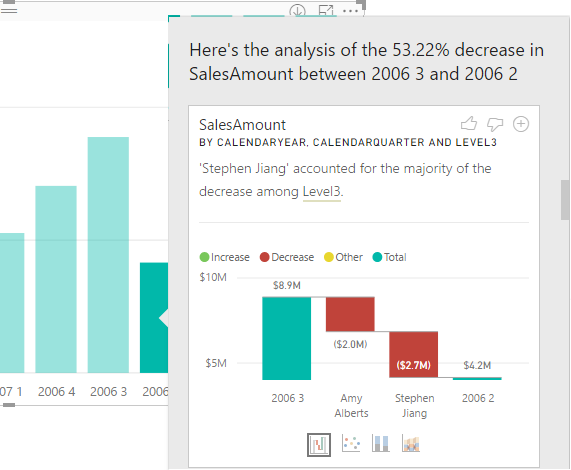
Suppose you have a meeting and walk management through the sales performance of your company. You start with a bar chart. There is a decrease in sales in which you can explain by using the Analyze Increase/Decrease which I discussed here. Now you have two visuals on the same page:

100917_1332_PowerBIBook1.png

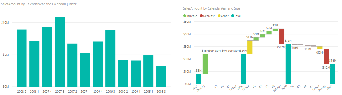
But at the beginning of your presentation, you’d want to bring focus on the bar chart, explain the overall trend, and then focus on why sales have decreased (the waterfall chart). You can use bookmarks to achieve this.

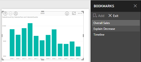
  1. Open the new Selection pane (in the View ribbon tab) and hide the Waterfall chart.
  2. While on the View ribbon tab, check the Bookmarks pane. Click Add to bookmark the state of the current page.
  3. Unhide the waterfall chart and create another bookmark.

Now you have two bookmarks that show/hide visuals on the same page. This is conceptually similar to the Power Point animation pane although bookmarks don’t come up with cool entry and exit animations. Now when you present, you can simply use the Bookmarks pane for navigation the way you can use a Table of Contents (TOC) in a Word document.

100917_1332_PowerBIBook2.png

Bookmarks are a welcome new Power BI feature. They are important for data story telling and for improving the navigation experience in a busy report.

Configuring Power Query OData Feeds

Scenario: A customer has implemented a Power BI model that retrieves data by calling the Dynamics CRM OData Feed endpoint. The dataset refresh operation is timing out. They want to increase the timeout setting but unlike connecting to SQL Server, where you can set the timeout duration in the source advanced properties, there is no UI for ODATA.

Solution: If you open the query behind the table, and click the Source step, you’ll see in the Query Editor formula bar the following M code:

= OData.Feed(“https://<tenant>.api.crm.dynamics.com/api/data/v8.1/”)

From the documentation, we realize that OData.Feed can take additional settings and one of them is the Timeout setting that you can pass to the third options argument. For example, you can change the M code to set the timeout to 1 hour:

= OData.Feed(“https://<tenant>.api.crm.dynamics.com/api/data/v8.1/”, null, [Timeout=#duration(0,1,0,0)])

The timeout uses the duration data type which is explained here. Bringing this one step further, you can restrict what records get pulled in the OData.Feed using $filter and also only grab data for the columns you’re using by including the field names in the $select parameters, e.g.

“https://<tenant>.crm.dynamics.com/api/data/v8.1/leads?$filter=<somefield> eq 740110001&$select= <removed list of fields>”

Power BI Premium Reports on Mobile Devices

Can we surface Power BI reports deployed to Power BI Premium Report Server on mobile devices? Yes, and we have three quick options:

  1. Since Power BI reports render in HTML5, they should render in any modern browser.
  2. On iOS and Android devices, consider Power BI Mobile for optimum viewing experience. In Power BI Mobile, go to the Settings and click Connect to Server. Then plug in the report server URL, e.g. http://<servername>/reports. Note that the Power BI Mobile Windows app doesn’t support Power BI Premium Report Server yet. Also, by default your reports will only work if you are on your company intranet or the mobile device connects to your company VPN. To make reports available outside corporate network, you can configure a Web Application Proxy to tunnel in.
  3. For embedding reports on a page, have an HTML page with iframe that request the report by URL passing the embed parameter as explained here.

Power BI can’t reach to your report server? Don’t forget to configure the firewall on the Power BI Premium Report Server to allow inbound connections over port 80, as explained here.

Power BI Group Security

Power BI security is interwoven with Azure and O365 security. Sure, granting individual users access by entering emails works everywhere but it quickly becomes counterproductive with many users. For example, a large insurance company would like grant report access to 250 users and integrate this report with Dynamics 365. If you secure individually, this will require entering 250 emails three times: Dynamics 365, Power BI, and Row-level Security (RLS). As in the old days, we want to use groups to reduce the maintenance effort because all these users are added to a security group, we can just grant access to the group. And, when users come and leave, we make changes to one place only: the group and everything will work magically. However, nothing is simple and security is no exception. In fact, Office 365 has various group types, as you can see below.

o365groups

To make things even more interesting, all groups are not created equal and currently Power BI supports has a varying degree of supporting them. Things will undoubtedly become more unified in time but for now the following table is meant to help you understand what’s supported and where.

Feature O365 Group O365 Distribution List O365 Security Group Exchange Dynamic Distribution List
App workspace Yes No No No
App distribution No Yes Yes (with email) No
Dashboard/report sharing No Yes Yes (with email) No
RLS No Yes Yes No

Let’s start with the features. “App workspace content” means adding group members to a shared app workspace. “App distribution” means publishing an app for a wider distribution, e.g. to the entire organization, as you can do previously with organizational content packs. “Dashboard sharing” means sharing a dashboard by email (the first sharing option in Power BI before workspaces and content packs were introduced). RLS means row-level security, i.e. adding groups as members of an RLS role so that they gain different access to data. Moving to group types, “O365 Group” is the group you’d get when you create a workspace. This type of group is supported by many O365 applications, such as Yammer, SharePoint, Teams, etc. “O365 distribution list” is meant for sending email to multiple users in Outlook Web Access. “O365 Security Group” is Azure Active Directory group (if you sync your on-premises AD to Azure, you’d get O365 security groups too). “Exchange Dynamic Distribution List” allows you to create condition-like groups, e.g. for sending email to everyone.

Are you still with me? One more twist. Due to a bug, app distribution and dashboard sharing requires the O365 security group to have an email assigned. A few more notes:

  • Creation of content: App workspaces in Power BI are meant for authors to collaborate and create content. You need a Power BI Pro license for accessing these workspaces and you cannot yet add AD security groups as members/admins to app workspaces
  • Distribution of content: Once content is created in an app workspace, you can distribute it in two ways:
    • Share out individual dashboards and reports. If the original app workspace is in premium, recipients just need a free license. If not, they need Pro licenses. Also, you can share dashboards to security groups but not O365 groups.
    • Publish out an app from the workspace. If the original app workspace is in Premium capacity, recipients just need a free license. If not, they need Pro licenses. Also, you can publish an app to AAD security groups but not O365 groups.

TIP: If you have Power BI Premium, you can share a dashboard or report from a Premium workspace to other users. You don’t have to publish an app. This is explained in more details here.

Clear as mud? As I said, I hope that table would become obsolete in a few months when Power BI would support all group types everywhere.

Quick Insights Coming to PBI Desktop

The September release of Power BI Desktop brings Quick Insights in the form of the very nice Explain Increase/Decrease feature (in preview). Suppose you have a column chart and you see a sudden increase or decrease in the chart series. You can now right-click on the bar and then click Analyze, Explain the Decrease menu. This runs the Quick Insights machine learning algorithms to predict what caused the anomaly. As in Power BI Service, Quick Insights produces several reports.

091417_1346_QuickInsigh1.png

In this case, one of the Quick Insights visuals informs me that most of the decrease is contributed to the bad performance of one of the sales reps (Stephen Jiang). I could have sliced and diced all day long but I could have found this myself. If I find a particular Quick Insight visual useful, I can add it to the report. From that point, I can use just like any other visual on the report.

The Power BI Desktop Explain Increase/Decrease helps you performing root cause analysis in a blink of an eye.

Currently in the preview, the feature is rough around the edges. For example, I was able to get it to work only if I add a field from a Date table, such as Calendar Year, to the chart. Other limitations include:

You can’t use it if your visual includes:

  • TopN filters
  • Include/exclude filters
  • Measure filters
  • Non-additive measures and aggregates
  • Show value as
  • Filtered measures (it’s the new thing we use for scatter chart in insights)
  • Categorical columns on X-axis unless it defines a sort by column that is scalar. If using a hierarchy, then every column in the active hierarchy has to match this condition
  • Non-numeric measures: Model measure support is limited to sum and count only right now.

There are also limitations in data connectivity:

  • Direct query
  • Live connect
  • On-prem RS
  • Embedding

Power BI Page Drillthrough

The September release of Power BI Desktop adds two very useful features: drilling through another page and explain increase/decrease. SSRS practitioners might find “page drillthrough” similar to SSRS actions. However, instead of navigating to another report, it allows the user to navigate to another page within the same report (at least for now cross-report drillthrough is not supported). Although not as flexible as SSRS actions, PBI page drillthrough expands the Power BI data exploration capabilities. Previously, you had the following drillthrough options:

  1. Dashboard drillthrough – Clicking on a dashboard tile navigates you to the underlying report assuming the tile was produced by pinning a report visual.
  2. See records – This chart-level features allows you to right click a bar and see the data behind it.

I won’t repeat the Microsoft intro (watch it here) but I’ll add a few more notes that the demo doesn’t cover and I find very useful. Consider this report which has two pages: Sales page that shows a sales summary and Customer Orders page that is defined as a drillthrough page. The idea here is to allow the user to drill from the sales summary to the Customers Orders to see the data in more detail.

To “define” the Customer Orders page as a drillthrough target, I had to only add CalendarYear and SalesTerritoryCountry fields to the new Drillthrough Filters area in the Visualizations pane. This is conceptually similar to defining parameters in an SSRS drillthrough report. Interestingly, the summary page automatically detects if the visual has one of the fields used in the Drillthrough Filters area. If it does, it automatically enables the Drillthrough context menu. The context menu is activated even if the summary page has just one of the fields defined as drillthrough filters. For example, if the Sales visual has only Calendar Year, the drillthrough page would show all customer orders for that year. If it has also SalesTerritoryCountry, the drillthrough page would show orders for that year and for that country. If the Sales visual has none of the fields used for drillthrough filters, then Drillthrough won’t show up. In other words, Power BI automatically matches the source fields and drillthrough filters and this saves you a lot of configuration steps, such as to configure parameters, to check which field exist and to pass All to the parameters that don’t exist!

Page BI page drillthrough was one of the most requested features by the community. I’d love to see it extended with the following options in future:

  1. Expression-based filters – This applies not only to drillthrough filters but the other filter types. For example, it will be great to default the filter to value using an expression, e.g. =IF(SELECTEDVALUE()==”, <some value>).
  2. Ability to drill to pages in other reports.
  3. Multiple context-aware drillthrough actions – For example, SSRS allows you define an action for each report element. Currently, PBI page drillthrough takes the entire row context and you can’t define drillthrough targets for specific fields.

Power BI vs Qlik Presentation

Mark your calendar for the next meeting of our Atlanta MS and Power BI Group on September 25th when we will compare Power BI and Qlik.

Presentation:

Did Qlik run out of BI Power?

Level: Intermediate
Date: September 25, 2017
Time 6:30 – 8:30 PM ET
Place: South Terraces Building (Auditorium Room)

115 Perimeter Center Place

Atlanta, GA 30346

Overview: Haters are gonna hate. Lovers are gonna love. What about you? Come decide by yourself whether you are a Qlik or a PBI guy/gal. This presentation is intended for anyone who wants to see these two BI tools in action. Carlos and Daniel will show the differences and similarities between QlikView and Power BI. They will perform side-by-side the following:

  • Extract and transform data
  • Create a data model (so to allow cross filtering)
  • Compare features side by side, including hiding/displaying visuals, creating linked objects, role-playing dimensions, what-if scenarios
  • Create a nice dashboard (which tool can actually do it?)
Speaker: Carlos Rodrigues has more than 18 years’ experience as an IT professional and has successfully proven that he is especially adept at translating complex business needs into flawlessly Business Intelligence solutions. In his current role, Director- IT with Brightstar Device Protection, he holds the responsibility of defining the strategic roadmap and overseeing the implementation of the company’s Business Intelligence. He is a recent Georgia Tech MBA graduate (go Jackets 🐝). He enjoys traveling to different places around the world, appreciating the local culture, savoring local culinary styles and mainly, taking thousands of photos using his Nikon gear.

Daniel Granadillo is a Business Intelligence Architect / Developer with more than 10 years of experience around Data Warehouse and Analytics projects. Advocate of the Microsoft BI stack and discovered love at first sight with SSIS. You can find me enjoying the outdoors when not embraced with SQL Server

Sponsor: Accelebrate is an IT training firm headquartered in Atlanta, Georgia, USA that provides on-site and online training on a wide variety of technologies for clients in North America, Europe, and worldwide. Accelebrate is a Prime Sponsor of the Atlanta Microsoft BI and Power BI Group.

Power BI What-if Analysis

Veteran Excel users might have used the Excel What-if feature that let you try several different sets of values in one or more formulas to explore various outcomes (scenarios). The August release of Power BI Desktop introduces a similar feature. You start by defining a What If parameter from the Modeling tab.

Don’t confuse the What If parameter with a query parameter which is used in query parameter-driven properties, such as to change the data source the query connects to.

In the process of configuring the parameter, you define hardcoded minimum, maximum, and increment values. The outcome is two DAX measures. The first one generates the scale, while the second returns the selected value.

Discount Percentage = GENERATESERIES(0, 0.5, 0.05)

Discount Percentage Value = SELECTEDVALUE(‘Discount Percentage'[Discount Percentage])


Next, you can use the “Value” measure as any DAX measure. Typically, you would create a target measure that somehow depends on the What If parameter, e.g.:

Sales After Discount = SUM([SalesAmount]) – (SUM(InternetSales[SalesAmount]) * ‘Discount Percentage'[Discount Percentage Value])

Now you can see how the target value changes when you change the What If value.

Power BI What If parameters allow you to parameterize you DAX measures. Continuing on the same path, I’d like to see expression-based properties and filters, as well as the ability to parameterize fields on the report, such as to present the user with a list of measures, and rebind visualizations after the user selects which measure they want to see on the report.

Creating PBI Detail Reports

Related to the previous blog, let’s show how to create a detail report in Power BI that mimics an Excel PivotTable report in a flattened layout. Consider the report below. To create it, use the Matrix visual and add the necessary fields to the Rows bucket and measures to the Values bucket. By default and similar to Excel, Matrix would use a Stepped layout so that each time you expand a field, the next field would use the same column to minimize horizontal space. In the Format tab, in the “Row headers” section there is a setting “Stepped layout” that is easy to miss. When you switch it to Off, Matrix is now configured to mimic the Excel Tabular (flattened) report layout. Now right-click on the report each field that you want to expand, and then click “Expand to next level”.

081217_2015_CreatingPBI1.png

There are currently two limitations that I hope will be lifted soon. There isn’t an option to expand all fields in one step so you have to expand one field at the time. More importantly, currently there isn’t a way to disable specific totals. The “Total row” option in the Format tab toggles on/off all subtotals. Having report subtotals might lead to a performance issue (see my previous blog for more detail). UPDATE 8/14/2017 – The latter limitation has been lifted in the August release of Power BI Desktop, which now supports configuring row subtotals per level (turn the “Per row level” to on in the Subtotals section of the Format tab) .

Power BI vs. Qlik

After Tableau and SiSense, Keeping ’em Honest continues with Qlik. Now, after they sold the company and took a hit in the latest Gartner’s quadrant, I didn’t expect much of a completion from Qlik but every now and then I run into a customer considering Qlik and willing to share Qlik’s feedback on how Qlik outshines Power BI in every possible way (can’t share these documents due to NDA although they are interesting and entertaining stories). But to be fair to Power BI, I’ll enumerate next a few reasons that customers have shared of why they prefer Power BI over Qlik and from my experience in in helping several customers transition to Power BI from Qlik. I’ll focus on Qlik Sense, which is the Qlik’s latest tool that competes head to head with Power BI.

Chasing the perfect tool (hint: there is none)? Instead, focus on architecture and data quality. Tools come and go, and they tend to leapfrog each other. Data quality and good foundation stays on.

Data Acquisition

  1. Connectors – the data journey starts with connecting to your data. According to Qlik’s documentation, it offers a very small set of connectors. By contrast, Power BI supports over 70 connectors and the list growing every month.
  2. Content packs – In Power BI, content packs delivered by Microsoft partners allow business users to get pre-packaged reports and dashboards from popular cloud services, such as Dynamics CRM, Salesforce, Google Analytics, Marketo, and many more, directly in Power BI Service (no need to use Power BI Desktop). No such a feature exists in Qlik.
  3. Complexity – One prevailing theme I hear from Qlik users is complexity where the tool requires the end user to be a developer to create scripts and import data. In fact, I know of a large organization in Atlanta which has hired a consulting company to create and maintain Qlik reports. So much about the self-service BI story. By contrast, Power BI Service and Power BI Desktop include user-friendly wizards.
  4. Data transformation – In Power BI Desktop, a data analyst can use the Query Editor to define repeatable steps to transform and cleanse the data before it’s imported in the data model. The Query Editor (Power Query in Excel) resonates well with business users. No such a tool exists in the Qlik world

Data Model

  1. Associative data model – Qlik continues to tout the “associative data model” (learn more in this video and its related videos on YouTube). Besides the self-service vs organizational BI propaganda, nothing new here that Power BI can’t do. As far as the extolled virtues of the “associative data model”, I couldn’t agree more with what Donald Farmer (a former Vice President at Qlik) had to say a while back. “Talking of engines, some have been misled to believe that QlikView’s supposed “associative analysis” represents some significant engine smarts. I have even heard analysts very misleadingly say that QlikView has “association rules” – implying some kind of data mining, such as Microsoft implements in its Data Mining server and Excel Add-ins. QlikView add to the confusion by talking about an associative “architectural model.” However, despite the hype, as Curt Monash points out (or rather, painfully extracted from QlikTech themselves through a long thread of comments) it is not so: “The associative aspect is really more meaningful in describing the end user experience, in that you see visually what is associated and is not associated with any particular selection or drilldown.” As Curt says, “Thank you for admitting that clearly!!! It wastes a fair amount of analysts’ time when your company pretends otherwise.” So, the associative model is nothing more that the relationship auto-discovery in Power BI Desktop.
  2. Data model capabilities — I said this many times and I’ll say it again – no other tool on the market comes even close to Power BI as far as its modeling capabilities which allow business users to create self-service data models that are on a par with models created by BI pros.
  3. Calculations – In Power BI, we use DAX, a language that is far more powerful than Qlik expressions.

Platform

  1. Ecosystem — No matter how good it is, a self-service visualization tool addresses only a small subset of data analytics needs. By contrast, Power BI is a part of the Microsoft Data Platform that allows you to implement versatile solutions and use Power BI as a presentation layer. Want to implement a real-time dashboard from data streams? Azure Stream Analytics and IoT integrates Power BI. What to show reports on the desktop from natural questions? Cortana lets you do it by typing questions or voice. Want to implement smart reports with predicted results? Power BI can integrate with Azure Machine Learning? Want to publish SSRS and Excel reports alongside interactive reports? Power BI supports this. Expect this strength to increase as Cortana Analytics Suite and prepackaged solutions evolve.
  2. Scalability and continuum – Despite Qlik’s scalability white papers that claim to scale to billions of rows, a desktop tool can get you up to a few million rows. Even if its technology can scale to much bigger data volumes, working with gigabyte files is no fun. Not to mention that you’d probably wouldn’t want millions for rows imported and exported all the time. At some point, you have to consider moving your models to a dedicated server. In MS BI, you can transition from Power BI Desktop to Tabular on the server. Same technology, same interfaces. In fact, I tell students that if you know Power BI Desktop, you already know 80% of Tabular. What’s Qlik’s continuum story?
  3. On your terms – Power BI lets you deploy your report to the cloud Power BI Service and on premises to the Power BI Report Server. Qlik is predominantly on-premises solution with a fledgling cloud offering. Besides, Qlik Sense Cloud is more expensive at $25/month vs $10/mo in Power BI (if you decide to go cloud).

Analytics

  1. Natural language – No equivalent to Power BI Q&A which allows business users to ask natural questions. Qlik has a basic story telling via the Narrative Data Science and so does Power BI.
  2. Advanced analytics – No integration with R or built-in machine learning capabilities, such as Quick Insights in Power BI.
  3. Real-time dashboards – Qlik doesn’t have the API to allow developers to push data to a dashboard that updates in real time.
  4. Geospatial reporting – Qlik’s geospatial reporting is not as robust as Power BI. For example, Power BI offers at least four mapping visualizations, including ShapeMap (supports custom shapes) and ArcGIS

Openness

  1. Reporting tools – Reporting tools come and go. If make a decision to go with Qlik, can you use another reporting tool to connect to it? By contrast, in Power BI you can analyze your data with any DAX or MDX capable tool, such as Excel.
  2. Custom visuals – Qlik claims that it can integrate with D3.js to allow developers to create custom visuals. In reality, Qlik extensions basically spit out HTML. By contrast, Power BI custom visuals adhere to predefine interfaces. What this means for a developer is that it’s much easier to implement and test custom visuals in Power BI.

Other

  1. Cost – I’ll let you do your own math here but the number one reason customers gravitate to Power BI is cost.
  2. Speed – Power BI gets new features every month. How often is Qlik updated?

pbivsqlik