Getting Rid Of Custom Visuals
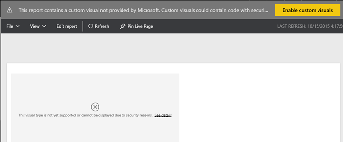
Scenario: You might have imported a custom visual in Power BI Desktop, tested it, and decided not to use it. However, even if your reports don’t use the visual anymore, Power BI will still prompt you if you want to enable custom visual with “This report contains a custom visual not provided by Microsoft…”. This is a security warning to avoid malicious code because custom visuals are deployed in Javascript.
Currently, there is no way in Power BI to disable this prompt. To make things worse, neither Power BI Service nor Power BI Desktop have a feature to get rid of the custom visual once it’s added to a Power BI Desktop file.
Solution: Here are the manual steps are followed to get rid of custom visuals in Power BI Desktop file for good:
- Copy the Power BI Desktop (*.pbix) file. Rename the file to have a zip extension, e.g. from Adventure Works.pbix to Adventure Works.pbix.zip.
- Unzip the file.
- In the uncompressed folder where you unzip the file content, navigate to the Report folder, and open the Layout file in your favorite text editor.
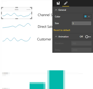
- At the top of the file content, find a resourcePackage string that includes the visual name (you could search for the name of the visual to locate it). For example, the resourcePackage element might look like this for the Sparkline visual:
,”resourcePackages”:[{“resourcePackage”:{“name”:”Sparkline1444636326814″,”items”:[{“path”:”icon.png”,”type”:3},{“path”:”Sparkline.js”,”type”:0}
- Carefully, delete this entire string but make sure that you don’t end up with two commas or you miss a comma after the deletion.
- While you’re in the uncompressed file content, delete also a folder that has the same name as the visual. Strictly speaking, this step is not needed to avoid the prompt but it’s a good idea to clean up all visual files so that you don’t distribute the visual Javascript source.
- Zip the entire content again. For some obscure reason, besides getting rid of the visual, in my case compressing the file reduce the PBI Desktop file size almost twice! This reduces the time to upload the visual to Power BI Service.
- Rename the file back to the original file name without the zip extension.
Now when you deploy the PBI Desktop file to Power BI and view its reports, you shouldn’t get prompted anymore.


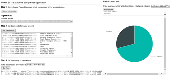
 I think the Microsoft decision to make Power BI open will be a paradigm shift for the BI industry. Besides the Push API which are already published, Microsoft has already indicated plans to make Power BI even more open, such as to allow developers to embed reports in custom web applications. Now, if only Power BI supports on-prem installation …

