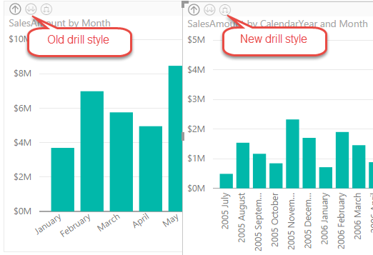
In the latest Power BI Desktop update, Power BI introduced a new drill-down option. Previously, after enabling drill-down on a chart and clicking the double-arrow icon, the chart will drill down to the next field in the Axis area (or to the next level of a hierarchy if a hierarchy is added to the Axis area). A student attending my Power BI class asked me this week how to avoid aggregation across all years if the user drills down from Year to the Month level. A few days ago, the only option was to introduce another Month field that has the Year-Month combination, e.g. 2005 July, 2005 August, and so on. Now, with the new drill down style, the chart will nest the hierarchical levels so you don’t have to add a new field. This behavior is similar to how Excel show categories nested in PivotChart.
One of the most prominent Power BI benefits is its extensible architecture that allows developers to integrate Power BI with custom apps and extend its capabilities, such by creating custom visuals. Having contributed one of the first custom visuals, the Sparkline custom visual, I can tell from experience that Microsoft does its part to ensure that the submitted visuals meets quality, security, and functionality best practices.
As custom visual developers have probably noticed, the Power BI Dev Tools is deprecated in favor of the new Custom Visual CLI Developer Toolset. The announcement page enumerates the main benefits of the new toolset. Personally, I like that Microsoft has decoupled the tool from dependencies to the “visual framework” that the original Power BI visuals use. This allows developers to use whatever dev tool they like, such as Visual Studio Code or Visual Studio, to code custom visuals. I also like the better integration with Power BI Service for auto-detecting code changes and showing what data has been passed to the visual.
There will be some pains when migrating existing visuals to the new tool. As of this time, there are also missing features so don’t rush yet to the new tool:
Tooltips are not yet supported.
Value formatters, such as to format values shown in tooltips, are not supported so you have to create your own, use third-party libraries, or copy code from this project.
The D3 definitions that the tool installs are different from the ones old tool and the Visual Studio framework used. Moreover, Microsoft indicates that they will stop providing the D3 definitions. Consequently, some D3 features I used resulted in compiled errors so I had to use the old types.
For some reason, checking the “Enable developer visual for testing” checkbox in Power BI Settings didn’t “stick” for me in Chrome so I had to use Edge.
The new Custom Visual CLI Developer Toolset will improve the developer experience for coding custom visuals. Download the migrated Sparkline code that works with the new toolset to understand the changes.
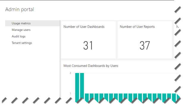
Larger organizations are naturally interested in established procedures for data governance, retention, search and taxonomy. With the rising important of data analytics, such policies are equally important for BI artifacts. For example, a large organization wants to restrict users to access Power BI only from approved devices and/ or on premises. Although it doesn’t match yet the SharePoint data governance features, Power BI is making strides in this direction. The tenant admin can access the Admin Portal page (log in to powerbi.com, then click Settings, Admin Portal) to:
View Power BI usage metrics and utilization. This fulfills a similar role to the Power Pivot Management Dashboard in SharePoint.
Manage users.
Set global tenant permissions, such as the ability to publish content pack to the entire organization, allowing sharing content with external users, publish to web (anonymous access), export data, interact with R scripts, Cortana, Analyze in Excel, templates, create audit logs, and data classification.
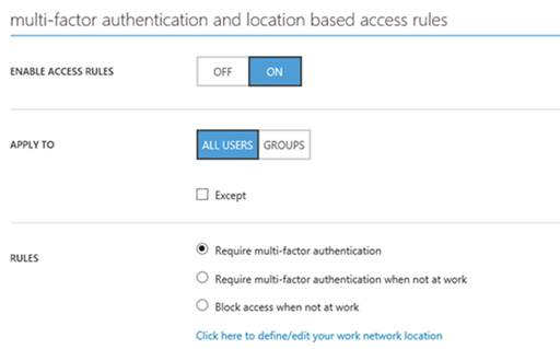
Recently, Power BI added two very important governance features:
Active Directory conditional policies (requires Azure Active Directory Premium) – Enforces multi-factor authentication that adds an additional-level of the login process, besides using his email and password, the user has to enter a code that Power BI sends to a mobile device. The “Block access when not at work” rule prevents the user from accessing Power BI while not at work.
Auditing– When enabled, this feature generates audit logs when users access Power BI content, export data, or make changes to important settings. Although the tenant admin needs to access the Office 365 Security and Compliance Portal to view the logs, auditing doesn’t require Office 365 subscription.
Power BI Desktop has a very useful feature that lets you create tables by manually entering the data. This could be useful in a variety of scenarios, such as entering some reference data, defining KPI goals, creating simple lookup tables, or prototyping some data. If you’re familiar with creating tables in Power Pivot by copying and pasting tabular data, think of Enter Data as the Power BI Desktop equivalent. However, Enter Data is more flexible because it lets you also the edit the data! This makes it more similar to the Power Pivot linked tables that automatically synchronize changes in the Excel source tables.
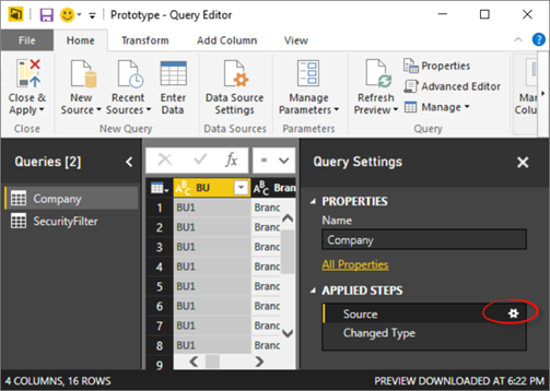
Creating a new table is straightforward. You click the Enter Data button in the Home ribbon. Don’t confuse this with the New Table button in the Modeling ribbon that allows to create a read-only table from a DAX table-producing expression. While entering the initial data and columns is easy, finding how to make changes is not that obvious. To do so:
Click the Edit Queries button in the Home ribbon to open the Query Editor.
In the Queries pane, select the query that corresponds to the “Enter Data” table.
In the Applied Steps pane, click the gear icon next to the Source step.
https://prologika.com/wp-content/uploads/2016/01/logo.png00Prologika - Teo Lachevhttps://prologika.com/wp-content/uploads/2016/01/logo.pngPrologika - Teo Lachev2016-08-23 21:28:482016-08-26 12:01:26“Enter Data” Feature in Power BI Desktop
Are you looking for an agile self-service platform that doesn’t require reporting and query skills to get basic analytics done without reliance on IT? Or, perhaps you’ve heard or evaluating Power BI but not sure where to start or how to take the most out of it? If so, this workshop is for you. A year ago Microsoft unveiled the new Power BI platform consisting of the PowerBI.com cloud service, Power BI Desktop, and Power BI Mobile. Since then, Prologika has helped organizations of all sizes to adopt Power BI. Packed with features, Power BI supports a dizzying variety of features and integration scenarios and it offers plenty to all types of users interested in data analytics: information workers, data analysts, BI pros, and developers.
Reserve your seat today to attend this insightful 2-day workshop for only $999 (use coupon POWERBI20160914 to get 10% discount when signing up two or more people) at the Microsoft Office in Alpharetta, when Teo Lachev (CEO of Prologika, a Power BI Red Carpet Partner) teaches you practical Power BI knowledge and data analytics skills that you can immediately apply to your job. See how Power BI can improve your usability and productivity even further.
Understand how Power BI changed the way users (information workers, data analysts, BI pros, and developers) gain and share data insights.
Learn how to connect to popular cloud services to derive instant insights, create interactive reports and dashboards, and view them in the browser and on the go.
Discover how to integrate and transform data from virtually everywhere and then implement sophisticated self-service models and business calculations.
Find how to implement hybrid architectures and strict security requirements by leaving data on premise and deploying reports and dashboards to the cloud.
Learn how to share your BI artifacts and collaborate with other teammates.
Gain practical skills by creating a self-service model in the lab exercises.
Learn Power BI best practices, limitations (every tool has them) and workarounds.
Get your questions answered.
and much more…
You won’t want to miss this educational and engaging training event! Attend it and get a free paper copy of the bookApplied Microsoft Power BI! Please registertoday as seating is limited.
Audience
Information workers
Business analysts
BI professionals
In general, anyone interested in self-service data analytics with Power BI
Prerequisites
Students are encouraged to bring their laptops for the exercises. Detail setup instructions and source files will be sent before the event.
Instructor
Teo Lachev is an internationally-recognized authority on Data Analytics and CEO of Prologika. Teo helps organizations make sense of their most valuable asset: their data. His strategy formulation, trusted advisory and mentoring, design and implementation services empower his clients to apply effectively data analytics in order to understand, improve, and transform their business. Teo has authored and coauthored several books and his latest one is “Applied Microsoft Power BI (Bring your data to life!)” He has been leading the Atlanta Microsoft Business Intelligence group since he founded it in 2010. Microsoft has recognized Teo’s expertise and contributions to the technical community by awarding him the prestigious Microsoft Most Valuable Professional (MVP) for Data Platform award since 2004.
https://prologika.com/wp-content/uploads/2016/01/logo.png00Prologika - Teo Lachevhttps://prologika.com/wp-content/uploads/2016/01/logo.pngPrologika - Teo Lachev2016-08-08 21:43:002016-08-08 22:47:132-Day Applied Power BI Workshop – Atlanta
A year ago Microsoft unveiled the new Power BI platform consisting of the PowerBI.com cloud service, Power BI Desktop, and Power BI Mobile. Since then, Prologika has helped organizations of all sizes to plan and adopt Power BI. Packed with features, Power BI supports a dizzying variety of features and integration scenarios but it might be difficult to understand how Power BI fits in your data analytics ecosystem.
Join Prologika and Microsoft for a 3-hour free seminar on Wednesday, August 31th, 8:30 AM -12 PM ET, at the Microsoft Office in Alpharetta, when Teo Lachev (CEO of Prologika) and Brian Jackson (Cloud Solution Architect at Microsoft) share practical knowledge and experience to help you to formulate a Power BI enterprise strategy. If you’re considering Power BI but you’re not sure how it fits within your organizational data strategy, this event is for you.
Key Takeaways
Understand how Power BI changed the way users (information workers, data analysts, BI pros, and developers) gain and share data insights.
Learn 10 areas where Power BI excels compared to other popular BI tools, such as Tableau, Qlik Sense, Sisense, Domo, and others.
Plan a data access strategy for:
Importing data
Connecting live to cloud sources with content packs and solution templates
Connecting live to on-premises data sources
Implementing real-time dashboards
Embedded reporting
Taking a deep dive to learn how Prologika designed and implemented a hybrid architecture solution for a Fortune 50 organization and meet security requirements that prevented exporting data to the cloud
Join in a discussion about other business use cases and gaps between Power BI and other BI products, and find how to address them. Get your questions answered.
9:00-10:30 – How Power BI empowers businesses like yours
10:30-10:40 – Break
10:40-11:45 – Plan a data access strategy and go “under the hood” of a hybrid architecture case study
11:45-12:00 – Q&A
Presenters
Teo Lachev is an internationally-recognized authority on Data Analytics and CEO of Prologika. Teo helps organizations make sense of their most valuable asset: their data. His strategy formulation, trusted advisory and mentoring, design and implementation services empower his clients to apply effectively data analytics in order to understand, improve, and transform their business. Teo has authored and coauthored several books and his latest one is “Applied Microsoft Power BI (Bring your data to life!)” Prologika is a Microsoft Gold Partner in Data Analytics, demonstrating a “best-in-class” ability and commitment to meet Microsoft customers’ evolving needs and distinguishing itself within the top one percent of Microsoft’s partner ecosystem. Learn more at www.prologika.com.
Brian Jackson is a Microsoft Certified Architect and Cloud Solution Architect at Microsoft. He has deep technical expertise in the SQL Server and Azure platform and served as a subject matter expert for Microsoft’s SQL Server Master and Business Intelligence certification programs. Brian has more than 20 years of experience in solution architecture and software development with a focus on business intelligence, data warehousing and database design. He has strong customer relationship skills with over 15 of years of IT consulting to several Fortune 500 companies and proven success in leading and delivering large scale implementations with globally distributed teams.
https://prologika.com/wp-content/uploads/2016/01/logo.png00Prologika - Teo Lachevhttps://prologika.com/wp-content/uploads/2016/01/logo.pngPrologika - Teo Lachev2016-08-08 21:10:412021-02-17 01:00:37Formulating a Power BI Enterprise Strategy Seminar – Atlanta
Currently in preview, Microsoft Flow is a cloud service for creating automation flows without writing code, similar to Zapier’s “zaps” and IFTTT’s “recipes”. How is this useful for BI? Let’s consider an example. Power BI has recently introduced data-driven alerts in Power BI Service (previously alerts were supported on iPhone only). Currently, alerts can be created only on single-card and gauge dashboard tiles that are connected to imported datasets. You can go to the tile properties and click the Manage Alerts (bell) icon to create an alert rule, such as “SalesAmount is above 1,000,000.”
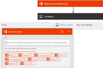
When the alert rule condition is met, you are notified in the Power BI notification center and by e-mail. But what if you want to broadcast the alert to a large audience? Currently, this feature is not a Power BI native feature. Sure, you can forward the email manually but what if you’re on vacation or the alert is triggered outside working hours but you need to notify certain people immediately? Enters Microsoft Flow that allows you to create simple if-then-else flows. In the screenshot below, I’ve created a trigger that checks my Office 365 email account for emails sent from noreply@powerbi.com and the subject contains “Alert”. If this condition is met, the “yes” action forwards the email to additional people.
Microsoft flows has a comprehensive list of triggers and actions for integration with many popular services, such as Dynamics CRM, Salesforce, SQL Server, MailChimp, SharePoint, Facebook, GitHub, and many more. Naturally, Microsoft Flow integrates very well with Microsoft cloud and on-prem services. It also has an extensible architecture that allows developers to plug in additional services. Together with PowerApps, Microsoft Flow has a bright future to help you automate your business processes and get actionable insights.
https://prologika.com/wp-content/uploads/2016/01/logo.png00Prologika - Teo Lachevhttps://prologika.com/wp-content/uploads/2016/01/logo.pngPrologika - Teo Lachev2016-08-01 09:29:232016-09-01 09:46:23Going with the Flow
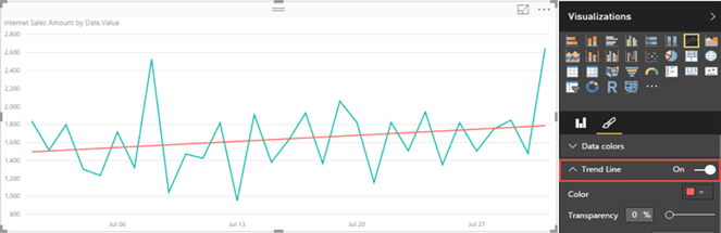
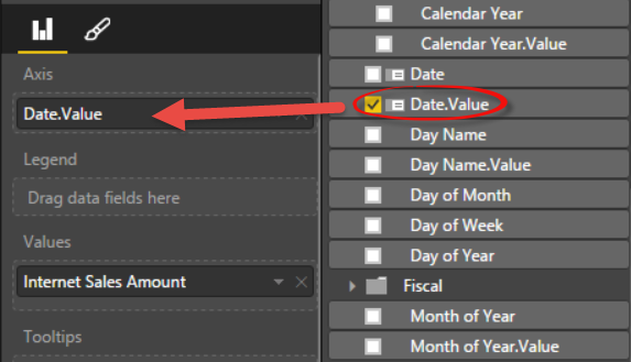
Recently, Power BI charts introduced trend lines. However, they require numeric or date values on X-axis, which must have a continuous type. In fact, if you use a text field for the X-axis, a warning indicator will be displayed in the top left corner of the chart to warn you that non-numeric values are used.
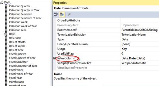
This requirement presents issues if the report is connected to a Multidimensional cube because by default all attributes are text-based. As a workaround, in the Multidimensional project set the ValueColumn property of the attribute to a column in the underlying table of a numeric or date data type, and deploy the cube.
Back to Power BI Desktop, bind the corresponding .Value field to the X-axis.
https://prologika.com/wp-content/uploads/2016/01/logo.png00Prologika - Teo Lachevhttps://prologika.com/wp-content/uploads/2016/01/logo.pngPrologika - Teo Lachev2016-07-28 21:13:352016-07-28 21:13:35Trend Lines in Power BI Charts
One great feature of Microsoft BI has been the continuum from personal BI to organizational BI. For example, a business user can start small with an Excel Power Pivot model which IT can restore at some point to a scalable Tabular model. In fact, if you know Microsoft personal BI (Power Pivot or Power BI Desktop), you already know 80% (or even more) of SSAS Tabular.
Unfortunately, currently there isn’t a supported way to restore Power BI Desktop models to Tabular or create a Tabular project from a pbix file. The reason is that because Power BI Desktop is changing on a monthly basis, it’s ahead of Tabular and currently Power BI Desktop doesn’t support backward compatibility. However, the following approach worked for me to upgrade Power BI Desktop to Tabular 2016.
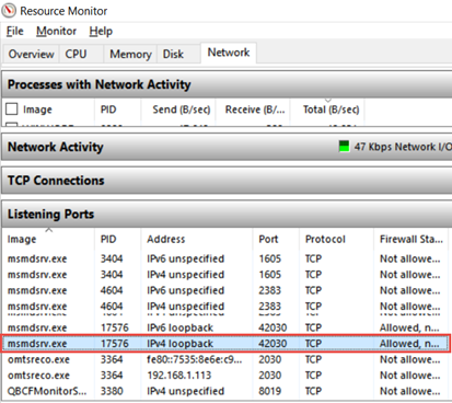
Power BI Desktop has a Tabular child process which is the workhorse for all data crunching you do on the desktop. This process uses a dynamic port. As a first step, you need to find that port. The easiest way to do so is to run Windows Resource Monitor (in the Windows search bar, type resmon). Then, flip to the Network tab, and in the Listing Ports section, find “msmdsrv.exe”, and then note the port number. In my case, I have a few instances of msmdsrv because I run dedicated instances of Multidimensional and Tabular but I found that the PBI Tabular instance ports start above 10000 so it should be easy to identify the instance.
Now that you have the port number, open SSMS 2016 (you can download it from here), and connect to that Tabular instance, using the syntax: localhost:<port number>. For example, to connect to the highlighted instance, in SSMS I’ll Connect ð Analysis Services, and then enter localhost:42030.
TIP: You can also use the SQL Profiler to connect to the PBI Tabular instance and do profiling using SQL Profiler, as Adam Saxton demonstrates here, or using DAX Studio, which by the way automatically enumerates the Power BI Desktop instances.
Right-click the database (the database name is a guid), and click Script ð Script Database As ð CREATE TO ð Clipboard. This will export the database schema in the new JSON format.
Connect to the Tabular instance that will host the database, and create a new Analysis Services XMLA Query, and paste the script. One of the changes you want to make here is to rename the database by change the name element at the beginning of the file so you don’t end up with the same guid for the database name.
Execute the script to create the new database. If you get an error, you should be able to change the script and strip code for features that Tabular doesn’t support. Now that we have JSON-based schema, making such changes should be much easier.
Now you can use SSDT to create a project by importing the Tabular database and continue making changes to the project.
https://prologika.com/wp-content/uploads/2016/01/logo.png00Prologika - Teo Lachevhttps://prologika.com/wp-content/uploads/2016/01/logo.pngPrologika - Teo Lachev2016-07-10 15:29:082016-07-15 20:53:46Upgrading Power BI Desktop Models to Tabular
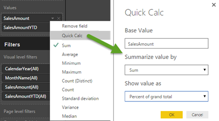
DAX is very powerful but it could entail a steep learning curve for novice users. Power BI Desktop has started on the road of delivering pre-packaged calculations. The first one is Percent of Grand Total. Once you add a measure to the Values zone, you can expand the measure drop-down and click Quick Calc. This is similar to how you would pick one of the default aggregation functions.
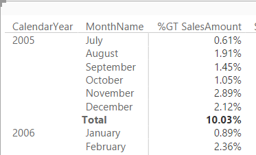
Interestingly, Power BI Desktop doesn’t add a new calculation when the Quick Calc feature is used. Instead, it probably creates an implicit DAX measure and you can’t see the formula. The original measure is renamed to %GT <original measure name>.
Prepackaged calculations are a frequently requested Power BI feature. Expect additional quick calculations to light up soon. As a recommendation for improvement, I think that it would be nice to be able to see the DAX formula behind the quick calc.