Azure Analysis Services
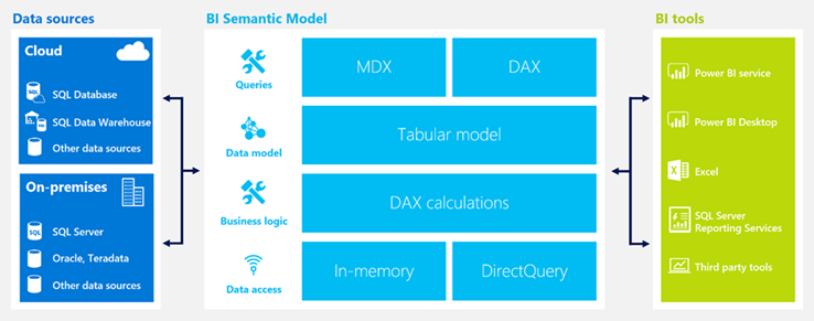
Despite the mantra you might hear elsewhere, my experience shows that the best self-service BI is empowering users to create reports from trusted semantic models sanctioned and owned by IT. Most of the implementation work I do involves Analysis Services in one form or another. Analysis Services has a very important role in your BI ecosystem as I explain in the “Why Semantic Layer” newsletter.
Today, at the SQL PASS SUMMIT, Microsoft announced that Analysis Services Tabular is now available as an Azure PaaS service. As a participant in the prerelease program, I had the opportunity to test Azure Analysis Services and this is why I believe you should care:
- If you develop cloud-based solutions, you might not have to provision a VM for Tabular anymore. Instead, you can provision an Analysis Services cloud service in seconds, just like you can provision an Azure SQL Database.
- You can easily scale up or down Azure Analysis Services, just like you can do this with Azure SQL Database. You can even pause it so that you don’t incur cost.
- You don’t have to set up a gateway for SSAS. You can use Power BI Desktop to connect to Azure Analysis Services and deploy the report to Power BI. However, you would need a gateway if your source data resides on premises so that you can process the model with on-premises data. Note that currently you can’t use Power BI Get Data to connect to Azure Analysis Services directly from Power BI. Instead, you must use Power BI Desktop.
- The service is highly available by default. SQL Server pros implementing highly available solutions know that this is not easy and not cheap. So, factor in high availability if you find Azure Analysis Services pricing is too high.
On the downside, as it stands Azure Analysis Services uses Azure Active Directory for security and it doesn’t support claim authentication. Power BI users will be able to authenticate but not Power BI Embedded (not yet).
Currently in preview, Azure Analysis Services is a very important addition to the Microsoft Azure BI stack that allows BI pros to implement cloud-based semantic models as they can currently do on premises.