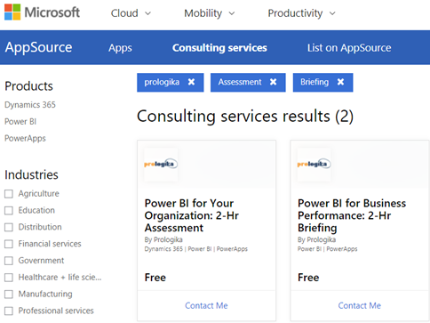
Microsoft selected and published two Prologika Power BI-related consulting offers on Microsoft AppSource. And their price is right; they are both free!
Power BI for Your Organization: 2 HR Assessment – Prologika will evaluate your data analytics objectives to determine how Power BI can empower your organization to understand better and improve its business.
Power BI for Business Performance: 2-Hr Briefing – Prologika will provide you with a free, 2-hour briefing on how our client derived tremendous value from our solution for Business Performance Management. Learn how Prologika transformed the way a large organization does financial planning by creating and comparing budgets and forecasts with our customized solution based on the Microsoft Data Platform and Power BI.
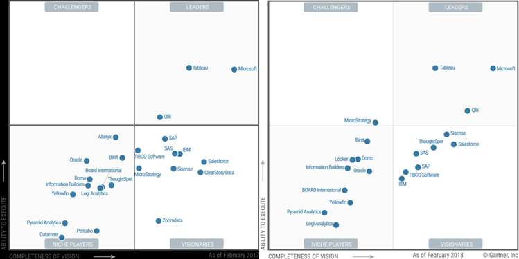
The 2018 Gartner Magic Quadrant for Analytics and Business Intelligence Platforms is out. I read the report and followed the dots. I personally hoped to see the Microsoft dot higher than the overrated Tableau, given everything I said here, here, and here. I’m glad that Gartner finally realized what I have been saying all along that Tableau lacks “complex data model support” among many other things.
Anyway, this is a great endorsement of how far Power BI has come. And about what Microsoft can do when product groups work together. Mind you, the main focus of the Gartner’s evaluation was Power BI. The organizational BI pieces (SQL Server, SSRS, SSAS, SSIS, Azure) were not considered.
Here are my thoughts about the Microsoft-related cautions cited by Gartner:
Mode 2 analytics, Azure cloud only – “Power BI has mainly focused on the requirements for Mode 2 (agile, self-service) analytics, while its on-premises SQL Server Reporting Services serves the needs of Mode 1 (for scheduled, distributed reports). For Microsoft customers, this has resulted in a two-product deployment with different capabilities and different deployment approaches. Microsoft’s reference customers cited absent or weak functionality (14%) as a limitation to wider deployment, with 27% (the highest percentage of respondents for this Magic Quadrant) citing a range of other problems.” Gartner has a point here. “Cloud first” shouldn’t mean “on premises never”. Supporting Power BI reports in Power BI Report Server (an add-on to SSRS) was a great move but customers expect to get at least the most important Power BI features, such as dashboards, Q&A, online report editing, Quick Insights, embedded APIs. But they are not in Power BI Report Server and there is no roadmap when they will arrive on premises if ever. If there is a fear that Power BI Report Server would cannibalize the cloud, then maybe we shouldn’t have Power BI Report Server at all. The interesting part is that some on-premises features, such as Excel workbooks with live connections, are not supported in the cloud. So, the feature mismatch goes both ways. I hope Microsoft addresses this as it’s a biggy for my clients.
Breadth of use – “As previously, Microsoft’s scores from its reference clients place it in the bottom quartile for breadth of use. Breadth of use looks at the percentage of users using the product for a range of BI styles: from viewing reports, creating personalized dashboards and doing simple ad hoc analysis, to performing complex queries, data preparation and using predictive models“. Not sure I agree with this one. My observations do show that business users don’t bother to learn the more advanced features, such as Power Query. But whose problem is this? Further “This pattern of use suggests that the more advanced data preparation is performed outside Power BI“, there are absolutely cases that go beyond a typical power user and such tasks are better done by IT, such as data integration in a central data repository. Do Tableau and Qlik handle advanced data preparation? Wait, Tableau doesn’t even have data integration while Qlik requires scripting.
Multiple products – “The core of Microsoft Power BI is a self-contained product. However, a number of elements in Microsoft’s roadmap that are part of the product vision span multiple products and require integration. For example, insight to action requires Microsoft Flow.” I don’t see a problem with having multiple products if they can integrate. Especially given that some are free, such as PowerApps and Flow with O365. The reason why they are separate products is that they don’t apply to BI only. And which BI vendor has flow, business apps, predictive models, in the same product? Not to mention that Tableau and Qlik don’t have anything more than just a reporting tool.
Sales experience – “The majority of Microsoft’s reference customers evaluated their sales experience as good to excellent. However, in relative terms, Microsoft is slightly below average for this Magic Quadrant.” I haven’t gotten feedback from clients about their sales experience, so I can’t comment but I thought Gartner should have elaborated more on this and beyond “relative terms”. Further, “While Microsoft Power BI is a low-priced option, clients expressed frustration about changes in the pricing and packaging and the lack of clarity about what Power BI functionality is included with Microsoft Dynamics 365.” So, Power BI pricing has remained the same and it’s clearly stated. I think what Gartner meant is that the Power BI Embedded pricing story has changed. I wonder how many customers complained about the Dynamics 365 integration.
2017 vs. 2018
https://prologika.com/wp-content/uploads/2016/01/logo.png00Prologika - Teo Lachevhttps://prologika.com/wp-content/uploads/2016/01/logo.pngPrologika - Teo Lachev2018-02-27 20:18:512018-03-09 09:00:372018 Gartner Magic Quadrant for Analytics and BI Platforms
While we’re waiting for the Gartner 2018 Magic Quadrant for Data Analytics (should be out any moment), two others related to data analytics were released.
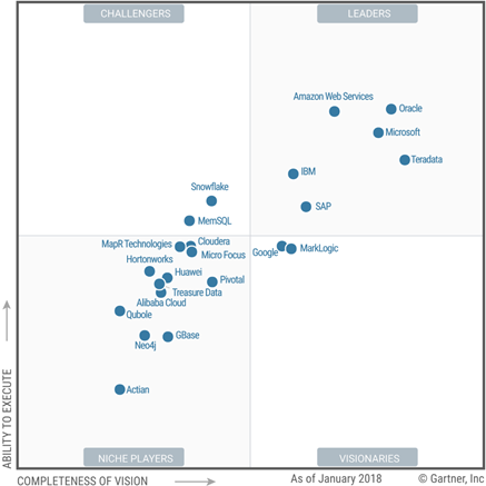
2018 Magic Quadrant for Data Management Solutions for Analytics
This one evaluates “complete software system that supports and manages data in one or more file management systems (usually databases)”. So, think of traditional and cloud-based data warehousing. I’m surprised to see AWS ahead of Microsoft and Oracle in the ability to execute, given that Amazon doesn’t have on-premises offerings (see the ML quadrant below where apparently that’s important).
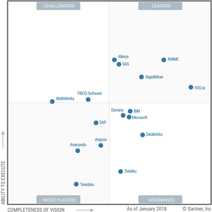
2018 Magic Quadrant for Data Science and Machine-Learning Platforms
This one evaluates “vendors of data science and machine-learning platforms. These are software products that data scientists use to help them develop and deploy their own data science and machine-learning solutions.” I personally don’t agree with Gartner on the Microsoft Visionary rank, given all the investments Microsoft has made in machine learning.
“Microsoft remains a Visionary. Its position in this regard is attributable to low scores for market responsiveness and product viability, as Azure Machine Learning Studio’s cloud-only nature limits its usability for the many advanced analytic use cases that require an on-premises option.”
Apparently, Azure Machine Learning is not well received as it’s not easy to operationalize. That one I agree with. But “for on-premises workloads, Microsoft offers SQL Server with Machine Learning Services, which was released in September 2017 — after the cutoff date for consideration in this Magic Quadrant.” Not really. In 2016, Microsoft integrated R with SQL Server after the acquisition of Revolution R. Apparently, this wasn’t communicated well to Gartner.
I love performance optimization. It’s exciting to peek under the hood and take a deep dive in the mysterious world of how Microsoft designed things. And it always humbles me by bringing forth gaps in my knowledge.
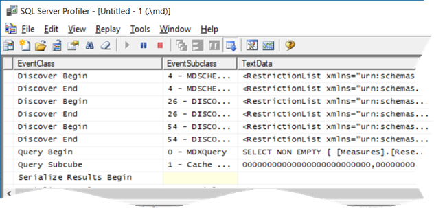
Scenario: You have SSRS reports that query Analysis Services Multidimensional cubes. When users request reports in Report Manager (aka Web Portal starting with SSRS 2016) and … the report hangs sporadically, without even getting to the ReportViewer page… for minutes. The server doesn’t appear to be under resource pressure. The issue happens when the cube is being processed. And no, this is not about locking.
Solution: This one wasn’t trivial to figure out. The profiler showed that when the report is requested, SSRS fires the first MDX query (typically, a query that populates the parameter available values). The breakthrough came when I executed the same query in SSMS while the SSRS one was blocked, and it executed immediately. With some help from Microsoft, it turned out that flattened rowsets (SSRS requests flattened rowsets), are serialized by threads in the SSAS processing pool. Indeed, once I enabled the Serialize events in the profiler, I noticed that the Serialize Results Begin event fires but not Serialize Results End.
So, if there are not enough threads in the SSAS processing pool, the flattened queries are queued. You can use the MSAS11 Threads: Processing Pool Job Queue Length counter to confirm that processing threads are queued. In this case, the queue length was about 200 threads when fully processing the database!
The resolution depends on your specific situation. If you have plenty of CPU cores, try increasing the pool size by increasing the ThreadPool\Process\MaxThreads SSAS setting. The default value of this setting is 0, causing SSAS to allocate the maximum of (64, number of logical cores). So, if you have a two-socket server with 16 hyperthreaded cores (32 logical cores), the maximum number of processing threads would be 64. On the other hand, if you see a high CPU utilization during processing, try reducing the parallelism of the processing task by using one of these three approaches:
Reduce the maximum number of connections in the SSAS data source properties.
Set the MaxParallel setting on the processing batch command.
Reduce the CoordinatorExecutionMode SSAS configuration settings.
Also, I recommend you load test your production server to ensure that it has enough capacity. I did a “Can Your BI Solution Scale” presentation at TechEd 2011 about load testing SSAS and SSRS that shows how this could be done.
Many thanks to Akshai Mirchandani from the SSAS product team for shedding light in dark places.
https://prologika.com/wp-content/uploads/2016/01/logo.png00Prologika - Teo Lachevhttps://prologika.com/wp-content/uploads/2016/01/logo.pngPrologika - Teo Lachev2018-02-23 21:59:052018-02-23 21:59:05Unblocking MDX Queries from SSRS Reports
MS BI fans, join us for the next Atlanta MS BI and Power BI Group meeting on February 26th at 6:30 PM. Stacey Jones will explain how Power BI can integrate with other systems, such as Dynamics and Salesforce. SentryOne will sponsor the meeting. And your humble correspondent will show you two latest Power BI features: report sharing and date tables. For more details, visit our group page and don’t forget to RSVP (use the RSVP survey on the group page) if you’re planning to attend.
Presentation:
Integrating Power BI with Dynamics and Other Solutions
Level: Intermediate
Date:
February 26, 2018
Time
6:30 – 8:30 PM ET
Place:
South Terraces Building (Auditorium Room)
115 Perimeter Center Place
Atlanta, GA 30346
Overview:
Microsoft has differentiated itself for many years as the company that not only sells software, but software that works well together. For example, many companies sold suites of office productivity software, but none sold software that worked as well together as Microsoft Office. We continue that legacy today with Power BI, the leading BI software in the industry, and the integration story is improving, working well with Dynamics as well as leading 3rd party software packages, such as Salesforce!
Speaker:
Stacey Jones is a Data Solutions Architect and Business Intelligence Evangelist at Microsoft’s Technology Center (MTC) in Atlanta, GA. He has 25+ years of industry experience spanning Database Administration in both Oracle and SQL Server, Database Development, Data Modeling, and most recently as a Data Architect focused in Business Intelligence. He is an industry recognized expert in database tuning, query tuning, and Business Intelligence. He has taught many classes on these subjects and has plenty of real life experience putting out database performance fires. His experience spans the health care and transportation industry. Stacey is active on LinkedIn, you can see his profile at https://www.linkedin.com/in/stacey-jones-05989124 for more information on his industry honors and awards.
Sponsor:
SentryOne, formerly SQL Sentry, enables data professionals to monitor, diagnose, and optimize server performance across physical, virtual, and cloud environments. Our software provides unparalleled insight, awareness, and control over the true source of performance issues. Headquartered in Huntersville, North Carolina, SentryOne products are sold and supported directly and through authorized resellers and partners.
Prototypes with Pizza
“Report sharing and Date tables” by Teo Lachev
https://prologika.com/wp-content/uploads/2016/01/logo.png00Prologika - Teo Lachevhttps://prologika.com/wp-content/uploads/2016/01/logo.pngPrologika - Teo Lachev2018-02-22 21:17:052021-02-17 01:01:18Atlanta MS BI and Power BI Group Meeting on February 26th
To compete more effectively with Power BI, Tableau acquired a database technology called HyPer. Like the Microsoft xVelocity in-memory technology (formerly known as VertiPaq), which powers Analysis Services Tabular, Power BI, and SQL Server Columnstore, HyPer is an in-memory database system. Hyper was initially developed as a research project at the Technical University of Munich. Tableau explains that “with Hyper, transactions and analytical queries are processed on the same column store, with no post-processing needed after data ingestion. This reduces stale data and minimizes the connection gap between specialized systems. Hyper’s unique approach allows a true combination of read-and write-heavy workloads in a single system. This means you can have fast extract creation without sacrificing fast query performance. (We call that a win-win.)”. Tableau shipped Hyper with Tableau v10.5. Here, we have a statement that Tableau claimed that Hyper achieved 3x faster data extraction and 5x increase in query performance compared to the old TDE data extracts.
Intrigued, I ran some tests to compare xVelocity, which has been around for more than a decade (since Excel 2007), with Hyper, and I wanted to share the results. My tests focused only the speed of data extraction and compression. I used Tableau 10.5.1 and Power BI Desktop February 2018 release. The tests loaded data from the ContosoRetailDW SQL Server database hosted on my laptop. Of course, there are many other factors that can influence the data ingestion speed, such as the query performance, driver, etc.
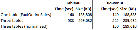
Loading One Table
The first test loaded a single table, FactOnlineSales, with over 12 million rows. Tableau data extract finished in 160 seconds while Power BI Desktop finished faster in 140 seconds. Interestingly, Tableau compressed data better. This should warrant some additional investigation, but I don’t know of a Tableau tool that can show the data compression ratio per column. It looks though the Hyper compression algorithm does a better job compressing numeric data types and no so much with text-based columns.
Loading Tree Tables
In the second test, I loaded three tables (FactOnlineSales, DimCustomer, and DimDate). Tableau uses by default an inner join among tables, resulting in a single SQL query that joins all three tables. To achieve the equivalent in Power BI Desktop, I used the same query that Tableau generated (another way would be to merge the tables in the Query Editor, which probably would have resulted in faster data load). Again, Power BI finished loading data faster but this time it compressed the data better.
Three Tables Normalized
In the third test, I wanted to leave the three tables loaded separately but joined with relationships. Surprisingly, Hyper focused apparently on performance alone and left the Tableau data modeling limitations. Tableau is still limited to a single dataset, unless you go for the weird and limited data blending, requiring a primary and secondary data source. Power BI has been supporting normalized schemas (a best practice) since it was initially released more than a decade ago. So, I couldn’t do the third test with Tableau. But out of curiosity, I ran the test with Power BI Desktop. Power BI data load was comparable with the first test, plus some additional time to create the relationships. And the data load size was comparable with the first test.
As far as query performance, both tools felt very responsive when slicing and dicing data and queries would complete within milliseconds. Once we have some officials query stats from Tableau, I’ll compare against xVelocity.
Conclusion
While Hyper might improve data load and query performance compared to the old Tableau data technology, don’t expect it to be any faster than xVelocity. This probably explains why Tableau is shy of touting Hyper too much.
Hyper didn’t remove the Tableau data modeling limitations. Tableau still lags by far the xVelocity data modeling capabilities. As a result, the more data you load, the larger the data footprint would be, and the slower it would be to load the data compared to multi-table Power BI schemas. Not to mention that having all the data merged into a single dataset is not a best practice for a variety of reasons.
https://prologika.com/wp-content/uploads/2016/01/logo.png00Prologika - Teo Lachevhttps://prologika.com/wp-content/uploads/2016/01/logo.pngPrologika - Teo Lachev2018-02-18 16:51:332018-02-18 16:51:33Tableau Hyper vs. Power BI xVelocity
Scenario: You’ve created a dashboard-looking Power BI report that has a filter. Most visuals on a report page need to show only data for the selected filter but some must ignore the filter.
Solution: There are several solutions to achieve this goal depending on requirements. Let’s start with the no-brainer and move down in complexity.
Move the unfiltered visuals to another report page — Slicers and page-level filters filter visuals on the same page (note that the Power BI Desktop February update allows you to configure a report-level slicer). By moving the visuals that should remain unaffected by the slicer to another page, you’re effectively ignoring the page-level filtering.
Use a slicer and “Edit Interactions” – If you use a slicer, you can use the Edit Interactions feature (Format ribbon) to specify which visuals ignore the slicer selection. Edit Interactions is described in more detail here.
Consider using time calculations – For example, if most charts on the report must show data for the last 12 months, but some need to show data for the current month, you can apply the most common filter, which in this case is 12 months. For those charts that shows the last month, create a DAX Month-To-Date (MTD) measure and bind it to those charts.
Overwrite page-level and report-level filters – Sometimes you can’t use slicers, such as in the case where you need more advanced filtering options or when you need to filter the report by URL (you can pass filters on the report URL only if you have page-level and report-level slicers). This is the most complex case because it requires some changes to the model as I describe below.
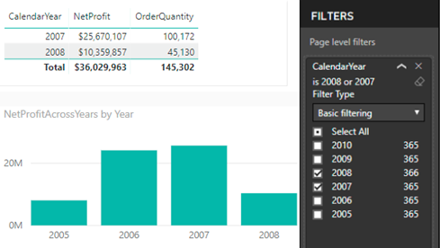
Currently, Power BI doesn’t allow you ignore page-level or report-level filters. As you’d quickly find out, Edit Interactions doesn’t work for them. When you apply such a filter, Power BI generates a query with SUMMARIZE that applies the filter as an argument to SUMMARIZE. Think of that filter as a WHERE clause that is applied after all measure-level filters. So, you might have a measure that ignores the filter, but the report would still return the rows matching the filter condition. However, you can use the following workaround to achieve the desired effect. Consider this report.
In this case, a page-level filter filters CalendarYear from the Date table to values 2007 and 2008. The first Table visual returns data only for these years (no issues here). But the Chart visual shows data for all years. Follow these steps to get the Chart visual to work as shown:
You need a new measure to ignore the dimension filter. However, the key to get this to work is to use the field form the fact table on the report.
Add the filter column (CalendarYear in this case) to the fact table. You can do this by different means, such as creating a DAX calculated column, creating a PowerQuery calculated column, or by PowerQuery merged queries (to look up the value from another table). The important thing is that you need to have the filtered field on the fact table.
Use that field to the chart (not the one from the dimension table that the page-level filter uses).
Create a measure that overwrites the filter and use that measure on the chart:
The measure ignores the filter on the CalendarYear field. This expands the filter context on the table to all years. Because the Year field used on the report is from the fact table, the net effect is that the data for all years is shown. This approach won’t work if the chart shows measures from two fact tables because you probably won’t have a relationship between them.
In this post, I outlined several options to overwrite Power BI filters. It wouldn’t be nice if Microsoft enhances Edit Interactions to page and report-level filters to avoid changes to the data model.
https://prologika.com/wp-content/uploads/2016/01/logo.png00Prologika - Teo Lachevhttps://prologika.com/wp-content/uploads/2016/01/logo.pngPrologika - Teo Lachev2018-02-14 19:03:552018-03-05 13:10:37Overwriting Power BI Filters
Planning to attend the PASS Summit this year? The PASS Summit is the go-to conference for data professionals that will take place November 6-9, in Seattle, WA. You have two options to register:
Early bird registration priced at $1,699 has started and it will continue until March 23, 2018. As a bonus, use code LGSTRMZB8 at registration to get streaming access to all PASS Summit 2017 content!
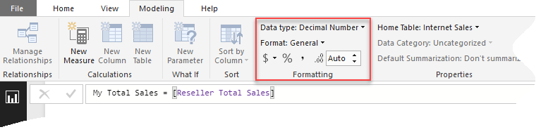
Scenario: You want to overwrite the formatting of some field in a Power BI Visual, such as in the case of showing the field in one visual with decimals and then in another without decimals. Or, you might want to overwrite the default format when connected live to a semantic model. You search left and right, bing the Internet, and still no clue as to why Power BI doesn’t have this feature.
Answer (that you probably won’t like): Most visuals already support display units and decimals. Table and matrix would probably get this feature very soon. We don’t have ETA for full custom format string override (per visual). Your vote counts so vote on ideas.powerbi.com.
As a best practice, I recommend applying format settings in the model so that it’s applied consistently to all reports.
In the narrower case of formatting measures, you can create a new measure and change its formatting. This also works when Power BI Desktop connects to a Tabular semantic model because you can create local DAX measures on top of the semantic model. Just create a measure that piggy-backs on an existing measure, whose format you want to change. Then, use the Formatting section to change its format.
https://prologika.com/wp-content/uploads/2016/01/logo.png00Prologika - Teo Lachevhttps://prologika.com/wp-content/uploads/2016/01/logo.pngPrologika - Teo Lachev2018-02-07 12:07:042018-02-07 12:07:04Visual-level Formatting in Power BI
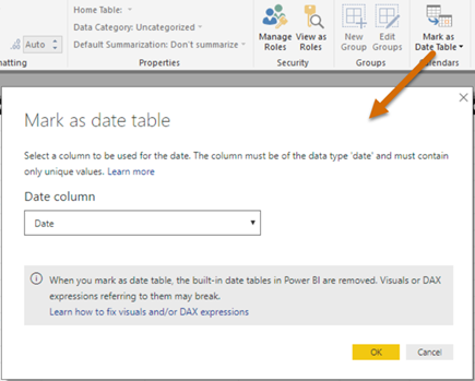
In my “Understanding Dates in Power BI Quick Measures” blog, I mentioned that having a Date table is a best practice but Quick Measures didn’t support it. Fortunately, the February update of Power BI Desktop fixes this. Now you can mark a Data table as such, as you’ve been able to do in Excel Power Pivot since the beginning.
Marking a date table accomplishes three things:
Disables the Power BI-generated date hierarchies (aka as inline hierarchies). Good riddance! Check the same blog for details of why inline hierarchies should be avoided.
Allows you to use your Date table for time calculations in Quick Measures.
Makes DAX time calculations work even if the relationship between a fact table and the Date table is created on a field that is not a date field, such as a smart integer key (YYYYMMDD). Previously, you had to create the relationship on a field of Date data type.
https://prologika.com/wp-content/uploads/2016/01/logo.png00Prologika - Teo Lachevhttps://prologika.com/wp-content/uploads/2016/01/logo.pngPrologika - Teo Lachev2018-02-06 22:21:432020-12-20 21:01:56Mark as Date Table in Power BI