Atlanta MS BI and Power BI Group Meeting on February 26th

MS BI fans, join us for the next Atlanta MS BI and Power BI Group meeting on February 26th at 6:30 PM. Stacey Jones will explain how Power BI can integrate with other systems, such as Dynamics and Salesforce. SentryOne will sponsor the meeting. And your humble correspondent will show you two latest Power BI features: report sharing and date tables. For more details, visit our group page and don’t forget to RSVP (use the RSVP survey on the group page) if you’re planning to attend.

Presentation:

Integrating Power BI with Dynamics and Other Solutions

Level: Intermediate

Date:

February 26, 2018

Time

6:30 – 8:30 PM ET

Place:

South Terraces Building (Auditorium Room)

115 Perimeter Center Place

Atlanta, GA 30346

Overview:

Microsoft has differentiated itself for many years as the company that not only sells software, but software that works well together. For example, many companies sold suites of office productivity software, but none sold software that worked as well together as Microsoft Office. We continue that legacy today with Power BI, the leading BI software in the industry, and the integration story is improving, working well with Dynamics as well as leading 3rd party software packages, such as Salesforce!

Speaker:

Stacey Jones is a Data Solutions Architect and Business Intelligence Evangelist at Microsoft’s Technology Center (MTC) in Atlanta, GA. He has 25+ years of industry experience spanning Database Administration in both Oracle and SQL Server, Database Development, Data Modeling, and most recently as a Data Architect focused in Business Intelligence. He is an industry recognized expert in database tuning, query tuning, and Business Intelligence. He has taught many classes on these subjects and has plenty of real life experience putting out database performance fires. His experience spans the health care and transportation industry. Stacey is active on LinkedIn, you can see his profile at https://www.linkedin.com/in/stacey-jones-05989124 for more information on his industry honors and awards.

Sponsor:

SentryOne, formerly SQL Sentry, enables data professionals to monitor, diagnose, and optimize server performance across physical, virtual, and cloud environments. Our software provides unparalleled insight, awareness, and control over the true source of performance issues. Headquartered in Huntersville, North Carolina, SentryOne products are sold and supported directly and through authorized resellers and partners.

Prototypes with Pizza“Report sharing and Date tables” by Teo Lachev

092417_1708_AtlantaMSBI1.png

Tableau Hyper vs. Power BI xVelocity

pbivstableau

To compete more effectively with Power BI, Tableau acquired a database technology called HyPer. Like the Microsoft xVelocity in-memory technology (formerly known as VertiPaq), which powers Analysis Services Tabular, Power BI, and SQL Server Columnstore, HyPer is an in-memory database system. Hyper was initially developed as a research project at the Technical University of Munich. Tableau explains that “with Hyper, transactions and analytical queries are processed on the same column store, with no post-processing needed after data ingestion. This reduces stale data and minimizes the connection gap between specialized systems. Hyper’s unique approach allows a true combination of read-and write-heavy workloads in a single system. This means you can have fast extract creation without sacrificing fast query performance. (We call that a win-win.)”. Tableau shipped Hyper with Tableau v10.5. Here, we have a statement that Tableau claimed that Hyper achieved 3x faster data extraction and 5x increase in query performance compared to the old TDE data extracts.

Intrigued, I ran some tests to compare xVelocity, which has been around for more than a decade (since Excel 2007), with Hyper, and I wanted to share the results. My tests focused only the speed of data extraction and compression. I used Tableau 10.5.1 and Power BI Desktop February 2018 release. The tests loaded data from the ContosoRetailDW SQL Server database hosted on my laptop. Of course, there are many other factors that can influence the data ingestion speed, such as the query performance, driver, etc.

Loading One Table

The first test loaded a single table, FactOnlineSales, with over 12 million rows. Tableau data extract finished in 160 seconds while Power BI Desktop finished faster in 140 seconds. Interestingly, Tableau compressed data better. This should warrant some additional investigation, but I don’t know of a Tableau tool that can show the data compression ratio per column. It looks though the Hyper compression algorithm does a better job compressing numeric data types and no so much with text-based columns.

Loading Tree Tables

In the second test, I loaded three tables (FactOnlineSales, DimCustomer, and DimDate). Tableau uses by default an inner join among tables, resulting in a single SQL query that joins all three tables. To achieve the equivalent in Power BI Desktop, I used the same query that Tableau generated (another way would be to merge the tables in the Query Editor, which probably would have resulted in faster data load). Again, Power BI finished loading data faster but this time it compressed the data better.

Three Tables Normalized

In the third test, I wanted to leave the three tables loaded separately but joined with relationships. Surprisingly, Hyper focused apparently on performance alone and left the Tableau data modeling limitations. Tableau is still limited to a single dataset, unless you go for the weird and limited data blending, requiring a primary and secondary data source. Power BI has been supporting normalized schemas (a best practice) since it was initially released more than a decade ago. So, I couldn’t do the third test with Tableau. But out of curiosity, I ran the test with Power BI Desktop. Power BI data load was comparable with the first test, plus some additional time to create the relationships. And the data load size was comparable with the first test.

As far as query performance, both tools felt very responsive when slicing and dicing data and queries would complete within milliseconds. Once we have some officials query stats from Tableau, I’ll compare against xVelocity.

Conclusion

While Hyper might improve data load and query performance compared to the old Tableau data technology, don’t expect it to be any faster than xVelocity. This probably explains why Tableau is shy of touting Hyper too much.

Hyper didn’t remove the Tableau data modeling limitations. Tableau still lags by far the xVelocity data modeling capabilities. As a result, the more data you load, the larger the data footprint would be, and the slower it would be to load the data compared to multi-table Power BI schemas. Not to mention that having all the data merged into a single dataset is not a best practice for a variety of reasons.


Overwriting Power BI Filters

Scenario: You’ve created a dashboard-looking Power BI report that has a filter. Most visuals on a report page need to show only data for the selected filter but some must ignore the filter.

Solution: There are several solutions to achieve this goal depending on requirements. Let’s start with the no-brainer and move down in complexity.

  1. Move the unfiltered visuals to another report page — Slicers and page-level filters filter visuals on the same page (note that the Power BI Desktop February update allows you to configure a report-level slicer). By moving the visuals that should remain unaffected by the slicer to another page, you’re effectively ignoring the page-level filtering.
  2. Use a slicer and “Edit Interactions” – If you use a slicer, you can use the Edit Interactions feature (Format ribbon) to specify which visuals ignore the slicer selection. Edit Interactions is described in more detail here.
  3. Consider using time calculations – For example, if most charts on the report must show data for the last 12 months, but some need to show data for the current month, you can apply the most common filter, which in this case is 12 months. For those charts that shows the last month, create a DAX Month-To-Date (MTD) measure and bind it to those charts.
  4. Overwrite page-level and report-level filters – Sometimes you can’t use slicers, such as in the case where you need more advanced filtering options or when you need to filter the report by URL (you can pass filters on the report URL only if you have page-level and report-level slicers). This is the most complex case because it requires some changes to the model as I describe below.

Currently, Power BI doesn’t allow you ignore page-level or report-level filters. As you’d quickly find out, Edit Interactions doesn’t work for them. When you apply such a filter, Power BI generates a query with SUMMARIZE that applies the filter as an argument to SUMMARIZE. Think of that filter as a WHERE clause that is applied after all measure-level filters. So, you might have a measure that ignores the filter, but the report would still return the rows matching the filter condition. However, you can use the following workaround to achieve the desired effect. Consider this report.

021418_2013_Overwriting1.png

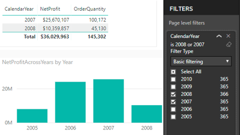
In this case, a page-level filter filters CalendarYear from the Date table to values 2007 and 2008. The first Table visual returns data only for these years (no issues here). But the Chart visual shows data for all years. Follow these steps to get the Chart visual to work as shown:

You need a new measure to ignore the dimension filter. However, the key to get this to work is to use the field form the fact table on the report.

  1. Add the filter column (CalendarYear in this case) to the fact table. You can do this by different means, such as creating a DAX calculated column, creating a PowerQuery calculated column, or by PowerQuery merged queries (to look up the value from another table). The important thing is that you need to have the filtered field on the fact table.
  2. Use that field to the chart (not the one from the dimension table that the page-level filter uses).
  3. Create a measure that overwrites the filter and use that measure on the chart:

    NetProfitAcrossYears = CALCULATE(SUM(ResellerSales[NetProfit]), ALL(‘Date'[CalendarYear]))

    The measure ignores the filter on the CalendarYear field. This expands the filter context on the table to all years. Because the Year field used on the report is from the fact table, the net effect is that the data for all years is shown. This approach won’t work if the chart shows measures from two fact tables because you probably won’t have a relationship between them.

    In this post, I outlined several options to overwrite Power BI filters. It wouldn’t be nice if Microsoft enhances Edit Interactions to page and report-level filters to avoid changes to the data model.

PASS Summit 2018 Registration

Planning to attend the PASS Summit this year? The PASS Summit is the go-to conference for data professionals that will take place November 6-9, in Seattle, WA. You have two options to register:

  • Early bird registration priced at $1,699 has started and it will continue until March 23, 2018. As a bonus, use code LGSTRMZB8 at registration to get streaming access to all PASS Summit 2017 content!
  • Pay the regular price after March 23, 2018.

Visual-level Formatting in Power BI

Scenario: You want to overwrite the formatting of some field in a Power BI Visual, such as in the case of showing the field in one visual with decimals and  then in another without decimals. Or, you might want to overwrite the default format when connected live to a semantic model. You search left and right, bing the Internet, and still no clue as to why Power BI doesn’t have this feature.

Answer (that you probably won’t like): Most visuals already support display units and decimals. Table and matrix would probably get this feature very soon. We don’t have ETA for full custom format string override (per visual). Your vote counts so vote on ideas.powerbi.com.

As a best practice, I recommend applying format settings in the model so that it’s applied consistently to all reports.

In the narrower case of formatting measures, you can create a new measure and change its formatting. This also works when Power BI Desktop connects to a Tabular semantic model because you can create local DAX measures on top of the semantic model. Just create a measure that piggy-backs on an existing measure, whose format you want to change. Then, use the Formatting section to change its format.

020718_1703_Visuallevel1.png

Mark as Date Table in Power BI

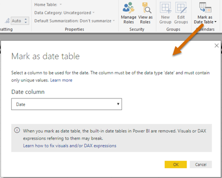
In my “Understanding Dates in Power BI Quick Measures” blog, I mentioned that having a Date table is a best practice but Quick Measures didn’t support it. Fortunately, the February update of Power BI Desktop fixes this. Now you can mark a Data table as such, as you’ve been able to do in Excel Power Pivot since the beginning.

020718_0319_PowerBIMark1.png

Marking a date table accomplishes three things:

  1. Disables the Power BI-generated date hierarchies (aka as inline hierarchies). Good riddance! Check the same blog for details of why inline hierarchies should be avoided.
  2. Allows you to use your Date table for time calculations in Quick Measures.
  3. Makes DAX time calculations work even if the relationship between a fact table and the Date table is created on a field that is not a date field, such as a smart integer key (YYYYMMDD). Previously, you had to create the relationship on a field of Date data type.

Reporting on Concatenated Field in DAX

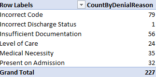
Scenario: You have a concatenated field stored in a table. For example, a medical claim might have several denial reasons. Instead of representing this as a Many-to-Many relationship, you’ve decided to store this a comma-delimited field, such as to allow the user to see all codes on one row. However, users are asking to produce counts grouped by each reason code, such as this one:

Solution: Follow these steps to implement a DAX measure that dynamically parses the string.

  1. Implement a DenialReason table with a single column DenialReason that stores the distinct reason codes. Add the table to your Power BI Desktop/Tabular model. Leaving it hanging without a relationship.
  2. Add a CountByDenialReason DAX measure that parses the string:

    CountByDenialReason :=
    CALCULATE (
        SUMX (
    Claim,
            IF (
                NOT ISEMPTY (
                    FILTER (
                        VALUES ( DenialReason[DenialReason] ),
                        PATHCONTAINS (
                            SUBSTITUTE ( Claim[DenialReason], “,”“|” ),
    DenialReason[DenialReason]
                        )
                    )
                ),
                1
            )
        )
    )

The NOT ISMPTY clause checks if the row contains any reasons. The PATHCONTAINS checks if the row has the denial reason whose context is passed from the report. In my case, the DenialReason field has a comma-delimited string if multiple reasons are stored on the row. Because PATHCONTAINS requires a pipe “|” delimiter, I use the SUBSTITUTE function to replace commas with pipes. If match is found for that reason, the IF operator returns one, which is summed in SUMX to return the actual count.

If you have a large table, you might get a better performance if you do the replacement in a wrapper SQL view or in Query Editor and avoid SUBSTITUTE altogether.

Business Value of Semantic Model

A while back I wrote about the ROI for BI and this blog happened to be one of my post popular blogs. I’m a big fan of a BI semantic model for the reasons I outlined in my “Why Semantic Layer” newsletter. Although written five years ago, these are still valid reasons and a semantic model plays a prominent role in every organizational BI solution.

But management cares about business value and not architectures. Allow me to share just one feedback that I got today from one of our insurance customers. In the insurance business, a loss triangle is very important way to analyze losses incurred from claims. Previously, it would take an actuary in this company a month to compile the data and produce a loss triangle report for several important measures, such as Loss Paid Inception to Date. With the semantic model we implemented, it takes seconds.

How long does it take you to compile your reports?

Power BI Sharing Got a Bit Better 2

A week ago, I wrote that Power BI sharing improved by giving you the ability to include specific reports and dashboards in an app. Recall that that there are three ways to share Power BI content: workspaces, apps, and dashboard sharing. Only the last two lets you share content out of a workspace, such as by sharing with free users if the workspace is in a Power BI Premium capacity.

The fast-changing cloud world brought in another nice enhancement this week: the ability to share reports, just like you could share dashboards.

Suppose you have published some content to a workspace and want to share some reports with a certain group of users and other reports with another group of users. An app can’t do it because there is a 1:1 relationship between an app and a workspace and in the process of creating an app you specify a fixed list of recipients. However, you can now share these reports individually without having to create a dashboard.

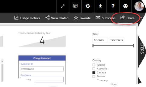
Once you open the report in powerbi.com, just click Share in the top-right corner, and you’ll be presented with the same options as when you share a dashboard. Again like dashboard sharing, you can share reports with external users thanks to the the Power BI B2B integration, as I explain in my last newsletter.

012818_2133_PowerBIShar1.png

Atlanta MS BI and Power BI Group Meeting on January 29th

MS BI fans, join us for the next Atlanta MS BI and Power BI Group meeting on January 29th at 6:30 PM. Julie Smith will hack sweet reports in Power BI. Innovative Architects will sponsor the meeting. And your humble correspondent will show you two new cool Power BI features: integration with PowerApps and Q&A in Power BI Desktop. For more details, visit our group page.

Presentation:H*ckin Sweet Reports with Power BI
Level: Intermediate
Date:January 29, 2018
Time6:30 – 8:30 PM ET
Place:South Terraces Building (Auditorium Room)
115 Perimeter Center Place
Atlanta, GA 30346
Overview:Power BI is constantly evolving; this session is an overview of the current elements of Power BI and ways to implement them, based on experience in the field using it. Topics include the Power BI Service, Power BI Desktop, Power BI Embedded, Pricing models and some details of Power BI Premium. Sample data set used in this presentation is from @Dog_Rates on Twitter.
Speaker:Julie Smith has spent close to 20 years moving data using varied tools such as MS Access, MySQL, and SQL Server versions 2000 and on. She is a Business Intelligence Consultant at Innovative Architects, where she has been implementing Power BI v2 and Azure solutions for the last couple of years.
Sponsor:Since 2005, Innovative Architects has been serving industries to help solve business and technology challenges. We provide business consulting, development and implementation services for Microsoft platforms which include BizTalk, SharePoint, .NET, Business Intelligence, Mobile Apps and much more.
Prototypes with Pizza“Power BI Writeback and Desktop Q&A” by Teo Lachev

092417_1708_AtlantaMSBI1.png