Posts

2-Day Applied Power BI Workshop – Atlanta

Are you looking for an agile self-service platform that doesn’t require reporting and query skills to get basic analytics done without reliance on IT?  Or, perhaps you’ve heard or evaluating Power BI but not sure where to start or how to take the most out of it? If so, this workshop is for you. A year ago Microsoft unveiled the new Power BI platform consisting of the PowerBI.com cloud service, Power BI Desktop, and Power BI Mobile. Since then, Prologika has helped organizations of all sizes to adopt Power BI. Packed with features, Power BI supports a dizzying variety of features and integration scenarios and it offers plenty to all types of users interested in data analytics: information workers, data analysts, BI pros, and developers.

Reserve your seat today to attend this insightful 2-day workshop for only $999 (use coupon POWERBI20160914 to get 10% discount when signing up two or more people) at the Microsoft Office in Alpharetta, when Teo Lachev (CEO of Prologika, a Power BI Red Carpet Partner) teaches you practical Power BI knowledge and data analytics skills that you can immediately apply to your job. See how Power BI can improve your usability and productivity even further.

Syllabus>>

Key Benefits

  • Understand how Power BI changed the way users (information workers, data analysts, BI pros, and developers) gain and share data insights.
  • Learn how to connect to popular cloud services to derive instant insights, create interactive reports and dashboards, and view them in the browser and on the go.
  • Discover how to integrate and transform data from virtually everywhere and then implement sophisticated self-service models and business calculations.
  • Find how to implement hybrid architectures and strict security requirements by leaving data on premise and deploying reports and dashboards to the cloud.
  • Learn how to share your BI artifacts and collaborate with other teammates.
  • Gain practical skills by creating a self-service model in the lab exercises.
  • Learn Power BI best practices, limitations (every tool has them) and workarounds.
  • Get your questions answered.
  • and much more…

You won’t want to miss this educational and engaging training event! Attend it and get a free paper copy of the book Applied Microsoft Power BI! Please register today as seating is limited.

Audience

  • Information workers
  • Business analysts
  • BI professionals
  • In general, anyone interested in self-service data analytics with Power BI

Prerequisites

Students are encouraged to bring their laptops for the exercises. Detail setup instructions and source files will be sent before the event.

Instructor

Teo Lachev is an internationally-recognized authority on Data Analytics and CEO of Prologika. Teo helps organizations make sense of their most valuable asset: their data. His strategy formulation, trusted advisory and mentoring, design and implementation services empower his clients to apply effectively data analytics in order to understand, improve, and transform their business. Teo has authored and coauthored several books and his latest one is “Applied Microsoft Power BI (Bring your data to life!)” He has been leading the Atlanta Microsoft Business Intelligence group since he founded it in 2010. Microsoft has recognized Teo’s expertise and contributions to the technical community by awarding him the prestigious Microsoft Most Valuable Professional (MVP) for Data Platform award since 2004.

Formulating a Power BI Enterprise Strategy Seminar – Atlanta


A year ago Microsoft unveiled the new Power BI platform consisting of the PowerBI.com cloud service, Power BI Desktop, and Power BI Mobile. Since then, Prologika has helped organizations of all sizes to plan and adopt Power BI. Packed with features, Power BI supports a dizzying variety of features and integration scenarios but it might be difficult to understand how Power BI fits in your data analytics ecosystem.

Join Prologika and Microsoft for a 3-hour free seminar on Wednesday, August 31th, 8:30 AM -12 PM ET, at the Microsoft Office in Alpharetta, when Teo Lachev (CEO of Prologika) and Brian Jackson (Cloud Solution Architect at Microsoft) share practical knowledge and experience to help you to formulate a Power BI enterprise strategy. If you’re considering Power BI but you’re not sure how it fits within your organizational data strategy, this event is for you.

Key Takeaways

  • Understand how Power BI changed the way users (information workers, data analysts, BI pros, and developers) gain and share data insights.
  • Learn 10 areas where Power BI excels compared to other popular BI tools, such as Tableau, Qlik Sense, Sisense, Domo, and others.
  • Plan a data access strategy for:
    • Importing data
    • Connecting live to cloud sources with content packs and solution templates
    • Connecting live to on-premises data sources
    • Implementing real-time dashboards
    • Embedded reporting
    • Taking a deep dive to learn how Prologika designed and implemented a hybrid architecture solution for a Fortune 50 organization and meet security requirements that prevented exporting data to the cloud
  • Join in a discussion about other business use cases and gaps between Power BI and other BI products, and find how to address them. Get your questions answered.

You won’t want to miss this educational and engaging event! Please register today as seating is limited: https://prologika.com/event/formulating-a-power-bi-enterprise-strategy/

Agenda

8:30-9:00 – Networking and introductions

9:00-10:30 – How Power BI empowers businesses like yours

10:30-10:40 – Break

10:40-11:45 – Plan a data access strategy and go “under the hood” of a hybrid architecture case study

11:45-12:00 – Q&A

Presenters

Teo Lachev is an internationally-recognized authority on Data Analytics and CEO of Prologika. Teo helps organizations make sense of their most valuable asset: their data. His strategy formulation, trusted advisory and mentoring, design and implementation services empower his clients to apply effectively data analytics in order to understand, improve, and transform their business. Teo has authored and coauthored several books and his latest one is “Applied Microsoft Power BI (Bring your data to life!)” Prologika is a Microsoft Gold Partner in Data Analytics, demonstrating a “best-in-class” ability and commitment to meet Microsoft customers’ evolving needs and distinguishing itself within the top one percent of Microsoft’s partner ecosystem. Learn more at www.prologika.com.

Brian Jackson is a Microsoft Certified Architect and Cloud Solution Architect at Microsoft. He has deep technical expertise in the SQL Server and Azure platform and served as a subject matter expert for Microsoft’s SQL Server Master and Business Intelligence certification programs. Brian has more than 20 years of experience in solution architecture and software development with a focus on business intelligence, data warehousing and database design. He has strong customer relationship skills with over 15 of years of IT consulting to several Fortune 500 companies and proven success in leading and delivering large scale implementations with globally distributed teams.

Going with the Flow

Currently in preview, Microsoft Flow is a cloud service for creating automation flows without writing code, similar to Zapier’s “zaps” and IFTTT’s “recipes”. How is this useful for BI? Let’s consider an example. Power BI has recently introduced data-driven alerts in Power BI Service (previously alerts were supported on iPhone only). Currently, alerts can be created only on single-card and gauge dashboard tiles that are connected to imported datasets. You can go to the tile properties and click the Manage Alerts (bell) icon to create an alert rule, such as “SalesAmount is above 1,000,000.”

080116_1325_Goingwithth1.png

When the alert rule condition is met, you are notified in the Power BI notification center and by e-mail. But what if you want to broadcast the alert to a large audience? Currently, this feature is not a Power BI native feature. Sure, you can forward the email manually but what if you’re on vacation or the alert is triggered outside working hours but you need to notify certain people immediately? Enters Microsoft Flow that allows you to create simple if-then-else flows. In the screenshot below, I’ve created a trigger that checks my Office 365 email account for emails sent from noreply@powerbi.com and the subject contains “Alert”. If this condition is met, the “yes” action forwards the email to additional people.

080116_1325_Goingwithth2.png

Microsoft flows has a comprehensive list of triggers and actions for integration with many popular services, such as Dynamics CRM, Salesforce, SQL Server, MailChimp, SharePoint, Facebook, GitHub, and many more. Naturally, Microsoft Flow integrates very well with Microsoft cloud and on-prem services. It also has an extensible architecture that allows developers to plug in additional services. Together with PowerApps, Microsoft Flow has a bright future to help you automate your business processes and get actionable insights.

Trend Lines in Power BI Charts

Recently, Power BI charts introduced trend lines. However, they require numeric or date values on X-axis, which must have a continuous type. In fact, if you use a text field for the X-axis, a warning indicator will be displayed in the top left corner of the chart to warn you that non-numeric values are used.

072916_0110_TrendLinesi1.png

This requirement presents issues if the report is connected to a Multidimensional cube because by default all attributes are text-based. As a workaround, in the Multidimensional project set the ValueColumn property of the attribute to a column in the underlying table of a numeric or date data type, and deploy the cube.

072916_0110_TrendLinesi2.png

Back to Power BI Desktop, bind the corresponding .Value field to the X-axis.

072916_0110_TrendLinesi3.png

Upgrading Power BI Desktop Models to Tabular

One great feature of Microsoft BI has been the continuum from personal BI to organizational BI. For example, a business user can start small with an Excel Power Pivot model which IT can restore at some point to a scalable Tabular model. In fact, if you know Microsoft personal BI (Power Pivot or Power BI Desktop), you already know 80% (or even more) of SSAS Tabular.

Unfortunately, currently there isn’t a supported way to restore Power BI Desktop models to Tabular or create a Tabular project from a pbix file. The reason is that because Power BI Desktop is changing on a monthly basis, it’s ahead of Tabular and currently Power BI Desktop doesn’t support backward compatibility. However, the following approach worked for me to upgrade Power BI Desktop to Tabular 2016.

  1. Power BI Desktop has a Tabular child process which is the workhorse for all data crunching you do on the desktop. This process uses a dynamic port. As a first step, you need to find that port. The easiest way to do so is to run Windows Resource Monitor (in the Windows search bar, type resmon). Then, flip to the Network tab, and in the Listing Ports section, find “msmdsrv.exe”, and then note the port number. In my case, I have a few instances of msmdsrv because I run dedicated instances of Multidimensional and Tabular but I found that the PBI Tabular instance ports start above 10000 so it should be easy to identify the instance.

    071016_1926_UpgradingPo1.png

  2. Now that you have the port number, open SSMS 2016 (you can download it from here), and connect to that Tabular instance, using the syntax: localhost:<port number>. For example, to connect to the highlighted instance, in SSMS I’ll Connect ð Analysis Services, and then enter localhost:42030.

TIP: You can also use the SQL Profiler to connect to the PBI Tabular instance and do profiling using SQL Profiler, as Adam Saxton demonstrates here, or using DAX Studio, which by the way automatically enumerates the Power BI Desktop instances.

  1. Right-click the database (the database name is a guid), and click Script ð Script Database As ð CREATE TO ð Clipboard. This will export the database schema in the new JSON format.
  2. Connect to the Tabular instance that will host the database, and create a new Analysis Services XMLA Query, and paste the script. One of the changes you want to make here is to rename the database by change the name element at the beginning of the file so you don’t end up with the same guid for the database name.
  3. Execute the script to create the new database. If you get an error, you should be able to change the script and strip code for features that Tabular doesn’t support. Now that we have JSON-based schema, making such changes should be much easier.

Now you can use SSDT to create a project by importing the Tabular database and continue making changes to the project.

Power BI Quick Calculations

DAX is very powerful but it could entail a steep learning curve for novice users. Power BI Desktop has started on the road of delivering pre-packaged calculations. The first one is Percent of Grand Total. Once you add a measure to the Values zone, you can expand the measure drop-down and click Quick Calc. This is similar to how you would pick one of the default aggregation functions.

061916_2118_PowerBIQuic1.png

Interestingly, Power BI Desktop doesn’t add a new calculation when the Quick Calc feature is used. Instead, it probably creates an implicit DAX measure and you can’t see the formula. The original measure is renamed to %GT <original measure name>.

061916_2118_PowerBIQuic2.png

Prepackaged calculations are a frequently requested Power BI feature. Expect additional quick calculations to light up soon. As a recommendation for improvement, I think that it would be nice to be able to see the DAX formula behind the quick calc.

Prologika Newsletter Summer 2016

Why Choose Power BI as BI Platform


061916_1807_PrologikaNe2.pngAre you deciding which BI platform to adopt? With so many vendors and products, you are not alone and the choice is far from easy. For the past few months, I’ve consulted with and mentored several large publicly traded companies to help them understand the benefits of Power BI and teach their staff on how to get the most out of it. Speaking of Power BI and large organizations, Prologika added a new Power BI case study to the Power BI partner showcase that demonstrates why the world’s largest logistic company decided to standardize on a single platform and adopt Power BI. Last but not least, if you are in Atlanta, visit our Atlanta MS BI group which is now the only official local Power BI group. So, if you’re serious about Power BI, check our monthly meetings which now feature plenty of Power BI content.


In this newsletter, I’ll enumerate the most important advantages of Power BI that make it stand out from the rest of the competing platforms. Also, I’ll mention some areas my customers have identified where Power BI has left a room for improvement.

Overall

In this section, I’ll review some general implementation and cost considerations that in my opinion make Power BI a very compelling choice.

  1. Data Platform – No matter how good it is, a self-service visualization tool addresses only a small subset of data analytics needs. By contrast, Power BI is a part of the Microsoft Data Platform that allows you to implement versatile solutions and use Power BI as a presentation layer. Want to implement a real-time dashboard from data streams? Azure Stream Analytics and IoT integrates Power BI. What to show reports on the desktop from natural questions? Cortana lets you do it by typing questions or voice. Want to implement smart reports with predicted results? Power BI can integrate with Azure Machine Learning? Want to publish SSRS and Excel reports? Power BI supports this. Expect this strength to increase as Cortana Analytics Suite and prepackaged solutions evolve.
  2. Cloud First – I know that many of you might disagree here as on-premises data analytics is currently more common, but I see the cloud nature of Power BI as an advantage because allows Microsoft to push out new features much faster than the typical 2-year major release cadence of other vendors. Recall that Power BI Service is updated on a weekly basis while Power BI Desktop is on a monthly release cadence. And because Power BI is a cloud service, it supports the versatile integration scenarios I mentioned before.
  3. Cost – It’s hard to compete with a freemium pricing model. Implementing a BI solution has been traditionally cost prohibitive. However, now Power BI Desktop is free, Power BI Mobile apps are free, Power BI Service is mostly free. If you need the Power BI Pro features, Power BI is packaged with the Office 365 E5 plan, it has an enterprise license, and I’ve heard customers get further discounts from Microsoft.

Next, I’ll review specific Power BI strengths for different user types.

Business Users

By “business users”, I’ll mean information workers that don’t have the necessary skills or desire to create data models.

  1. Content packs and Get Data – Basic data analytics needs can be met in Power BI without modeling. For example, if the user is interested in analyzing data from Salesforce, the user can use the Salesforce content pack and get predefined reports and dashboards. Further, the user can create their own reports from the dataset included in the content pack. What if your cloud data sources have a lot of data and content packs are impractical? Microsoft is rolling out pre-configured scalable solutions (currently, Salesforce and Dynamics CRM).
  2. Productivity features – Power BI has several features that resonate very well with business users. Q&A allows users to ask natural questions, such as “sales last year by country”. Power BI interprets the question and shows the most suitable visualization which the user can change if needed. Within 20 seconds, Quick Insights applies machine learning algorithms that help business users perform root cause analysis and to get insights that aren’t easily discernible by slicing and dicing, such as to find why profit is significantly lower in December. Such productivity features are missing in competing products.

Data Analysts

Data analysts (power users) are the primary audience for self-service BI. Power BI excels in the following areas:

  1. Data shaping and transformations – Source data is rarely clean. Excel Power Query and Power BI Desktop queries allow the data analysts to perform a variety of basic and advanced data transformations. For example, these features could help the data analyst shape the data without staging it first to a relational database.
  2. Sophisticated data models – Power BI offers much more advanced modeling experience where a data analyst can build a self-service model on a par with semantic models implemented by BI pros. For example, the model can have multiple fact tables and conformed dimensions. Power BI supports one-to-many and many-to-many relationships.
  3. Powerful programming language – The Data Analysis Expressions (DAX) excels any other vendor’s programming language.

BI and IT Pros

Besides the ability to integrate Power BI to implement synergistic solutions, pros can build hybrid solutions:

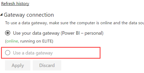
  1. Hybrid solutions – Want to get the best of both worlds: always on the latest visuals while leaving data on premises? Power BI lets you connect to your data on premises.
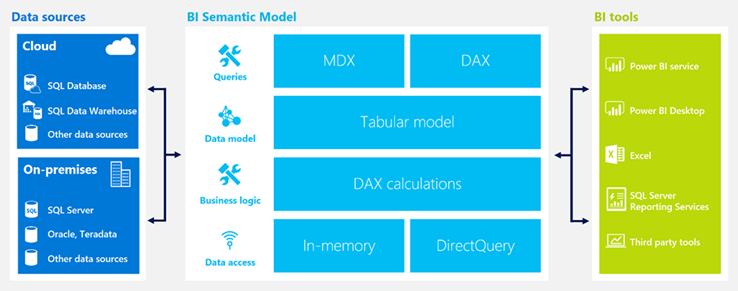
  2. Semantic layer – Many organizations are considering a semantic layer to achieve a single-version of the truth. If your staff is experienced in Power BI modeling, you’ll find that they already have 80-90% of the knowledge they need to implement a Microsoft-based semantic layer with Analysis Services Tabular. This gives you a nice continuum from self-service to organizational BI. For more information about why a semantic layer is important, read my newsletter “Why Semantic Layer?”.

Developers

Developers has much to gain from the Power BI open extensible architecture.

  1. Custom visuals – Power BI allow developers implement custom visuals which can be optionally shared to Power BI Visuals Gallery.
  2. Extensibility – Power BI has a comprehensive REST API that allow developers to integrate Power BI with custom apps. For example, Power BI let developers push data into datasets for real-time dashboards and manipulate deployed objects programatically. Power BI Embedded, currently in preview, allows developers to embed interactive reports without requiring installation of tools and with very attractive licensing model.

Improvement Areas

Here are some areas that customers have identified where Power BI needs improvement:

  1. Direct Query – Currently, Direct Query is limited to a single data source. Microsoft should extend Direct Query to support multiple data sources within a single model.
  2. File size limits – Power BI Service (powerbi.com) is currently limited to 1 GB maximum file size. Some customers have indicated that their data analysts require larger file extracts. My personal advise has been that such large extracts should be avoided in favor of a centralized semantic layer.
  3. DAX complexity – Customers have expressed concerns about the DAX complexity that the lack of quick calculations. Microsoft has already started addressing this by adding the Percent of Total quick calculations. Expect other calculations to light up shortly.
  4. Variables – One large organization transitioning from Qlik/Tableau has pointed out that Power BI lacks variables and parameters, such as to dynamically bind several visualizations to a measure that is chosen as a parameter.
  5. Exporting reports and datasets from Power BI Service to Power BI Desktop – This is currently not supported but high on the Power BI roadmap.
  6. Predictive capabilities – Currently, besides using R or integrating with Azure Machine Learning, Power BI doesn’t have native forecasting capabilities, such as to forecast future months. This is a frequently requested feature and very high on the roadmap.
  7. Drillthrough limitations – Different drillthrough options in Power BI has different limitations. For example, exporting to CSV is limited to 10,000 rows, while drilling through a chart data point is limited to 1,000 rows. This limits will probably lifted in Power BI Pro. Meanwhile, you can use the Analyze in Excel feature and drillthrough in Excel pivot reports which gives you an option to drill through 1,048,576 rows.
  8. Data reduction algorithms – Currently, Power BI visualizations employ data reduction algorithms to limit the number of data points to plot. This is high on the roadmap and there is a work underway to address this limitation.
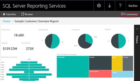
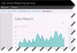
  9. Replacement for paginated reports – Some organizations have hoped that Power BI can be a replacement of other vendors’ products for paginated (pixel-perfect) reports. Power BI reports are designed for quick data exploration and not as paginated reports. However, SSRS is the Microsoft product for paginated reports. Moreover, SSRS 2016 has been extended significantly to fulfill a very important role in the Microsoft on-premises reporting roadmap.
  10. Maturity – I often hear that Power BI is great but it’s not mature. In my opinion, you should view Power BI to be as mature (or even more mature) as other tools. That’s because the Power BI building blocks have been around for many years, including xVelocity (the in-memory data engine where imported data is stored), Power Query, Power Pivot, Power View, Tabular, and Azure cloud infrastructure.

MS BI Events in Atlanta

As you’d probably agree, the BI landscape is fast-moving and it might be overwhelming. If you need any help with planning and implementing your next-generation BI solution, don’t hesitate to contact me. As a Microsoft Gold Partner and premier BI firm, you can trust us to help you plan and implement your data analytics projects, and rest assured that you’ll get the best service.

Regards,

sig-1
Teo Lachev
Prologika, LLC | Making Sense of Data
Microsoft Partner | Gold Data Analytics

Power BI Enterprise Content Sharing

I taught Power BI to a large organization this week. Naturally, they were interested in sharing content across multiple departments and even entire organization. Let’s revisit the sharing options available in Power BI which I summarize in the following table.

052316_0116_PowerBIEnte1.png

  • Simple sharing – This is the only option available in Power BI Free. It allows sharing real-only dashboards and underlying reports to a small audience, such as with your boss or with a few coworkers. The content author would typically invite recipients by email. Recipients can’t change the shared dashboards and reports that someone else shared with them.
  • Groups – Power BI groups (workspaces) are based on Office 365 unified groups. Anyone with a Power BI Pro subscription can create a group and add other users to the group. In the process of creating a group, the group owner specifies the group privacy level (private or public) and content access (edit or read-only). Groups are great to share content with members of a team, such as Sales, Finance, or a project. Public groups might seem like a convenient way to share content across the entire organization but they aren’t really “public” because a user still needs to add himself to the group. Once the group is created (give it some 30 minutes to become discoverable), the user can find the group in Outlook and add himself as a member of the group. So, public groups are public to the extent of allowing end users to gain membership without an administrator formally approving them. However, to share content across the entire organization, you probably won’t want to add every user to the group, especially considering that Power BI groups don’t currently support membership via AD groups or distribution lists.
  • Organizational content pack – Similar to service content packs, organizational content packs allow the author to package and distribute content to any user or group (distribution and AD groups are supported) who’s interested in the content pack. Organizational content packs are discoverable in the Power BI Content Pack Library (in powerbi.com, click Get Data ð Organization). Content packs are designed for broader content delivery. By default, the content pack is read-only but users can create personal write copies of packaged dashboards and reports. So content packs are flexible.

To recap, if you need to distribute content across multiple departments or entire organization, organizational content packs should be the way to go.

Power BI vs. Tableau (Part 1)

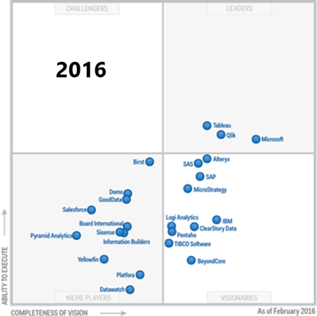
As I mentioned in my blog “Why Business Like Yours Choose Power BI Over SiSense”, expect attack from other vendors to intensify as they find themselves fighting an increasingly uphill battle against Power BI. As we’ve seen, Power BI has indeed disrupted their sales cycles. In this blog, I’m reviewing the “10 Ways Power BI Falls Short” presentation that Tableau has published on their site. Tableau, of course, is a fine tool for what it’s designed to do – mainly self-service BI. But as we’ve all seen tools come and go as seasons. A few years ago it was all about Qlik, then Tableau, and now 2016 seems to be the year of Power BI. My advice has always been that the focus should be on sound strategy, data integration, and data quality, and not tools. The last thing you want is a “cool” tool that over promises but under delivers and you’re left with nothing when you decide to move on (and some of the vendors really cross the line during their sales pitch). So, we have to keep them honest!

Anyway, let’s take a look at some the claims that Tableau has made by going through their slides. This is, of course, a one-sided perspective that extolls the Tableau virtues. I plan a future post “10 Ways Tableau Falls Short” to fill in the gap. Also, Tableau should get in the habit to update this document frequently given the fact that Power BI changes weekly and some of the claims are no longer valid.

  1. Missing outliers are lost insights – Tableau has a point here. For some obscure reason, Power BI developers has decided to apply a data reduction algorithm to favor performance over details. True, this might result in lost outliers with thousands of data points. I recommend Microsoft allow end users to adjust the data reduction settings. I know this limitation is high on the wish list and I expect it to be addressed/lifted really soon. UPDATE 9/13/2017 – As of this date, all Power BI visuals except map supports rendering of all data points. UPDATE 1/8/2017 – As of the December 2017 update of Power BI, maps are high-density too.
  2. Difficult to answer easy questions – This refers to the fact that currently Power BI doesn’t support auto-generating common calculations. Fair enough, Power BI doesn’t support this yet but the statement “you’ll need to learn DAX first” is somewhat overloaded. There are plenty of DAX examples online of how to implement common calculations so there isn’t that much to learn. And DAX is much more powerful than Tableau expressions. UPDATE 10/1/2016 – Power BI introduced Quick Calc with the Percentage of Total being the only one currently available. UPDATE 4/3/2017 – Better yet, Power BI introduced Quick Measures, which supports various prepackaged calculations and show the DAX formula.
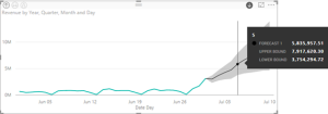
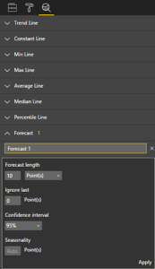
  3. No trends or forecasting available – Power BI just added trendlines. For now, forecasting needs to be done either in Excel or R. I don’t know why Power BI still hasn’t picked the linear forecasting capabilities that Power BI for Office 365 had. Another feature that is very high on the wish list so I don’t expect you have to wait long for forecasting. UPDATE 10/1/2016 – Power BI added time series forecasting. It also added Explain Increase/Decrease machine learning algorithms in Power BI Desktop.
  4. You can’t compare several categories – If I understand this correctly, it refers to ability to drill down across multiple categories. Power BI matrix reports should get the job done. Also, Power BI has recently added the ability to drill through chart data points.
    050416_0229_PowerBIvsTa1.png
  5. Filtering is tough – Tableau is correct that Power BI doesn’t support context filtering but the statement “You’d have to take the time to filter everything around it, one-by-one, instead” is overloaded. It shouldn’t be that difficult to filter out values using visual-level, page, or report filters. It might take a few more clicks, but I won’t consider this to be a major limitation.
  6. Half the details = Half the insight. True, Power BI tooltips are not yet customizable. Should important information be in tooltips though and require hovering from one point to next? UPDATE 10/1/2016 – Tooltips are now customizable.
  7. Organizing your data is difficult – True, Power BI doesn’t support dynamic groups, e.g. by lassoing some scatter points. I personally haven’t heard users complaining or asking about it so I don’t consider it to be a major limitation. Power BI does support hierarchies. UPDATE 11/1/2016 Power BI Desktop October Release introduced dynamic groups and binning in charts.
  8. No offline iterations allowed – “In Power BI, you can do some basic web editing, but you can’t download it to your desktop or work offline” This is incorrect. First, web report editing it’s on a par with desktop editing. Second, a best practice is to create your reports in Power BI Desktop and upload to powerbi.com. If you do this, you can download the pbix file and work offline. Moreover, Tableau web editing has more limitations than Power BI.
  9. You can’t tell a story – Outdated. Power BI added a Narratives for Power BI. Coupled with Quick Insights, these features surpass the Tableau capabilities. UPDATE 10/9/2017 Power BI also added bookmarks, selection pane, and spotlight.
    050416_0229_PowerBIvsTa2.png
  10. You can’t ask what-if questions – True, Power BI doesn’t support What-If natively yet. If this is important, you can export the visual data to Excel and use the Excel what-if, goal seek, and scenario capabilities. UPDATE 9/13/2017 – August release introduced What-If parameters and analysis

Overall, I believe that some of the points Tableau makes are insignificant while Power BI has already addressed others. Agree? Stay tuned for a “10 Ways Tableau Falls Short” blog.

Drilling Through in Power BI

Excel users are familiar with drilling through details by double-clicking a cell in a PivotTable report or PivotChart data point. Power BI has silently added a similar feature to let users see the level of detail behind a chart data point in both Power BI Desktop and Power BI Service. This option can be enabled per visual by turning on the See Records option in Power BI Desktop or the same option from the Explore menu when viewing a report in powerbi.com. Interestingly, it’s also available when you right-click a data point in Power BI Desktop (this is the first time I’ve seen a context menu to work in Power BI).

050216_0146_DrillingThr1.png

Once you enable it, clicking on a chart data point doesn’t trigger interactive highlighting (the default behavior). Instead, it navigates you to a new page that auto-generates a Table report whose filters inherit the filters on the main report. Interestingly, drilling through works even the main report has a multi-valued filter (it took Excel all the way to 2016 to support multi-valued filters for drilling through).

050216_0146_DrillingThr2.png

I think Power BI defaults to 1,000 rows by default and I don’t see a way to change this limit. It the drillthrough action results in more rows, a warning icon is displayed in the upper left corner of the report. It’s not clear how Power BI preselects which columns to show in the drillthrough report but you can always use the Fields list to add/remove fields. That’s another great feature that Excel drillthrough didn’t support and required custom SSAS actions to support. Also, instead of auto-generated field captions the report shows the actual field names (another welcome feature that Excel doesn’t support). Unfortunately, currently Power BI doesn’t support drilling through cells in Tabular and Matrix reports.

Power BI “See Records” feature adds drilling-through capabilities to chart and map visuals to allow users to see the rows that contribute to the aggregated value. Users would love this feature as it’s more versatile than Excel drill-through and completely missing in Power View reports.

Downloads

Nothing Found

Sorry, no posts matched your criteria