Posts

Prologika Newsletter Summer 2016

Why Choose Power BI as BI Platform


061916_1807_PrologikaNe2.pngAre you deciding which BI platform to adopt? With so many vendors and products, you are not alone and the choice is far from easy. For the past few months, I’ve consulted with and mentored several large publicly traded companies to help them understand the benefits of Power BI and teach their staff on how to get the most out of it. Speaking of Power BI and large organizations, Prologika added a new Power BI case study to the Power BI partner showcase that demonstrates why the world’s largest logistic company decided to standardize on a single platform and adopt Power BI. Last but not least, if you are in Atlanta, visit our Atlanta MS BI group which is now the only official local Power BI group. So, if you’re serious about Power BI, check our monthly meetings which now feature plenty of Power BI content.


In this newsletter, I’ll enumerate the most important advantages of Power BI that make it stand out from the rest of the competing platforms. Also, I’ll mention some areas my customers have identified where Power BI has left a room for improvement.

Overall

In this section, I’ll review some general implementation and cost considerations that in my opinion make Power BI a very compelling choice.

  1. Data Platform – No matter how good it is, a self-service visualization tool addresses only a small subset of data analytics needs. By contrast, Power BI is a part of the Microsoft Data Platform that allows you to implement versatile solutions and use Power BI as a presentation layer. Want to implement a real-time dashboard from data streams? Azure Stream Analytics and IoT integrates Power BI. What to show reports on the desktop from natural questions? Cortana lets you do it by typing questions or voice. Want to implement smart reports with predicted results? Power BI can integrate with Azure Machine Learning? Want to publish SSRS and Excel reports? Power BI supports this. Expect this strength to increase as Cortana Analytics Suite and prepackaged solutions evolve.
  2. Cloud First – I know that many of you might disagree here as on-premises data analytics is currently more common, but I see the cloud nature of Power BI as an advantage because allows Microsoft to push out new features much faster than the typical 2-year major release cadence of other vendors. Recall that Power BI Service is updated on a weekly basis while Power BI Desktop is on a monthly release cadence. And because Power BI is a cloud service, it supports the versatile integration scenarios I mentioned before.
  3. Cost – It’s hard to compete with a freemium pricing model. Implementing a BI solution has been traditionally cost prohibitive. However, now Power BI Desktop is free, Power BI Mobile apps are free, Power BI Service is mostly free. If you need the Power BI Pro features, Power BI is packaged with the Office 365 E5 plan, it has an enterprise license, and I’ve heard customers get further discounts from Microsoft.

Next, I’ll review specific Power BI strengths for different user types.

Business Users

By “business users”, I’ll mean information workers that don’t have the necessary skills or desire to create data models.

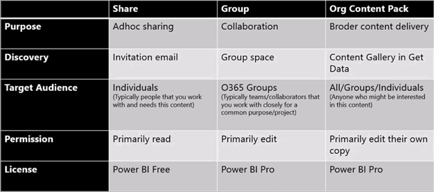
  1. Content packs and Get Data – Basic data analytics needs can be met in Power BI without modeling. For example, if the user is interested in analyzing data from Salesforce, the user can use the Salesforce content pack and get predefined reports and dashboards. Further, the user can create their own reports from the dataset included in the content pack. What if your cloud data sources have a lot of data and content packs are impractical? Microsoft is rolling out pre-configured scalable solutions (currently, Salesforce and Dynamics CRM).
  2. Productivity features – Power BI has several features that resonate very well with business users. Q&A allows users to ask natural questions, such as “sales last year by country”. Power BI interprets the question and shows the most suitable visualization which the user can change if needed. Within 20 seconds, Quick Insights applies machine learning algorithms that help business users perform root cause analysis and to get insights that aren’t easily discernible by slicing and dicing, such as to find why profit is significantly lower in December. Such productivity features are missing in competing products.

Data Analysts

Data analysts (power users) are the primary audience for self-service BI. Power BI excels in the following areas:

  1. Data shaping and transformations – Source data is rarely clean. Excel Power Query and Power BI Desktop queries allow the data analysts to perform a variety of basic and advanced data transformations. For example, these features could help the data analyst shape the data without staging it first to a relational database.
  2. Sophisticated data models – Power BI offers much more advanced modeling experience where a data analyst can build a self-service model on a par with semantic models implemented by BI pros. For example, the model can have multiple fact tables and conformed dimensions. Power BI supports one-to-many and many-to-many relationships.
  3. Powerful programming language – The Data Analysis Expressions (DAX) excels any other vendor’s programming language.

BI and IT Pros

Besides the ability to integrate Power BI to implement synergistic solutions, pros can build hybrid solutions:

  1. Hybrid solutions – Want to get the best of both worlds: always on the latest visuals while leaving data on premises? Power BI lets you connect to your data on premises.
  2. Semantic layer – Many organizations are considering a semantic layer to achieve a single-version of the truth. If your staff is experienced in Power BI modeling, you’ll find that they already have 80-90% of the knowledge they need to implement a Microsoft-based semantic layer with Analysis Services Tabular. This gives you a nice continuum from self-service to organizational BI. For more information about why a semantic layer is important, read my newsletter “Why Semantic Layer?”.

Developers

Developers has much to gain from the Power BI open extensible architecture.

  1. Custom visuals – Power BI allow developers implement custom visuals which can be optionally shared to Power BI Visuals Gallery.
  2. Extensibility – Power BI has a comprehensive REST API that allow developers to integrate Power BI with custom apps. For example, Power BI let developers push data into datasets for real-time dashboards and manipulate deployed objects programatically. Power BI Embedded, currently in preview, allows developers to embed interactive reports without requiring installation of tools and with very attractive licensing model.

Improvement Areas

Here are some areas that customers have identified where Power BI needs improvement:

  1. Direct Query – Currently, Direct Query is limited to a single data source. Microsoft should extend Direct Query to support multiple data sources within a single model.
  2. File size limits – Power BI Service (powerbi.com) is currently limited to 1 GB maximum file size. Some customers have indicated that their data analysts require larger file extracts. My personal advise has been that such large extracts should be avoided in favor of a centralized semantic layer.
  3. DAX complexity – Customers have expressed concerns about the DAX complexity that the lack of quick calculations. Microsoft has already started addressing this by adding the Percent of Total quick calculations. Expect other calculations to light up shortly.
  4. Variables – One large organization transitioning from Qlik/Tableau has pointed out that Power BI lacks variables and parameters, such as to dynamically bind several visualizations to a measure that is chosen as a parameter.
  5. Exporting reports and datasets from Power BI Service to Power BI Desktop – This is currently not supported but high on the Power BI roadmap.
  6. Predictive capabilities – Currently, besides using R or integrating with Azure Machine Learning, Power BI doesn’t have native forecasting capabilities, such as to forecast future months. This is a frequently requested feature and very high on the roadmap.
  7. Drillthrough limitations – Different drillthrough options in Power BI has different limitations. For example, exporting to CSV is limited to 10,000 rows, while drilling through a chart data point is limited to 1,000 rows. This limits will probably lifted in Power BI Pro. Meanwhile, you can use the Analyze in Excel feature and drillthrough in Excel pivot reports which gives you an option to drill through 1,048,576 rows.
  8. Data reduction algorithms – Currently, Power BI visualizations employ data reduction algorithms to limit the number of data points to plot. This is high on the roadmap and there is a work underway to address this limitation.
  9. Replacement for paginated reports – Some organizations have hoped that Power BI can be a replacement of other vendors’ products for paginated (pixel-perfect) reports. Power BI reports are designed for quick data exploration and not as paginated reports. However, SSRS is the Microsoft product for paginated reports. Moreover, SSRS 2016 has been extended significantly to fulfill a very important role in the Microsoft on-premises reporting roadmap.
  10. Maturity – I often hear that Power BI is great but it’s not mature. In my opinion, you should view Power BI to be as mature (or even more mature) as other tools. That’s because the Power BI building blocks have been around for many years, including xVelocity (the in-memory data engine where imported data is stored), Power Query, Power Pivot, Power View, Tabular, and Azure cloud infrastructure.

MS BI Events in Atlanta

As you’d probably agree, the BI landscape is fast-moving and it might be overwhelming. If you need any help with planning and implementing your next-generation BI solution, don’t hesitate to contact me. As a Microsoft Gold Partner and premier BI firm, you can trust us to help you plan and implement your data analytics projects, and rest assured that you’ll get the best service.

Regards,

sig-1
Teo Lachev
Prologika, LLC | Making Sense of Data
Microsoft Partner | Gold Data Analytics

Power BI Enterprise Content Sharing

I taught Power BI to a large organization this week. Naturally, they were interested in sharing content across multiple departments and even entire organization. Let’s revisit the sharing options available in Power BI which I summarize in the following table.

052316_0116_PowerBIEnte1.png

  • Simple sharing – This is the only option available in Power BI Free. It allows sharing real-only dashboards and underlying reports to a small audience, such as with your boss or with a few coworkers. The content author would typically invite recipients by email. Recipients can’t change the shared dashboards and reports that someone else shared with them.
  • Groups – Power BI groups (workspaces) are based on Office 365 unified groups. Anyone with a Power BI Pro subscription can create a group and add other users to the group. In the process of creating a group, the group owner specifies the group privacy level (private or public) and content access (edit or read-only). Groups are great to share content with members of a team, such as Sales, Finance, or a project. Public groups might seem like a convenient way to share content across the entire organization but they aren’t really “public” because a user still needs to add himself to the group. Once the group is created (give it some 30 minutes to become discoverable), the user can find the group in Outlook and add himself as a member of the group. So, public groups are public to the extent of allowing end users to gain membership without an administrator formally approving them. However, to share content across the entire organization, you probably won’t want to add every user to the group, especially considering that Power BI groups don’t currently support membership via AD groups or distribution lists.
  • Organizational content pack – Similar to service content packs, organizational content packs allow the author to package and distribute content to any user or group (distribution and AD groups are supported) who’s interested in the content pack. Organizational content packs are discoverable in the Power BI Content Pack Library (in powerbi.com, click Get Data ð Organization). Content packs are designed for broader content delivery. By default, the content pack is read-only but users can create personal write copies of packaged dashboards and reports. So content packs are flexible.

To recap, if you need to distribute content across multiple departments or entire organization, organizational content packs should be the way to go.

Power BI vs. Tableau (Part 1)

As I mentioned in my blog “Why Business Like Yours Choose Power BI Over SiSense”, expect attack from other vendors to intensify as they find themselves fighting an increasingly uphill battle against Power BI. As we’ve seen, Power BI has indeed disrupted their sales cycles. In this blog, I’m reviewing the “10 Ways Power BI Falls Short” presentation that Tableau has published on their site. Tableau, of course, is a fine tool for what it’s designed to do – mainly self-service BI. But as we’ve all seen tools come and go as seasons. A few years ago it was all about Qlik, then Tableau, and now 2016 seems to be the year of Power BI. My advice has always been that the focus should be on sound strategy, data integration, and data quality, and not tools. The last thing you want is a “cool” tool that over promises but under delivers and you’re left with nothing when you decide to move on (and some of the vendors really cross the line during their sales pitch). So, we have to keep them honest!

Anyway, let’s take a look at some the claims that Tableau has made by going through their slides. This is, of course, a one-sided perspective that extolls the Tableau virtues. I plan a future post “10 Ways Tableau Falls Short” to fill in the gap. Also, Tableau should get in the habit to update this document frequently given the fact that Power BI changes weekly and some of the claims are no longer valid.

  1. Missing outliers are lost insights – Tableau has a point here. For some obscure reason, Power BI developers has decided to apply a data reduction algorithm to favor performance over details. True, this might result in lost outliers with thousands of data points. I recommend Microsoft allow end users to adjust the data reduction settings. I know this limitation is high on the wish list and I expect it to be addressed/lifted really soon. UPDATE 9/13/2017 – As of this date, all Power BI visuals except map supports rendering of all data points. UPDATE 1/8/2017 – As of the December 2017 update of Power BI, maps are high-density too.
  2. Difficult to answer easy questions – This refers to the fact that currently Power BI doesn’t support auto-generating common calculations. Fair enough, Power BI doesn’t support this yet but the statement “you’ll need to learn DAX first” is somewhat overloaded. There are plenty of DAX examples online of how to implement common calculations so there isn’t that much to learn. And DAX is much more powerful than Tableau expressions. UPDATE 10/1/2016 – Power BI introduced Quick Calc with the Percentage of Total being the only one currently available. UPDATE 4/3/2017 – Better yet, Power BI introduced Quick Measures, which supports various prepackaged calculations and show the DAX formula.
  3. No trends or forecasting available – Power BI just added trendlines. For now, forecasting needs to be done either in Excel or R. I don’t know why Power BI still hasn’t picked the linear forecasting capabilities that Power BI for Office 365 had. Another feature that is very high on the wish list so I don’t expect you have to wait long for forecasting. UPDATE 10/1/2016 – Power BI added time series forecasting. It also added Explain Increase/Decrease machine learning algorithms in Power BI Desktop.
  4. You can’t compare several categories – If I understand this correctly, it refers to ability to drill down across multiple categories. Power BI matrix reports should get the job done. Also, Power BI has recently added the ability to drill through chart data points.
    050416_0229_PowerBIvsTa1.png
  5. Filtering is tough – Tableau is correct that Power BI doesn’t support context filtering but the statement “You’d have to take the time to filter everything around it, one-by-one, instead” is overloaded. It shouldn’t be that difficult to filter out values using visual-level, page, or report filters. It might take a few more clicks, but I won’t consider this to be a major limitation.
  6. Half the details = Half the insight. True, Power BI tooltips are not yet customizable. Should important information be in tooltips though and require hovering from one point to next? UPDATE 10/1/2016 – Tooltips are now customizable.
  7. Organizing your data is difficult – True, Power BI doesn’t support dynamic groups, e.g. by lassoing some scatter points. I personally haven’t heard users complaining or asking about it so I don’t consider it to be a major limitation. Power BI does support hierarchies. UPDATE 11/1/2016 Power BI Desktop October Release introduced dynamic groups and binning in charts.
  8. No offline iterations allowed – “In Power BI, you can do some basic web editing, but you can’t download it to your desktop or work offline” This is incorrect. First, web report editing it’s on a par with desktop editing. Second, a best practice is to create your reports in Power BI Desktop and upload to powerbi.com. If you do this, you can download the pbix file and work offline. Moreover, Tableau web editing has more limitations than Power BI.
  9. You can’t tell a story – Outdated. Power BI added a Narratives for Power BI. Coupled with Quick Insights, these features surpass the Tableau capabilities. UPDATE 10/9/2017 Power BI also added bookmarks, selection pane, and spotlight.
    050416_0229_PowerBIvsTa2.png
  10. You can’t ask what-if questions – True, Power BI doesn’t support What-If natively yet. If this is important, you can export the visual data to Excel and use the Excel what-if, goal seek, and scenario capabilities. UPDATE 9/13/2017 – August release introduced What-If parameters and analysis

Overall, I believe that some of the points Tableau makes are insignificant while Power BI has already addressed others. Agree? Stay tuned for a “10 Ways Tableau Falls Short” blog.

Drilling Through in Power BI

Excel users are familiar with drilling through details by double-clicking a cell in a PivotTable report or PivotChart data point. Power BI has silently added a similar feature to let users see the level of detail behind a chart data point in both Power BI Desktop and Power BI Service. This option can be enabled per visual by turning on the See Records option in Power BI Desktop or the same option from the Explore menu when viewing a report in powerbi.com. Interestingly, it’s also available when you right-click a data point in Power BI Desktop (this is the first time I’ve seen a context menu to work in Power BI).

050216_0146_DrillingThr1.png

Once you enable it, clicking on a chart data point doesn’t trigger interactive highlighting (the default behavior). Instead, it navigates you to a new page that auto-generates a Table report whose filters inherit the filters on the main report. Interestingly, drilling through works even the main report has a multi-valued filter (it took Excel all the way to 2016 to support multi-valued filters for drilling through).

050216_0146_DrillingThr2.png

I think Power BI defaults to 1,000 rows by default and I don’t see a way to change this limit. It the drillthrough action results in more rows, a warning icon is displayed in the upper left corner of the report. It’s not clear how Power BI preselects which columns to show in the drillthrough report but you can always use the Fields list to add/remove fields. That’s another great feature that Excel drillthrough didn’t support and required custom SSAS actions to support. Also, instead of auto-generated field captions the report shows the actual field names (another welcome feature that Excel doesn’t support). Unfortunately, currently Power BI doesn’t support drilling through cells in Tabular and Matrix reports.

Power BI “See Records” feature adds drilling-through capabilities to chart and map visuals to allow users to see the rows that contribute to the aggregated value. Users would love this feature as it’s more versatile than Excel drill-through and completely missing in Power View reports.

Power BI Row-level Security in Preview

As promised at the Microsoft Data Insight Summit last month, Power BI row-level security for published Power BI Desktop files (aka as cloud models) is now in preview. This means that soon you’ll be able to restrict the data that the user is authorized to see based on the user identity. If you have experience in Power Pivot, you’d probably recall that Power Pivot doesn’t support row-level security. If the user gains access to the model, the user can see all the data. Row-level security requirements for Power Pivot would necessitate migrating to Tabular. This is still a limitation for Excel Power Pivot models. However, if you use Power BI Desktop and publish the file to Power BI, you can now create roles that use rules (similar to DAX filters). Row-level security is well documented here.

From an implementation standpoint, Microsoft has decided to externalize row-level security in Power BI. At least for now, instead of defining security inside the PBIX file, you define roles in powerbi.com and associate them with a dataset. To do so, you simply click the ellipsis (…) button next to the dataset (it must be created by publishing a pbix file) and then click Security. You create a new role, assign users, and define rules using the same syntax as DAX row filters when creating Tabular roles. The RLS preview doesn’t seem to check currently for grammar errors. It takes any text so be sure to use correct DAX syntax.

050116_2135_PowerBIRowl1.png

To test the role, click the ellipsis (…) next to the role and click “Test data as role”. This action opens the report that is associated with the dataset. If you see nothing on the report, more than likely the rule syntax is incorrect or the rule has no match. Notice that you can also implement dynamic data security by using the DAX Username() function. For example, if the Employee dataset includes a LoginID column that stores the user principle name (UPN), the following rule would apply a filter on the Employee table to return only the employee who’s logged in to powerbi.com and running the report. UPN typically corresponds to the user email address. This is important to know because unlike Tabular where Username would return domain\user, here it returns the email address so make sure your filtered column stores UPNs.

050116_2135_PowerBIRowl2.png

As a preview feature, RLS has a few significant limitations that I expect to be removed when it becomes GA. For now, use it for testing and learning purposes only. As the documentation states:

Note: The preview is intended to let users to start trying out the feature. It will also allow us to collect feedback for improvements. It is not intended for operational usage. Rules defined during the preview may not be available when the feature is generally available.

The most important limitations are:

  • Republishing the dataset removes the role definitions. Not only is this annoying but it might also present security vulnerability during the period when you need to recreate the rules (users will see all the data).
  • RLS doesn’t support group workspaces. It’s not very useful to apply RLS to your private data unless you share dashboards with someone else.
  • When I did my first test a few days ago, Username would return a GUID which apparently is fixed now (Power BI moves fast!).
  • You cannot add security groups or distribution lists to the member list. As a best practice to simplify maintenance, instead of adding individual users, you should assign groups.

Prologika Power BI Showcase – Supply Chain

I’m excited to announce the second Prologika Power BI Showcase – Supply Chain that was added to the Power BI Partner portal! It’s based on the work we did for the world’s largest package delivery company and a provider of supply chain management solutions. Prologika designed a Power BI-based solution for a Fortune 50 organization to consolidate data sources and customer service reports and make them available on mobile devices.

Problem

This large organization wanted to strengthen its value and growth by redesigning current processes, improving business flexibility, time-to-market, innovation, and customer experience. Customer Service managers had to print or bring people into their office to review operational statistics with their representatives and team. This was taking additional management time to create the reports and then time to pull the representatives off the floor. Management needed a mobile solution for reviewing customer representative and team operational statistics. At the same time, security and service requirements dictated that the company’s data must remain on premises.

Solution

Prologika implemented a Power BI hybrid solution. The data was loaded in Analysis Services semantic models. The solution used the Power BI Enterprise Gateway to provide connectivity to the on-premises data. Managers use the Power BI mobile apps to view insightful Power BI reports and dashboards on tablets and smart phones.

Value to Customer

Power BI allows Customer Service managers to view key performance statistics on any device and from any place that has Internet connectivity. The hybrid solution didn’t require any changes to the current infrastructure, such as opening ports or granting proxy exceptions. Moreover, it brought the agility of the cloud and started a path of transformation for data analytics. Other organizational units are currently adopting the Power BI hybrid architecture developed by Prologika.

Visit the solution page to learn more about how we did it, watch a short video, and even try the interactive reports! Have questions? Contact me to today to find how Power BI can change your business!

image1

Why Business Like Yours Choose Power BI Over Sisense

As Power BI gains a momentum, expect attacks from vendors to intensify. Do you know that there are thousands of vendors offering BI tools! There is not a month passed by when I’m not asked about some cool vendor. I usually don’t criticize other vendors but sometimes I get provoked by their audacity and I need to keep ’em honest. Recently, a customer shared a Sisense whitepaper “Why Business Like Yours Choose Sisense over Power BI” and asked about my thoughts. The whitepaper is not published yet but I guess it will be soon as Sisense has deployed another battle card “Why Business Like Yours Choose Sisense over QlikView” that’s already in the open. Overall, Sisense appears to be a just another pure self-service BI player that it’s trying to aggressively get noticed  and refuses to see further then its nose. Judging by their mantra on YouTube and elsewhere, data warehousing is dead, OLAP is dead, star schema is dead, as well as pretty much everything else except Sisense. In their own words:

“DO I NEED TO BUILD A DATA WAREHOUSE?”
Absolutely not! Data warehouses are one of the most notorious projects associated with BI tools. That’s exactly what we have vowed to eliminate. We use an in-memory columnar database that automatically connects to your data and builds everything for you. You do not need to worry about a complex data modeling or performance. You just say which data you want to add, and Sisense does the rest.

Dream come true? Actually, nothing new here despite their Don Quixote’s rhetoric. If your BI solution can be done just by joining a bunch of tables, you can do it with any self-service BI tool, as folks have done for many years using Excel, Access, and for the past decade other self-service BI oriented tools. A tool that allows you to just import more data doesn’t solve the inherent problems of self-service BI. Complex data transformation, automation, and consolidation requires a centralized repository. When done right and if you need it, implementing DW shouldn’t be risky, and it should yield a nice ROI together with a true single version of truth. As I said many times, any vendor or a consulting firm that forces you in a particular methodology (pure self-service BI in this case), is just trying to score points and it shouldn’t be taken seriously. There isn’t one-size-fits-all tool or methodology when it comes to data analytics.

Let’s take a look at some of the statements that Sisense makes about Power BI and Sisense offerings. I actually installed their 15-day trial and did some limited testing. Mind you that their whitepaper is limited to comparing the self-service aspect of Power BI with Sisense because they don’t have organizational BI solution (which of course they hold in disdain). So, we’re comparing just Power BI Desktop self-service models and PowerBI Service with Sisense ElastiCube and dashboards. Let’s review some of the claims Sisense makes:

  1. “Power BI is a good out the box tool for simple data analysis, but if you need to analyze larger and more complex data you will likely need to invest in a costly high performance data store. Why? Because of the MS data and technology limitations to query larger or complex data sets, Power BI requires a direct query to the data. If you want the query to run fast or to scale, their lack of a high performance data engine creates 3 issues:
    1. You need expensive technical skills to get the data properly prepared for analysis in the data store.
    2. If you do not have a powerful data store, you need to invest in it.
    3. Business will be more reliant on IT to prepare data, which will create more, not less overhead and longer time to value.”

    Sisense is exalting the virtues of ElastiCube as superior to xVelocity (the memory engine behind Power BI Desktop/Power Pivot, Tabular and SQL Server columnstore indexes). SiSense ElastiCube is a proprietary multidimensional storage that is only accessible by Sisense dashboards. Think of ElastiCube as SSAS Tabular but simplified to target business users. Of course, simplification comes at expense of features. However, its storage is disk first, memory second, and it brings data in memory on demand (so think of it as a hybrid between Multidimensional and Tabular). Sisense claims that this architecture is highly scalable and superior to both OLAP and in-memory columnar databases. However, similar to the SSAS default cached storage, ElastiCube requires that all the data must be imported first. I don’t see a pass-through configuration where ElastiCube can pass queries to a fast database. Direct Query, of course, is mentioned as a limitation of Power BI while it should be the other way around. As far as scaling without a backend data store that is sanctioned by IT, I kept on asking myself “How many business users out there have access to billions of rows?” (that need to be imported, mind you!). To Sisense’s point, it’s true that PowerBI.com now limits the datasets you upload to 250 MB (expect this limitation to be lifted) but this 250 MB still allows you to pack a few million rows because data is highly compressed. Anyway, if your business users need to import billions of rows without IT getting involved and data doesn’t require extensive transformations, then Sisense might be worth a try but you probably shouldn’t be on the self-service bandwagon with these data volumes to start with. As far as complex data, I found Sisense to be no match to xVelocity and DAX as you’ll quickly find out when you start modeling with Sisense ElastiCube Manager and look at the limited calculations and relationship options the tool supports.
    UPDATE 5/16/2016 – Microsoft increased the max file size to 1 GB; UPDATE 7/115/2017 – Power BI Premium has further increased the dataset size to 10 GB.

  2. Dashboard filtering in Power BI – “Limited access pre-defined by dashboard creator using ‘slicer’ widgets”. Power BI supports visual-level, page-level, and report-level filters which Sisense obviously missed. Power BI support basic and advanced filtering modes. Interestingly, when I played with Sisense, their filtering options filters data before it’s aggregated.
  3. Widget drilldown in Power BI – “Only supported in Power BI Desktop, pre-defined by dashboard creator”. Another wrong statement. Users can create ad-hoc reports and they have the same reporting capabilities as in Power BI Desktop.
  4. “To avoid direct queries against data, Power BI Desktop uses a Memory intensive data engine with some data compression – this has all the disadvantages of the in-memory approach relating to performance limitations (you can’t get large data sets into memory) and cost to scale (memory is expensive).” – This goes back to the first point. I’m yet to see business users who are given rights and authority to analyze billions of rows, not to mention the performance implication of importing such a enormous dataset (the only option supported by ElastiCube). And, Power BI compresses everything so the statement “some data compression” is technically inaccurate.
  5. “Applying changes to an existing data model, for example adding or editing a column is like starting from scratch as the model will have to do all the data import and transformations again – very time consuming” – Nope. The Power BI engine is smart enough to apply the minimum processing. If you add a column, it will reload only that table. Not sure what Sisense means by “editing”, since the data is read-only but renaming the column is only a metadata operation and it’s very quick.
  6. “The Query Editor has a wizard feel, but it somewhat complex and clunky” – What’s the Sisense alternative that is not complex and clunky for data transformations by business users? Power Query resonates very well with business users and I don’t agree with this statement but beauty is the eye of the beholder.
  7. “In practice, if analytics are to be done on a larger, more complex data set, much care must be taken to pre-aggregate and clean the data to fit into the data size limitations.” – I don’t see how Sisense would address more complex data. More complex data would probably require an organizational BI solution which they don’t support.
  8. “However as data complexity and requirements generally grow as users’ appetites for more analytics and intelligent dashboards, problems will quickly arise due to the strict data limitations of Power BI.” Would you want your business users to manage complex solutions? Are they actually capable of doing so? If they are, Microsoft gives you a nice continuum where you can move the solution to a dedicated server. True, the modeler needs to learn a few more tricks and get out of Power BI Desktop/Excel and into Visual Studio, and gain many more features than Sisense provides.
  9. “Sisense can deploy to a cloud hosted service, or to an on premise server, while Power BI currently only offers a cloud hosted solution for sharing.” From here, we learn that Sisense Cloud is actually VM-hosted. So, no PaaS. You still have to configure it, manage it, license it, etc.
  10. “You will lose the ability to perform analytics on larger data sets, and will need to make decisions to pre-aggregate data in a data warehouse, or drop portions of the dataset in order to adhere to the data size limits.” We typically don’t pre-aggregate data as we have efficient backend technologies to aggregate it for us.
  11. “In Sisense, you will have a much more flexible, scalable solution that can be maintained much more easily by less technical resources.” – This goes back into the self-service mantra. Large, complex, and scalable solutions are often needed and it’s too much to ask of business users to tackle them.

Of course, Sisense leaves out many other points and features Power BI excels. Q&A? Quick Insights? Excel integration? Security? Governance? Sharing? Speed of development? Real-time BI? Machine Learning? Pricing – for this, you need to call Sisense.

In summary, why Business Like Yours Choose Power BI Over Sisense? Because Sisense is two quadrants behind (it made the Magic Quadrant this year). Read the latest Gartner report to find what Gartner thinks about Sisense (tip: you can download the report from the Sisense site).

Power BI Embedded

Embedding reports is an extremely popular scenario for ISVs and developers coding external (customer-facing) applications. As I wrote a while back in my “Power BI Embedded Dashboards Without Authentication UI” blog, Power BI supports REST APIs that allow developers to embed dashboards and reports. However, these APIs don’t support custom security so you have to provision users with Power BI. Furthermore, a hybrid architecture (reports definitions in the cloud and data on premises) requires Power BI Pro license for each user. This pricing model could quickly become overly expensive if you have to onboard hundreds of users.

Power BI Embedded, available for preview on April 1st, aims to remove these obstacles. Designed as an Azure service, it doesn’t require changes to the application security. For example, if your application uses Forms Authentication, users can still continue logging in using a user name and password. The application then calls the Azure APIs to obtain an authorization token that is passed onto Power BI. Once the user is authenticated, the app uses the Power BI REST APIs to embed Power BI content. The other benefit from the Azure integration that the application developer no longer have to work with OAuth API to handle security, as explained in more details here. Power BI Embedded also introduces a new licensing model, where you’re priced per the number of dashboard and reports views that your users render instead of by user. Notice that the licensing terms state that “you may use the Power BI Embedded service within an application you develop only if your application (1) adds primary and significant functionality to our [Power BI] service and is not primarily a substitute for any Power BI service, and (2) is provided solely for external users. You may not use the Power BI Embedded service within internal business applications”.

On the downside, the preview doesn’t support refreshing imported Power BI Desktop models. As far as direct connectivity, the preview is currently limited to Microsoft Azure data sources that support basic security (Azure SQL, Azure SQL DW, and HD Insight Spark). So, no support for SSAS yet as SSAS is not available (yet) as PaaS. This limitation also prevents implementing multi-tenant solutions (a must for most ISVs), where the user is authorized to see only a subset of data. Microsoft has provided a sample ASP.NET MVC app and excellent step-by-step documentation to help you get started. Below is a snapshot of the app, which I customized to display embedded custom reports that are demonstrated in the Prologika Power BI showcase.

Power BI Embedded is the missing piece that many ISVs need to integrate interactive Power BI reports and dashboards in their offerings. Although still lacking in features, Power BI Embedded has a bright future.

040716_1237_PowerBIEmbe1.png


Power BI SandDance Visual

One of the announcements from the Data Insights Summit was the SandDance custom visual. Originating from Microsoft Research and coded in SVG, it not only allows you to visually explore data in versatile ways but it also demonstrates how far your custom visuals can go. This is a super visual that combines multiple visualizations, including column chart, grid, scatter chart, density chart, stack chart, and squarify chart (similar to Treemap) visualization. It also demonstrates animations and storytelling with data. You can test the visual outside Power BI with some predefined datasets by going to https://sanddance.azurewebsites.net. Or, you can download it from the Power BI Gallery and try it with your data in Power BI Desktop and Power BI service.

When you compare visualization tools, pay attention to how open their capabilities are. Power BI provides several extensibility features. Custom visuals let any web developer extend the Power BI visualization features with “widgets” that can leverage popular visualization frameworks, such D3.js and SVG. Do other vendors let you do this?

Power BI Measure Dimensions

I had an inquiry about how to implement in Power BI/Power Pivot/Tabular something similar to the new Level of Detail (LOD) Expressions feature in Tableau 9.0. A more generic question would be how to turn a measure into a dimension so that you can analyze your data by the distinct values of the measure. Now, in my opinion, most real-life requirements would go beyond just using the distinct values. For example, the first sample Tableau report demonstrates a banding example. But what if you want to group measure values into “buckets”, e.g. 1, 2, 3, 4, 5-10, 10-20, etc?

Fortunately, DAX has supported powerful expressions since its very beginning. To make the code more compact, the example below uses DAX variables, which were introduced in Power BI Desktop and Excel 2016. However, you don’t have to use variables if you use a lower version of Excel. The sample model (attached) has three tables: FactInternetSales, DimCustomer, and DimDate. The scenario is to analyze data by a NumberOrders band that discretizes the number of orders the customers have placed over time. The trick is to add a calculated column to DimCustomer which has the following DAX formula:

NumberOrders =
VAR SumOrders =
CALCULATE ( DISTINCTCOUNT ( FactInternetSales[SalesOrderNumber] ) )
RETURN
SWITCH (
TRUE (),
SumOrders <= 4, FORMAT ( SumOrders, “General Number” ),
SumOrders >= 5 && SumOrders <= 10, “5-10”,
SumOrders > 10, “More than 10”
)

This expression defines a SumOrders variable whose expression calculates the number of orders each customer has in FactInternetSales. Because the grain of FactInternetSales is a sales order line item, we need to use DISTINCTCOUNT. Then, for more compact syntax, instead of using a bunch of nested IF functions, we use the SWITCH function to evaluate the value of the SumOrders variable and create the bands. This is where the variable comes handy. If you don’t have a variable, you need to create a separate measure for CALCULATE ( DISTINCTCOUNT ( FactInternetSales[SalesOrderNumber] ) ) and use this measure so you don’t repeat the same formula in the SWITCH statement. Variables also has the advantage of evaluating the expression once so the expressions that reference them should perform better.

Now we can have a report that uses the measure dimension, such as to show sales by the number of orders.

measure_dimensions


Downloads

Nothing Found

Sorry, no posts matched your criteria