Posts

Filtering Power BI Visuals by Measure

Power BI lets you filter the visual data by a measure, such as by a measure that dynamically calculates the customer’s rank. This is convenient but there are performance implications related to the way Power BI autogenerates the DAX query. If a visual has a visual-level filter on a measure, Power BI Desktop defines a variable table filter that includes all measures in the visual. In the following example, the visual filters on the IncludedInRank measure, but the filter table includes all measures in the visual:

VAR __ValueFilterDM1 =
FILTER (
KEEPFILTERS (
SUMMARIZECOLUMNS (
‘Customer'[PARENT_NAME],
‘Customer'[Label_DM],
‘Customer'[VP_NAME],
__DS0FilterTable,
__DS0FilterTable2,
__DS0FilterTable3,
__DS0FilterTable4,
“Vol_Gr_WKND”, ‘NRT_PRR_Parent'[Vol_Gr_WKND],
“Vol_Gr_WE_Mon”, ‘NRT_PRR_Parent'[Vol_Gr_WE-Mon],
“Vol_Gr_WE_Tue”, ‘NRT_PRR_Parent'[Vol_Gr_WE-Tue],
“Vol_Gr_WE_Wed”, ‘NRT_PRR_Parent'[Vol_Gr_WE-Wed],
“Vol_Gr_WE_Thu”, ‘NRT_PRR_Parent'[Vol_Gr_WE-Thu],
“Vol_Gr_WE_Fri”, ‘NRT_PRR_Parent'[Vol_Gr_WE-Fri],
“WTD_Gr_ptc”, ‘NRT_PRR_Parent'[WTD_Gr_ptc],
“IncludedInRank”, IGNORE ( ‘NRT_PRR_Parent'[IncludedInRank] )
)
),
[IncludedInRank] = 1
)

As a result, these measures are evaluated twice: once in the filter table and twice in the main query (EVALUATE clause). This could definitely impact performance if the measures are slow to begin with. While waiting on Microsoft to provide more control over the autogenerated query, one approach to mitigate the performance impact is to use the Power BI-provided TOPN filter. In this example, instead of sorting and filtering on IncludedInRank to find the top N customers, you would apply a TOPN filter on Customer[Parent Name] based on the IncludedInRank measure. When TOPN is used, the autogenerated filter table will filter only on the measure used for TOPN, thus avoiding evaluating the rest of the measures.

Atlanta MS BI and Power BI Group Meeting on October 7th

MS BI fans, join us for the next Atlanta MS BI and Power BI Group meeting on October 7, Mondayat 6:30 PM at the Microsoft office in Alpharetta. Qubole will show us how Presto, Azure Data Lake, and Power BI can be used to analyze Big Data. Qubole will sponsor the meeting. For more details, visit our group page and don’t forget to RSVP (fill in the RSVP survey if you’re planning to attend).

Presentation: Leveraging Power BI on Presto for the Azure Data Lake
Date: October 7, 2019
Time 6:30 – 8:30 PM ET
Place: Microsoft Office (Alpharetta)
8000 Avalon Boulevard Suite 900
Alpharetta, GA 30009
Overview: Presto is a distributed ANSI SQL engine designed for running interactive analytics queries. Presto outshines other data processing engines when used for business intelligence (BI) or data discovery because of its ability to join terabytes of unstructured and structured data in seconds, or cache queries intermittently for a rapid response upon later runs. Presto can also be used in place of other well-known interactive open-source query engine such as Impala, Hive or traditional SQL data warehouses. Attend this event to learn:

·        Why Presto is better suited for ad-hoc queries than other engines like Apache Spark

·        How to jumpstart analysts across your organization to harness the power of your big data

·        How to generate interactive or ad hoc queries or scheduled reports using Presto

·        Real-world examples of companies using Presto

Speaker: Man Zhang is a Solutions Architect at Qubole. He has 20+ years in software systems architecture, development, and integration and 4+ years in Big Data architecture. https://www.linkedin.com/in/man-zhang-34a887/
Sponsor: Qubole delivers a Self-Service Platform for Big Data Analytics built on Amazon Web Services, Microsoft and Google Clouds. We were started by the team that built and ran Facebook’s Data Service when they founded and authored Apache Hive.  With Qubole, a data scientist can now spin up hundreds of clusters on their public cloud of choice and begin creating ad hoc and/or batch queries in under five minutes and have the system autoscale to the optimal compute levels as needed.  Please feel free to test Qubole Data Services for yourself by clicking “Free Trial”​ on the website.
Prototypes with Pizza TBD

DCI_PowerBI

Atlanta MS BI and Power BI Group Meeting on September 10th

MS BI fans, join us for the next Atlanta MS BI and Power BI Group meeting on September 10, Tuesday, at 6:30 PM at the Microsoft office in Alpharetta. This is a meeting not to miss. A DAX founder, Jeffrey Wang (Principal Software Engineer Manager at the Power BI product group) is coming all the way from Seattle to share DAX best practices with our group! Captech Consulting will sponsor the event. For more details, visit our group page and don’t forget to RSVP (fill in the RSVP survey if you’re planning to attend).

Presentation: Common DAX Patterns
Date: September 10, 2019
Time 6:30 – 8:30 PM ET
Place: Microsoft Office (Alpharetta)

8000 Avalon Boulevard Suite 900

Alpharetta, GA 30009

Overview: We will learn common DAX patterns by examining several issues frequently reported by DAX users through PowerBI customer support tickets. Users will be able to:

1.      Learn from mistakes made by other DAX users so you can avoid them in your own work.

2.      Learn the common techniques to debug DAX problems.

3.      Learn the best DAX patterns to solve common problems.

4.      Gain deeper understanding of DAX by learning relevant history and underlying design of the programming language.

5.      Ask me their own DAX questions

Speaker: Currently working as Principal Software Engineer Manager at Microsoft, Jeffrey Wang stumbled upon BI after the Y2K bubble burst, fell in love with the field, and stayed in the industry ever since. After I joined Microsoft Analysis Services engine team in 2004, I quickly discovered that working on the programming language is the best way to stay close to the end users, so I joined the MDX formula engine team. After shipping a couple of releases of SQL Server Analysis Services, I joined the committee that created DAX. Today I lead the development effort of the DAX engine and the modeling engine inside the Power BI product group.

DCI_PowerBI

Implementing Asymmetric Crosstab in Power BI

A recent requirement called for an asymmetric crosstab report in Power BI. Transitioned to Adventure Works, the final report looks like this.

The Internet column shows the sales amount from FactInternetSales. Then, the matrix pivots on the BusinessType column in the FactResellerSales. Because, Internet sales don’t relate to BusinessType, it doesn’t make sense to pivot it. Instead, we want to show Internet sales in a single static column before the crosstab portion starts.

Implementing such a report in SSRS is easy thanks to its support of adjacent groups and static columns but not so much in Power BI. The issue is that Matrix would happily pivot both measures and the InternetSalesAmount would be repeated for each business type.

Fortunately, with some blackbelt modeling and DAX, we can achieve the desired effect. I attached the pbix file and here are the high-level implementation steps:

  1. Add a ReportCategory table (you can use the Enter Data feature), with a single column Category and two values: Internet and Reseller. Add a Category calculated column to FactInternetSales with a value of “Internet”. Add a Category calculated column to FactResellerSales with a value of “Reseller”. Create relationships FactInternetSales[Category]->ReportCategory and FactResellerSales[Category]->ReportCategory. These relationships are required because Matrix doesn’t support unrelated tables. Your model schema should look like this:

  2. Create a SalesAmount measure with the following formula:
     SalesAmount = IF(SELECTEDVALUE('ReportCategory'[Category]) = "Internet" && NOT ISINSCOPE('FactResellerSales'[BusinessType]),
     SUM(FactInternetSales[InternetSalesAmount]),
     SUM(FactResellerSales[ResellerSalesAmount]))

    The IF condition checks if the measure is under the Internet category. NOT ISINSCOPE(‘FactResellerSales'[BusinessType]) will return TRUE only for the total column in the Internet section. Otherwise, it will return the reseller sales. Because there are no reseller sales in the Internet category, only Internet sales will be shown. Note that SELECTEDVALUE will return FALSE for empty cells which is why I had to create the ReportCategory table.

  3. Add Matrix viz and bind Product[Color] to rows, ReportCategory[Category] and ResellerSales[BusinessType] on columns, and SalesAmount in Values. Expand the columns to the next level (to show the BusinessType level).
  4. In the Matrix format properties, go Subtotals, enable the “Per column” setting, and turn off the Category subtotal to avoid showing the reseller sales total twice.

Although Power BI has made great progress on the visualization side of things, it still lacks in flexibility. The two features that miss the most from SSRS are nesting visuals (to create repeat sections) and the flexible Matrix layout. However, with some black belt modeling and DAX, workarounds are possible.

High Memory Usage and Calculated Columns

Scenario: A client reports a memory spike during processing. They have a Tabular semantic model deployed to Azure Analysis Services. They fully process the model daily. The model normally takes less than 50 GB RAM but during processing, it spikes five times and Azure Analysis Services terminates the processing task complaining that it “reached the maximum allowable memory in our pricing tier”. Normally, fully processing the model should take about twice the memory but five times?

high_memory_usageSolution: Upon expecting the model design, I discovered that the client has decided to add (many) calculated columns to the two fact tables in the model. Most of these columns are used to calculated variances to prior year. The formulas contain DATESYTD and other DAX date-related functions. After data is read, Tabular processes calculated columns, relationships and hierarchies. In this case, the spike was due to calculations involving large time ranges and ineffective DAX expressions. Converting these columns to measures resolved the issue.

As a best practice, abstain from using calculated columns (especially in fact tables). Make sure you understand the difference between measures and calculated columns (I cover this extensively in my latest book “Applied DAX with Power BI“). If you do need expression-based columns, such to materialize expensive calculations, consider defining them upstream, such as in SQL views or Power Query.

Prologika Newsletter Summer 2019

090918_1951_DAXVariable1.png
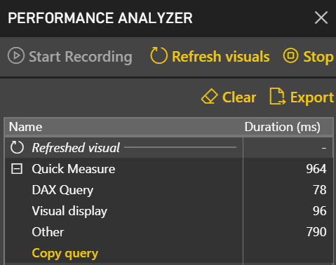
After learning how to model the data properly (the most important skill), DAX would be the next hurdle in your self-service or organizational BI journey. You won’t get far in Microsoft BI without DAX. This letter shares a tip on how to identify DAX performance bottlenecks by using a recent feature in Power BI called Performance Analyzer.

Learning DAX

DAXBefore I get to Performance Analyzer, I’m excited to announce my latest book: Applied DAX with Power BI: From zero to hero with 15-minute lessons. This book was born out of necessity. In my consulting practice, I had been teaching and implementing Power BI and Analysis Services Tabular, and people were constantly asking for DAX book recommendations. Indeed, DAX is not an easy topic and has its ways to humble even experienced practitioners. There are a few good reference books out there, but they could be somewhat overwhelming for novice users. So, I turned my classroom and consulting experience into this book and designed it as a self-paced guide to help you learn DAX one lesson at a time.

This one was a different book to write. Unlike my other books, which tend to be heavy, this book is smaller (220 pages). Regardless, it took me a while to write it. The book also adopts a lesson-based approach, so the reader can learn and practice a specific DAX concept quickly. There are usually three sections in each lesson: Practice (with step-by-step guidance), Outcome (a visual that shows the result), and Analysis (explaining why DAX works this way). Most lessons are five to six pages long, and it should take no more than 15 minutes to complete the lesson’s exercises (you can download and view a sample lesson from the book page).

And if you do one lesson per day, you’ll be a DAX expert in a month!

Analyzing DAX Queries

“This report is slow!” I hope you never hear this, but the chances are that you will sooner or later. No one likes watching a spinning progress indicator and waiting for the report to show up. Tucked in the View ribbon of the Power BI Desktop recent builds is a handy tool called Performance Analyzer that can help you identify slow queries. It’s easy to use:

  1. In Power BI Desktop, click the View ribbon and check the Performance Analyzer setting. This will open the Performance Analyzer pane.
  2. Click Start Recording in the Performance Analyzer pane. Once you start recording, any action that requires refreshing a visual, such as filtering or cross-highlighting, will populate the Performance Analyzer pane. You’ll see the statistics of each visual logged in the load order with its corresponding load duration.
  3. You can click the “Refresh visuals” link in Performance Analyzer to refresh all visuals on the page and capture all queries. However, once you are in a recording mode, every visual adds a new icon to help you refresh only that visual.

PerformanceAnalyzer

Performance Analyzer captures the following information:

  • DAX query – The length of time to execute the query.
  • Visual display – How long it took for the visual to render on the screen after the query is executed.
  • Other – This is the time that the visual spent in other tasks, such as preparing queries, waiting for other visuals to complete, or doing some other background processing.

Although not as comprehensive as DAX Studio, Performance Analyzer is a quick and easy way to get an overall idea of what impacts your report page performance. Performance Analyzer is currently only available in Power BI Desktop and it’s not available in Power BI Service.


Teo Lachev
Prologika, LLC | Making Sense of Data
Microsoft Partner | Gold Data Analytics

logo

“Applied DAX with Power BI” Book Available

I’m excited to announce my latest book: “Applied DAX with Power BI: From zero to hero with 15-minute lessons“. This book was born out of necessity. In my consulting practice, I had been teaching and implementing Power BI and Analysis Services Tabular, and people were constantly asking for DAX book recommendations. Indeed, DAX is not an easy topic and has its ways to humble even experienced practitioners. There are a few good reference books out there, but they could be somewhat overwhelming for novice users. So, I turned my classroom and consulting experience into this book and designed it as a self-paced guide to help you learn DAX one lesson at a time.

This one was a different book to write. Unlike my other books, which tend to be heavy, this book is smaller (220 pages). Regardless, it took me a while to write it. The book also adopts a lesson-based approach,  so the reader can learn and practice a specific DAX concept quickly. There are usually three sections in each lesson: Practice (with step-by-step guidance), Outcome (a visual that shows the result), and Analysis (explaining why it works this way). Most lessons are five to six pages long, and it should take no more than 15 minutes to complete the lesson’s exercises (you can download and view a sample lesson from the book page).

And if you do one lesson per day, you’ll be a DAX expert in a month!

Currently, the book is available on Amazon (paperback and Kindle eBook) and it’s making its way to other outlets. As always, I’m awaiting feedback on the discussion forum at the bottom of the book page.

051119_2019_AppliedDAXw1.png

Fixing Random Problems with DAX

Scenario: You have a dimension table and a fact table, and you want to generate some test data, such by randomly looking up a value from the dimension table for each row in the fact table.

The following DAX formula should get the job done but RANDBETWEEN doesn’t work (although it works as a standalone function outside LOOKUPVALUE). Specifically, you get either the same value or an empty value.

Rand_Value_From_Other_Table =
LOOKUPVALUE (
Dim_Table[Fruit],
Dim_Table[Fruit_ID], ( RANDBETWEEN ( 1, MAX ( Dim_Table[Fruit_ID] ) ) )
)

Solution: I think the issue is that like Power Query, DAX assumes that functions are idempotent. Given the same arguments, they should produce the same result, which isn’t true for RANDBETWEEN and Power Query Number.Random functions. The simple solution is to change the first argument to perform a dummy operation that doesn’t use a constant value, such as:

Rand_Value_From_Other_Table =
LOOKUPVALUE (
Dim_Table[Fruit],
Dim_Table[Fruit_ID], ( RANDBETWEEN ( 1 + Fact_table[Fact_table_id] – Fact_table[Fact_table_id], MAX ( Dim_Table[Fruit_ID] ) ) )
)

Thanks to Stacey Jones who came up with this interesting puzzle.

Implementing Input Table in DAX Query

Scenario: If you want to pass an input table to a DAX query. For example, you might have an application that lets the user specify a subset of customers and as-of dates for each customer. Your query needs to calculate certain metrics, such as Sales, for the list of customers but as of the user-specified date for each customer, and potentially other parameters. It’s impractical to save these parameters in a physical table in your database because this requires a processing task. You may also want to avoid Analysis Services placing locks on the database for each refresh and thus blocking pending queries. Instead, you want to simply pass a collection of all the parameters the query needs to do its job, inside the query.

Solution: DAX supports static tables using the DATATABLE function, but the resulting data table is very limited in its support of features. First, you can’t name the table in your query, so you need to resort to using a variable. More importantly, many DAX operations that reference columns, such as attempting to compute MAX of a table column to get the “current” value, will error with “Table variable ‘_filter’ cannot be used in current context because a base table is expected”. You can’t also create physical relationships to a custom data table.

However, you can use TREATAS to establish virtual relationships based on the input parameters in the input table. The following query has a _filter variable that points to a custom data table that contains two customers with corresponding as-of dates. Then, the query uses TREATAS to evaluate the sales and order quantity for each customer as of the specified date. You can run this query against the AdventureWorks Tabular Model that comes with the SSAS samples.

DEFINE
VAR _filter =
DATATABLE ( “Customer Id”, STRING, “Date”, DATETIME,
{ { “AW00011000”, “7/22/2007”}, {“AW00011001”, “7/18/2005” } } )
EVALUATE
ADDCOLUMNS (
TREATAS( _filter , Customer[Customer Id], ‘Date'[Date] ),
“Sales”, CALCULATE(SUM(‘Internet Sales'[Sales Amount]) ),
“Quantity”, CALCULATE(SUM(‘Internet Sales'[Order Quantity]) )
)

030719_2024_Implementin1.png

One cautionary note here is that the cost of such “per-row” virtual relationships could be very expensive. When possible, you should always favor “batch”-oriented execution where the query uses global filters and physical relationships.

Thanks to Darren Gosbell and Marco Russo for helping with this.

DAX Calculation Groups

Just when I started thinking that there won’t be any new BI features in SQL Server 2019, Christian Wade announced DAX calculation groups in CTP 2.3. His excellent post helped me try them out with Tabular Editor and Power BI Desktop and whip out this cool report.

030319_2353_DAXCalculat1.png

As Chris Webb pointed out, DAX calculation groups let us implement time calculations as in Multidimensional with a “shell” time dimension. They probably won’t help you reducing the number of measures because you’d still need to flatten the “shell” dimension for maximum flexibility and avoid forcing the user to use the Time Calculations slicer to select the time calculations they want on the report. So, you would still have to project Sales Amount YTD as a separate measure:

[Sales Amount YTD] = CALCULATE (SUM ( 'Reseller Sales'[Sales Amount] ), 'Time Intelligence'[Time Calculation] = "YTD")

What calculation groups help with is avoiding copying and pasting the time intelligence formulas all over the place. A future CTP will also help centralize measure formatting where you’ll have the option to inherit the current measure format string (by leaving it blank), or override it.

To me,  DAX calculation groups is a nice to have feature, which I could have happily traded for more significant ones. Speaking of which, I hope Microsoft adds more important enhancements to Tabular 2019.

Here is my top 10:

  1. Anything that can help the poor developer debug and understand in what context a DAX expression is evaluated as DAX tends to have more exceptions than rules.
  2. DAX script – to show and organize all measures in one place. I miss also the MD scope assignments.
  3. Better Excel support
  4. Aggregations as in Power BI
  5. Composite models as in Power BI
  6. Recursive DAX measures
  7. Writeback
  8. Default members
  9. Actions (or make the JSON schema extensible so the community can fill in blanks)
  10. Full support for Tabular in Power BI, including Quick Insights, explain Increase/decrease, etc. My blog “Power BI Feature Discrepancies for Data Acquisition” has the details.