Prologika Newsletter Spring 2021

Amidst the COVID pandemic, the Houston Health Department (HHD) had another predicament to tackle. With lab results accumulating rapidly at one million cases per month, the vendor system they used for capturing and analyzing COVID data couldn’t keep up. In this newsletter, you’ll learn how Prologika implemented a BI solution powered by SQL Server and Power BI to solve technology challenges, and deliver fast and reliable insights.
Business Challenges
The vendor SQL Server database had large tables with normalized name-value pairs for each question and answer received from the patient, and for each investigation result. To facilitate reporting, the vendor system had scheduled ETL processes to extract data from the OLTP tables into denormalized tables. However, locking conflicts and large data volumes would crash the system and fail the ETL processes.
As a result, business analysts were not able to get timely data for reporting. HHD and the vendor tried to isolate the reporting loads by replicating the data to a reporting database but the issue with populating the denormalized tables remained
Solution
A good solution starts with a solid foundation. After assessing the current state and objectives, Prologika recommended and implemented the following architecture:
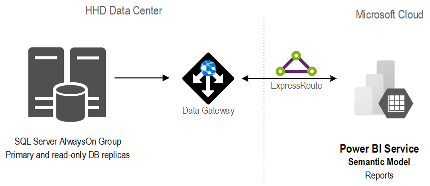
The stand-alone SQL database was replaced with an AlwaysOn availability group. Not only did this provide high availability, but it also isolated operational from reporting workloads.
In the client’s own words “we have compared the cluster server to the report server and cluster is vastly superior with regard to performance for regular queries. One simple run was 4x faster on cluster than the current report server. A much more complex run took four minutes on cluster and I stopped the same run on the report server after 87 minutes.”
Previously, data analysts would produce reports using different tools, ranging from SQL, Python, to Power BI reports. With scarce resources, HHD found it difficult to continue that path. Instead, Prologika implemented a semantic model that was hosted in Power BI.
Benefits
The new architecture and semantic model delivered the following benefits to HHD:
- A single version of truth – Strategic data and business calculations were centralized on one place.
- Fast insights – The Power BI reports crunching millions of rows were instantaneous.
- Isolation – Report loads were isolated from the operational loads because the data was cached in the semantic model.
- Standardization and centralization – Power BI became the reporting platform for delivering insights across the organization.

Teo Lachev
Prologika, LLC | Making Sense of Data
Microsoft Partner | Gold Data Analytics
![]()