So much data, so little budget! Caching data in Power BI gives you the best report performance, but budget constraints usually put downward pressure to stay within lower Power BI Premium premium plans. So, what to do?
Split large models. Remember that Power BI Premium Gen2 grants each dataset a 25 GB memory quota. I’m actually a big proponent for consolidated organizational semantic models, but this is where best practices meet reality.
Switch large tables to DirectQuery. When report performance sucks, follow this performance optimization progression:
Add a columnstore index to the fact table – As VertiPaq, a columnstore index organizes data in columns so aggregate queries should see an immediate performance boost. Detail-level queries, e.g. sales by customer, not so much as they probably won’t hit the index.
Try hybrid tables when you can get away with a compromise where the latest data can be cached, but archive data left in DirectQuery.
Try aggregation tables (first automatic, then manual) when you need to speed up aggregate queries at a higher-level grain, such as dashboard queries but leave lower-level queries pass through.
Pray for mercy to come! Or take the stakeholder out for lunch and insist that the time for some compromise has come…
Please join us online for the next Atlanta MS BI and Power BI Group meeting on Monday, January 3rd, at 6:30 PM ET. Paul Turley will show us how to integrate Power BI with paginated (SSRS) reports. And your humble correspondent will update you on the Power BI latest. For more details and sign up, visit our group page.
Presentation:
Power BI Paginated Reports: The New Old Operational Reporting Platform
Power BI Paginated Reports (aka SQL Server Reporting Services) was old but now it’s new again. Available on-premises or in the Power BI service with flexible licensing, you have multiple options to implement operational reports. This session will briefly cover the differences between analytic and operational reports; and help you understand the advantages and trade-offs using Power BI Paginated Reports, Power BI Report Server and SQL Server Reporting Services. Material from our forthcoming book: Paginated Report Recipes.
Speaker:
Paul is a Principal Consultant for 3Cloud Solutions (formerly Pragmatic Works), a Mentor and Microsoft Data Platform MVP. He consults, writes, speaks, teaches & blogs about business intelligence and reporting solutions. He works with companies around the world to model data, visualize and deliver critical information to make informed business decisions; using the Microsoft data platform and business analytics tools. He is a Director of the Oregon Data Community PASS chapter & user group, the author and lead author of Professional SQL Server 2016 Reporting Services and 14 other titles from Wrox & Microsoft Press. Paul is a 2021 FastTrack Recognized Solution Architect and holds several certifications including MCSE for the Data Platform and BI.
Prototypes without Pizza
Power BI Latest
https://prologika.com/wp-content/uploads/2016/01/logo.png00Prologika - Teo Lachevhttps://prologika.com/wp-content/uploads/2016/01/logo.pngPrologika - Teo Lachev2021-12-27 16:11:462021-12-27 16:11:46Atlanta MS BI and Power BI Group Meeting on January 3rd
Happy Holidays! More and more organizations consider data virtualization to abstract the underlying storage and integrate siloed sources. In this letter, I’ll discuss a real-life project that used PolyBase to expose third-party ERP data as SQL tables. Before I get to the subject of this newsletter, I’m excited to announce the seventh edition of my “Applied Microsoft Power BI” book. It should be available on Amazon in the first days of 2022. As far as I know, it’s the only book that is updated annually to keep it up to the date with the fast-changing Power BI. Stay tuned for a future blog with more details about the book.
Business Case
Think of data virtualization is a logical data layer that integrates enterprise data across various on-premises and cloud sources. A large, multinational chemical manufacturer decided to migrate their on-premises ERP system to the cloud. As usually happens, the tradeoff for embracing the cloud is losing access to your data in its native storage. Previously, the client could readily integrate the ERP data stored in a SQL Server database. But the ERP vendor didn’t support this option in their cloud offering. The usual explanation cites security and performance issues, although none of them really hold water. The ERP vendor could have supported a premium tier where data is exposed privately without affecting other customers, and report queries could have been redirected to a secondary replica. This is no different that securing and scaling an Azure SQL Database. Alas, as more and more companies find when embracing the cloud, the integration burden gets heavier and is on them and not on the vendor.
To make things even more difficult, the vendor had a replication mechanism to export the data to AWS S3 data lake. Realizing that most clients would struggle calling their REST APIs, the vendor provided an JDBC driver that abstracted the APIs. Great, except that the client wanted to access the data on Microsoft Azure, but no Microsoft tool supports JDBC drivers because no Microsoft BI tool is written in Java.
Integration Options
One integration option could have been to use a JDBC-capable ETL tool, such as Pentaho. But that would have required implementing integration pipelines to pull the data periodically and stage it on Azure. This presented two issues. First, the data integration effort became more difficult as someone had to own and troubleshoot ETL failures. Second, Business wanted as much real-time access to data as possible. In the past, the business users had implemented self-service Power BI models that they would refresh as needed to cache the data from the on-premises database. However, since the ERP vendor required at least 20 minutes for data changes to be applied to the S3 data lake and ETL needed additional time (even with incremental extraction), the data latency became an issue.
The second option was to somehow virtualize the data. Had the vendor supported exporting the data as files on Azure, Synapse Serverless could have been used to expose the data as virtual tables that can be queried with SQL and loaded in Power BI Desktop. But Serverless doesn’t support AWS S3 and even if it did, the vendor didn’t allow direct access to the staged data (REST APIs and JDBC driver were the only supported options).
PolyBase to the Rescue
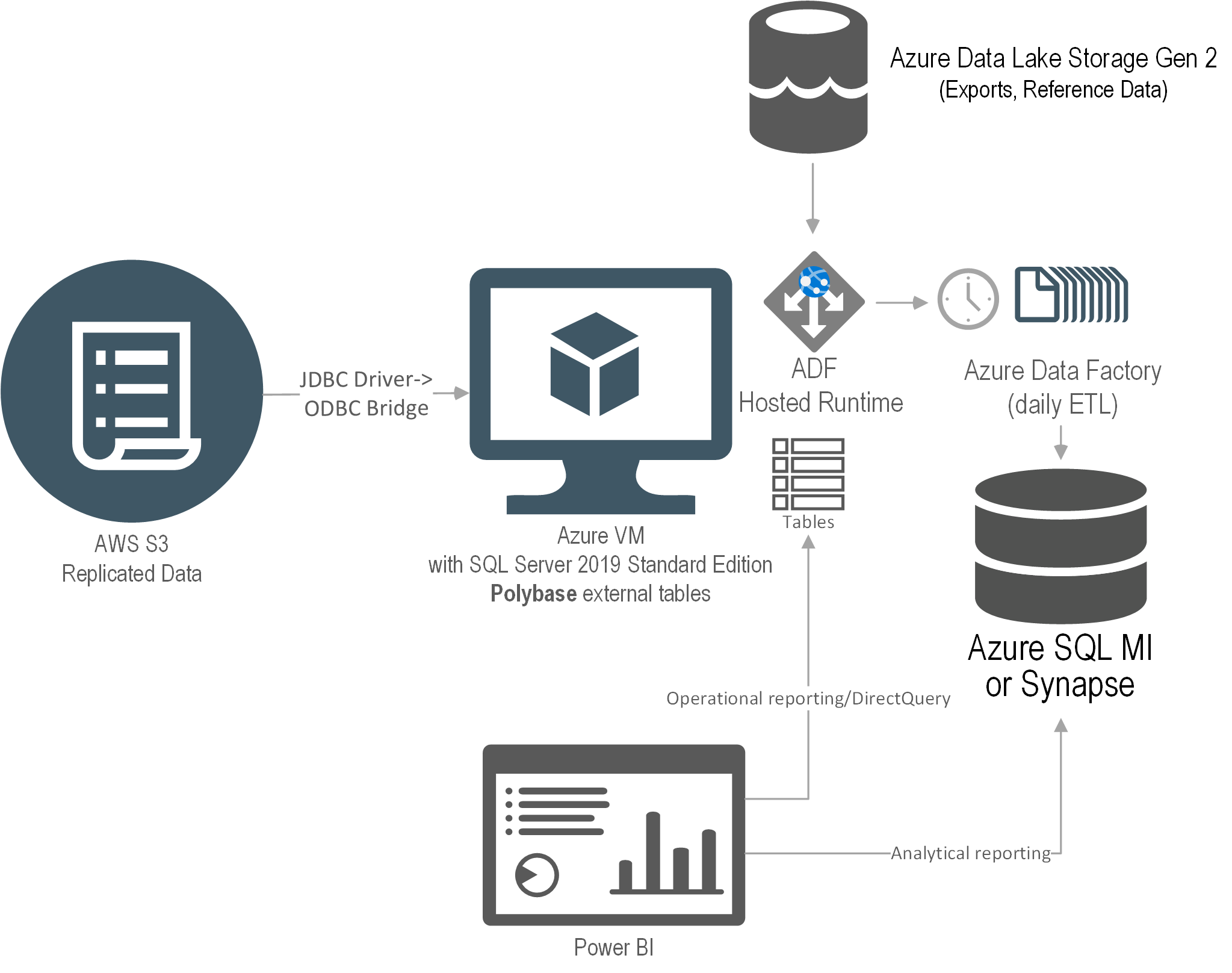
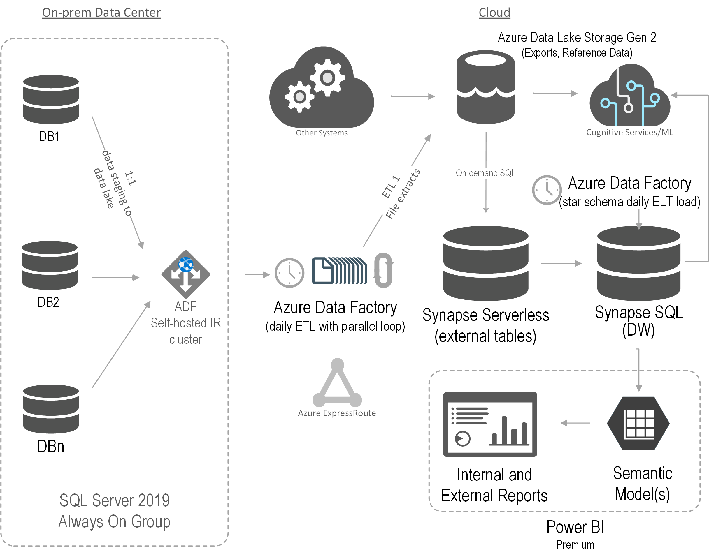
The solution I proposed was to use PolyBase which is included in SQL Server and Azure SQL Managed Instance. Ideally, the client wanted a full PaaS solution but only PolyBase in SQL Server supports ODBC. So, we had to use an IaaS VM just to virtualize the data. This diagram shows the solution architecture.
An Azure VM was provisioned with SQL Server 2019 Standard Edition. The JDBC driver was installed on the VM and configured to access the ERP data. We used a third-party JDBC-to-ODBC bridge driver to map the JDBC data source as an ODBC data source. Then, PolyBase external tables were set up to virtualize the ERP data as SQL Server tables.
The main drawback of this solution was that no matter how small the source table was, PolyBase would add about 30 seconds in internal processing. Specifically, the PolyBase runtime log has a detailed trail that shows that it takes some time for PolyBase to “warm up” before it gets to the query, and then it needs even more time to process the results. That’s because, as a distributed system (like Synapse), a head node coordinates the query execution with data nodes even if everything is installed on a single VM. More gotchas specific to the fact that the vendor has decided to use Oracle as their relational database can be found at https://prologika.com/polybase-adventures/.
Conclusion
Microsoft has made bold strides in data virtualization. I’m really impressed by Synapse Serverless, which I used for other projects, such as for the project described in this case study. I wish Microsoft extends Serverless to support more storage options. If Synapse Serverless is not an option, your next best bet would be PolyBase. Although PolyBase is supported in SQL MI and Synapse, only the SQL Server box SKU supports ODBC data sources, requiring an IaaS layer to virtualize the data.
Benefits
The solution delivered the following benefits to the client:
No ETL effort – Data was left at the original source.
Data virtualization – Polybase was used to create external tables that can be queried just like SQL Server regular tables.
Reduced data latency – Data changes were available as soon as they are replicated to the data lake.
Scalability – PolyBase can be scaled out to other servers if needed.
Teo Lachev
Prologika, LLC | Making Sense of Data
Microsoft Partner | Gold Data Analytics
A while back a client wanted to avoid importing a large snapshot fact table with loan balances because its memory footprint would require them to upgrade to a higher Power BI premium plan. This of course required leaving the table in DirectQuery mode at the expense of query performance. Luckily, most users would be interested in the latest six months of data. To speed up performance, we opted for aggregations. However, to complicate things further, they had M2M relationships between dimensions and the fact table which Power BI aggregations don’t support. So, we had to roll out our own “aggregation hits” by redirecting DAX measures either to the aggregated table if the as-of date was in the last six months or to the DirectQuery table otherwise.
Seasoned BI pros might recall that Multidimensional supports measure groups with a mixed storage by creating MOLAP and ROLAP partitions within the same table. The recently announced Power BI hybrid tables carry this concept to Tabular models hosted in Power BI Premium or PPU. This enables two new scenarios:
Implement real-time “hot” partitions – For best report performance, you can continue importing and refreshing the data periodically, but you can also implement a “hot” partition configured for DirectQuery to show the latest changes. This is the scenario supported by the incremental refresh policy discussed in the announcement.
Leave infrequently accessed data in DirectQuery – This is the scenario that I believe would inspire more interest to address the above requirement.
Implementing real-time partitions
The easiest way to implement a real-time partition is by defining an incremental refresh policy. All you must do is check the “Get the latest data in real time with DirectQuery” checkbox. This will add a DirectQuery partition to the end of the partition design created by Power BI. When the scheduled refresh runs, Power BI will refresh the historical partitions as it would normally do. However, all queries that request data after the scheduled refresh date (at the day boundary) will be sent to the data source. Consequently, your model will have new data that is inserted into the table. I suggest you also configure the report pages that show the real-time data for automatic page refresh (in Power BI Desktop, select the page and turn on the “Page refresh” slider) so that the visuals poll for data changes at a predefined cadence.
Leave infrequently accessed data in DirectQuery
Think of this scenario as the opposite of the real-time partitions because the frequently requested data is imported while the historical data is DirectQuery. Because Power BI Desktop doesn’t support custom partitions, you must use another tool, such as Tabular Editor or SSDT, to configure the partitions by connecting it to the published dataset via the XMLA endpoint (or working with a local *.bim file). If you prefer Power BI Desktop, another option could be to create the partitions in a published test or production model, use Power BI Desktop for development, and configure deployment pipelines to propagate the changes and preserve the partition design in the non-development environments. You’d probably need only two partitions:
Historical partition – Specify a SQL statement that queries the historical data with a WHERE clause that qualifies rows using a relative date, such as six months before the system date. Change the partition mode to DirectQuery.
Current partition – Specify a SQL statement that defines the slice for the frequently used data. Change the partition mode to Import.
Here are the high-level steps to implement the custom partition design with Tabular Editor assuming you would create the partitions in a published dataset. Note that the first step use Power BI Desktop. You can use Tabular Editor for all steps but it’s a more advanced tool so you might want to use something you’re more familiar with.
Start by opening your dataset in Power BI Desktop. For best performance, drop all imported dimension tables that relate to the large fact table, reimport them in DirectQuery, and then change their storage mode to Dual. That’s because currently Power BI Desktop doesn’t let you switch from Import to DirectQuery and there is no workaround.
Open the Power Query Editor. By default, every table will have one partition and if you used Power BI Desktop, the partition will be an M partition (meaning it will have a Power Query). Change the Source step of the first partition to use a custom query (click the gear icon next to the Source step and then enter your custom SQL statement as per you requirements. For example, if you want the default partition to import the last six months and you target SQL Server, the Source step might look like this:
let
Source = Sql.Database("XPS", "AdventureWorksDW2012", [Query="select * from FactResellerSales where OrderDate >= DATEADD(month, -6, GETDATE())"])
in Source
Publish the dataset to Power BI Service. Close Power BI Desktop and promise yourself never to use it again for that dataset (if you can’t live without it, see the aforementioned note about deployment pipelines). That’s because if you republish the model, PBI Desktop will nuke the custom partitions in the deployed dataset (nice work here Microsoft). Remember that the only partition design supported and preserved by Power BI Desktop is the incremental refresh policy but you can’t use incremental refresh for this scenario.
Connect the Tabular Editor to the published dataset XMLA endpoint (File, Open, From DB). As a prerequisite, make sure to enable the XMLA Endpont for Read/Write in the capacity settings.
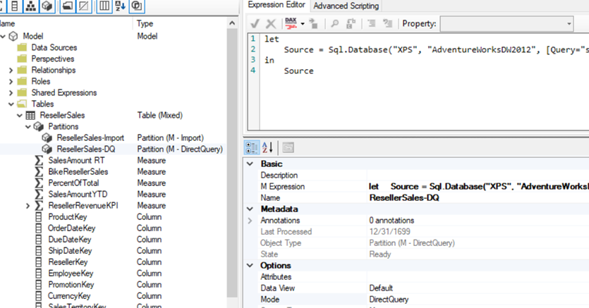
Rename the first partition, e.g. ResellerSales-Import.
Duplicate the partition and rename the second one ResellerSales-DQ. Change its Mode property to DirectQuery. Change its source query to slice the historical data.
let
Source = Sql.Database("XPS", "AdventureWorksDW2012", [Query="select * from FactResellerSales where OrderDate < DATEADD(month, -6, GETDATE())"])
in Source
Save (or deploy) the changes to Power BI Service and refresh the dataset.
(Optional) Open SQL Server Profiler connected to the published dataset. User Power BI Desktop or Analyze in Excel to create a report that queries the fact table by date. Notice that when the date filter falls within the last six months, there are no events in the profiler because the query is answered by the Tabular cache. However, when the date filter is outside that period, the profiler shows a SQL SELECT statement because that data is left in the data source to reduce the model’s memory footprint at the expense of performance.
This is what your partition design should look like:
Hybrid tables go even further than composite models by allowing you to mix storage modes within a table and having partitions in Import or DirectQuery storage modes. They enable two scenarios: real-time “hot” partitions and leaving infrequently accessed data in DirectQuery data. What I would like to see Microsoft improve in future is a) let us switch from Import to DirectQuery although this might break calculated columns and Power Query transforms, b) extend Power BI Desktop to support custom partitions so that we can connect Tabular Editor as an external tool and change the partition design and save it in the pbix file, and c) extend Power BI Desktop to preserve the partition design on deploy.
As a report author, you are constantly pressed to fit more visuals into a single page. The November release of Power BI Desktop introduced the Power BI Bookmark Navigator, which simplifies the process of creating a tabbed interface, such as this one.
Since Power BI doesn’t support visual containers or a “menu” visual, you must resort to the awful hack of hiding and showing UX elements by bookmarking them. This reminds me of the beginning of my career as a developer where we didn’t have widgets and we had to hack our way through implementing a custom navigation “experience” by toggling visibility. Alas, this continues in the 21st century but at least the hack got simplified. To implement the tabbed interface:
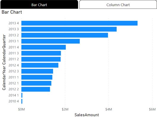
Add two (or more) overlapping visuals.
Add two bookmarks (Bar Chart and Column Chart) that show and hide the appropriate visual. Don’t worry about hidden visuals impacting the report performance because Power BI doesn’t process them.
Add the two bookmarks to a Tabbed Interface bookmark group.
In Report View, go to the Insert ribbon, expand the Buttons menu, and then click Navigators, “Bookmark navigator”.
Currently, Power BI supports two navigators. The “Page navigator” adds a tabbed navigation menu with a tab for each report page to let the user navigate to a given page by clicking the corresponding tab. The navigator that will inspire more interest is the “Bookmark navigator”.
Notice that by default the navigator adds a tab for each bookmark defined in the report, but in this case, you just need to restrict it to the two bookmarks that you previously created. With the navigator selected, expand the Bookmarks section in the “Format navigator” pane, and select the “Tabbed Interface” bookmark group.
Position the navigator above the two visuals. Remember that in Power BI Desktop, you need to press Ctrl when you click that navigator tabs to switch between the visuals.
Limitations and bugs:
The previously selected tab gets stuck in a highlighted state, so you must hover on it to make it appear “unselected”.
Hierarchical navigation is not supported. For example, you might want to build a page navigation experience like in Power BI apps. However, you can’t define a hierarchy, such as to start the user at the bookmark group level and then drill down to bookmarks.
Although you can somewhat customize the tab appearance, no UX designer will probably be impressed. For example, one feature that could be useful to free up more page real estate is to be able to toggle the navigator visibility.
https://prologika.com/wp-content/uploads/2016/01/logo.png00Prologika - Teo Lachevhttps://prologika.com/wp-content/uploads/2016/01/logo.pngPrologika - Teo Lachev2021-11-17 11:43:582021-11-17 11:43:58Power BI Bookmark Navigator – A Better Hack
I’m helping a client convert a few SSRS reports from SharePoint to Power BI Premium Per User (PPU). SSRS is of course near and dear to my heart because of all the work I’ve done around it circa 2004-2010 (yep, it’s been that long), books, MVP awards, etc. Since its humble beginnings, SSRS have had a solid architecture that excelled in extensibility. You’d be hardly pressed to face a requirement that couldn’t meet with SSRS back then.
Unfortunately, most of these extensibility features, such as custom assemblies, custom security, custom delivery extensions, custom renderers (essentially everything related to custom code) didn’t make it to paginated reports in Power BI Premium. Not many companies are using these features, so they probably won’t be a showstopper for your migration. To their credit, Microsoft is closing the gap between SSRS and paginated reports. As of now, the feature limits that you might run into are:
Missing Feature
Workaround
Shared data sources/datasets
Report-specific (embedded) data sources/datasets (yep, a maintenance nightmare)
Drillthrough report actions
Change to URL action and provide URL to drillthrough reports passing filters on the URL
Document map
No workaround
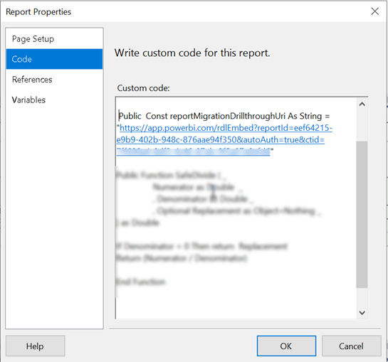
Instead of drillthrough report actions, implement URL-based actions. Assuming embedding for your organization, here are the high-level steps:
Deploy the drillthrough report to Power BI. Again, you must deploy to a Premium or PPU workspace. Run the report. It should run successfully. Go to File, Embed menu and copy the iframe code (assuming you want to embed the report in your company’s portal). The iframe code should look like this:
Open the main report in Visual Studio or Power BI Report Builder. In the report properties, Code tab, define a public constant to the drillthrough report(s). Or, you can define internal parameters.
Now find all instances of drillthrough actions in the main report. If there are many, it might be easier to open the report RDL in Visual studio and search for <Drillthrough>. For each textbox with drillthrough replace the Drillthrough section in the <ActionInfo> element with a Hyperlink, such as
In the example above, the positional string replace will replace the {0} placeholder with the report drillthrough constant you defined before. Then, you provide values for the drillthrough report parameters (in this case, the drillthrough report takes three parameters).
Test the main report and drillthrough links. If all is well, publish the main report to Power BI. Obtain its embedded iframe code and add it to your app page.
Use the secure embed iframe URL for the main report so that it’s embedded in the app instead of opening in a new browser tab. Unfortunately, the drillthrough reports will open in a separate tab and I couldn’t find a workaround to render them inside the iframe of the main report.
LabCorp operates one of the largest clinical laboratory networks in the world. It also has an Interactive Response Technology system that healthcare vendors can use to conduct case studies. Thanks to the cloud data analytics solution implemented by Prologika, LabCorp and its vendors can now analyze data across case studies. Read this newsletter to learn more about the solution architecture and business value.
Business Needs
The data for each study was saved into a separate on-prem SQL database. The total number of databases was more than 1,000. After the initial assessment, Prologika realized that one of the main gaps was that vendors couldn’t report across their studies or gain performance insights from studies conducted by other vendors. Further, as the IRT system evolves over time and to accommodate special requests, there were scheme differences between different versions.
LabCorp underscored the importance of consolidating the data from multiple studies into a single repository. They envisioned a cloud-based PaaS BI solution that would extract data from all the on-prem databases without impacting the system performance and centralize it into an enterprise data warehouse. Vendors would log an external portal that will deliver embedded reports. The first iteration was focused on analyzing audit and log data to gain strategic insights, such as how many users are using the system.
Solution
After assessing the current state and objectives, Prologika recommended and implemented the following architecture:
Prologika implemented an Azure Data Factory (ADF) configurable framework to extract data from the on-prem databases hosted on two production SQL Servers in parallel. The framework would stage the data into partitioned parquet files in Azure Data Lake Storage (ADLS).
Then Prologika created views in Synapse Serverless to consolidate the file extracts. For example, an Audit table could exist in several on-prem databases on both production servers. While each table would be staged in a separate file (or multiple files if the table supports incremental extraction), a Synapse Serverless would present a consolidated view across all files. We were impressed by the capabilities and performance of Synapse Serverless.
Another ADF process would extract the data from the Synapse Serverless views and load the data into a data warehouse hosted in a Synapse SQL pool. Although we considered other methods, such as using a linked server in a Azure SQL Managed Instance to Synapse Serverless to avoid data staging, we settled on Synapse SQL mainly for its scalability. Finally, a Power BI semantic model was created and Power BI Embedded used to deliver reports.
Benefits
The solution delivered the following benefits to LabCorp:
Data consolidation – Data was extracted with minimum impact to the operational systems and consolidated in ADLS.
Data virtualization – Thanks to the Synapse Serverless flexible support of schema differences, virtual views were created.
Scalability – Synapse SQL pool can scale almost indefinitely.
Secure and fast insights – Each vendor can access only their data.
Teo Lachev
Prologika, LLC | Making Sense of Data
Microsoft Partner | Gold Data Analytics
A long-standing limitation of Power BI has been that Excel pivot reports connected to external Analysis Services models can’t be interacted with when uploaded to Power BI Service. You get the cached pivot report but any attempt to interact with the report online (that is in Excel Online), such as to change a slicer or filter, would result in an error complaining that the connection can’t be refreshed and there hasn’t been a workaround. Today, Microsoft partially lifted this limitation by supporting interactive pivots connected to Power BI datasets. Unfortunately, pivots connected to external Analysis Services models (both on-prem and cloud) still don’t support interactivity.
For some reason, this feature is called “connected PivotTable refresh” although a better name would be “interactive Excel pivots finally”. It works in Power BI Pro and Premium. Unlike the initial announcement that speculated that this feature would be available by simply uploading your Excel file to Power BI Service, it appears that it requires the Excel file to be uploaded to OneDrive or SharePoint Online. Here are the high-level steps that worked for me:
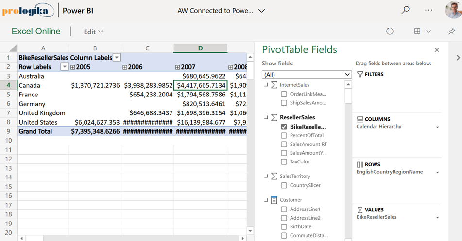
Create your Excel pivot using the Analyze in Excel feature or directly from Excel. Assuming you have a recent Office 365 build, the latter option allows you to open Excel on the desktop and click Insert->Pivot Table->From Power BI to connect to a Power BI dataset from within Excel Desktop.
Click Save As and save your workbook to OneDrive or SharePoint Online. Recall that you can specify a SharePoint site for storing workspace files in the Power BI workspace settings if you don’t want to upload the file to your personal folder.
Use the Power BI Service “Get data” feature to upload (not import) the Excel workbook in a Power BI workspace. Again, the Excel workbook must be located either in OneDrive or SharePoint online.
Interact with the report in Power BI Service, such by drilling down, drilling through, or even rebinding the report to different fields! As a bonus, when the underlying dataset refreshes, your pivot report will show the latest data as it connects live to the dataset.
The “connected PivotTable refresh” is a much-needed enhancement that brings the same interactive features to Excel pivot reports that users previously had in SharePoint Server. Now users who favor Excel pivots for interactive exploration can share their reports and the interactive features would be preserved when the report is rendered online. The feature requires storing the Excel workbook in OneDrive or SharePoint Online and using an Analyze in Excel connection. Unfortunately, it doesn’t work with Analysis Services models that are external to Power BI (not deployed to Power BI Service) which is another incentive to move your semantic models to Power BI as I’ve been advocating for some time.
https://prologika.com/wp-content/uploads/2016/01/logo.png00Prologika - Teo Lachevhttps://prologika.com/wp-content/uploads/2016/01/logo.pngPrologika - Teo Lachev2021-07-19 17:46:592021-07-20 08:14:17Interactive Excel Pivots in Power BI
Business Performance Management (BPM) is a methodology to help the company predict its performance. An integral part of a BPM strategy is creating and monitoring a scorecard with Key Performance Indicators (KPIs). In this newsletter, I’ll discuss how the newly released Power BI Goals can help you augmenet your BPM strategy. But before that, I’d like to share my excitement that Microsoft have recently awarded me FastTrack Recognized Solution Architect – Power BI! I’m one of the 33 individuals worldwide who got nominated by the Power Platform product engineering team for consistently exhibiting deep architecture expertise and creating high quality solutions for customers during project engagements.
Introducing Power BI Goals
A vital BI practice for every organization, performance management ensures that important metrics, such as Key Performance Indicators (KPIs), meet established goals. The typical artifact to do so is implementing a scorecard: a report that compares the current state with the desired state of these metrics. You might have also heard the term “balanced scorecard” which is an organization-wide scorecard that tracks several subject areas, such as Finance, Customer, and Operations. In the past, organizations would use different tools, such as the now deprecated PerformancePoint (included in SharePoint Server) to implement balanced scorecards. Realizing the importance of scorecards, Power BI introduced Goals that aim to simplify the process of implementing departmental and organizational scorecards. For more information on how Goals works, watch the “Goals in Power BI” presentation from the Microsoft Business Application Summit
What’s to like
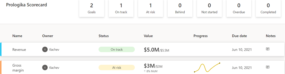
As with anything Power BI, Microsoft has democratized scorecards so business users with no reporting experience can quickly assemble them from existing reports. Think of a goal as a line (or KPIs) in the scorecard. Here is scorecard with two goals:
Currently, Power BI supports two goal types:
Static – The goal creator manually enters and track the goal properties, such as current value, target value, and status. This could be useful for quick and dirty KPIs that are not backed by a data source, such as launching a new promotion campaign. In the scorecard above, I created the Revenue goal by entering 5M as the current value and 5.5M as the goal.
Data-driven – The goal current value and/or target value can be data-driven and bound to metrics from existing report(s). Coming from Analysis Services, I was initially surprised that Power BI doesn’t require implementing KPI measures, but I get it: Microsoft decided to source the metrics from reports so business users can easily apply filters. If the goal owner chooses a metric from a visual that has a Date field, such as a time series chart, Power BI automatically shows a sparkline for the goal progress over time. And, of course, when the report dataset is refreshed, the goal values are updated.
So, no modeling or Power BI Desktop required assuming that someone else, such as a data analyst, has delivered functional reports with the metrics. Even better, the goal current and target values can come from different reports (even a report in a different workspace if you have permissions), e.g. a report with actuals and another report with targets. So, there is plenty of flexibility here. To mimic a balanced scorecard that spans multiple subject areas, the owner can create subgoals. For example, the main goal could be Finance with subgoals Revenue, Margin, etc. Because like dashboards, goals are “pinned” from reports, the end user can navigate to the underlying report to examine the data in more detail. Users can also add notes to explain the goal behavior to the teammates.
A scorecard is a first-class Power BI citizen, and as such, it can be secured, endorsed, secured with sensitivity labels, annotated, and shared, such as sharing the scorecard to a Microsoft Teams channel. The scorecard data is saved in a Power BI dataset that users can connect to build custom reports. Moreover, Power BI automatically adds daily snapshots to the dataset allowing users to build up a history of the goals. For example, if the underlying report is refreshed daily, the updated goal values will be appended to the dataset. Developers can use the Power BI REST APIs to implement programmatic scorecard management solutions.
What’s not to like
Besides navigating to the underlying report, a goal is a one-liner in the scorecard. I can’t define a goal that shows me a metric sliced by dimension members, such as business unit. Further, subgoals are not currently aggregable, such as to sum or average values when rolling up to the main goal. Like limitations with dashboards, there is no way to apply a global filter to the scorecard, e.g. to filter all goals for the prior month.
Besides current and target values, no other goal properties can be data driven. For example, unlike Analysis Services KPIs, the goal status can’t be currently bound to a DAX measure. Changing the status requires proactive manual “check ins” although Microsoft mentions a forthcoming feature that will let users define rules to change the status, like how you can define rules for dashboard tile alerts. Speaking of data-driven properties, I don’t understand why you must use a date field to get the progress as opposed to any other field, such as Month, in your Date table.
Finally and unfortunately, Goals require Power BI Premium. If we really want to democratize features, shouldn’t we make them available in Pro?
Conclusion
Goals are a Power BI Premium feature aimed at making it easier to create scorecards and monitoring metrics from existing reports. They promote a “bottom-up” culture, where business users can create departmental scorecards without reliance on IT. Microsoft plans more features by the end of the year to make Goals more appealing, such as integration with Power Automate to trigger actions, rolling up subgoals, changing the goal tracking cycle (DoD, MoM, YoY), custom goal formatting, Power BI Mobile experience optimized for phones, providing a scorecard visual, and cascaded goals (hierarchy of goals).
If you find Power BI Goals somewhat inflexible or you don’t have budget to upgrade to Premium, you don’t have to use the Goals feature to implement scorecards. You can define KPIs and create dashboard-looking reports where you have complete control over the scorecard presentation.
Teo Lachev
Prologika, LLC | Making Sense of Data
Microsoft Partner | Gold Data Analytics
You should definitely switch your Power BI Premium capacities to Gen2 although you might wait until it goes GA because Gen2 is currently in preview if you’re risk-averse. I switched an enterprise client P2 node to Gen 2 a few months ago and here are the top benefits we observed:
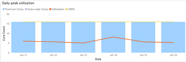
Lower CPU utilization
The Gen1 P2 node was under CPU pressure so the client was considering upgrading to P3. This went away after switching to Gen2 as the graph below shows. That’s because each operation essentially has access to all the cores on the node (which is essentially a P3 node). This can give you a nice boost to performance as well. This doesn’t mean that you get more cores for free. If Power BI detects that the CPU used by the capacity (across all its datasets/dataflows/etc.) is exceeding the CPU that you have purchased, then subsequent operations would be throttled (delayed).
More memory Imported models are memory-resident so memory is usually the most constraining factor. With Gen2, the capacity maximum memory applies to the resource itself and not collectively across all resources in the capacity. Let’s say you are on a P1 plan which has a maximum memory capacity of 25GB. With Gen 1, you won’t be able to have two datasets, let’s say 20GB and 10GB, loaded at the same time. However, Gen2 will apply the 25GB limit to each dataset. So, each resource (dataset, report, dataflow) will be boxed within 25 GB. This feat is possible because Gen2 uses a SaaS approach, which means datasets are scattered across multiple cluster nodes instead of being associated with a dedicated capacity. A potential downside, however, could be “noisy neighbor” because a P3 cluster node may co-host datasets from different customers.
Less “out of memory” refreshes
Related to item 2, dataset refreshes now have more room. Assuming P1, a 10GB dataset is likely to refresh successfully regardless of other datasets loaded in the same capacity. As a rule of thumb, a dataset will require at least twice the memory to fully refresh, so a full refresh of the 20GB dataset is likely to run out of memory. However, you should be able to utilize less memory if you process specific partitions in large tables or configure them for incremental refresh.
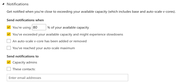
Less management overhead All activities running on the cluster are metered so it’s easy to understand when the capacity is overutilized by using the Gen2 utilization app. This removes the need to monitor Gen1 capacities proactively for signs of overutilization. Further, capacity admins can subscribe for notifications.
No additional cost The best for last. You get all the above without paying more!
What I like to see improved in future:
Customized capacity limits, such as when more memory but less cores are needed.
More granular auto-scale. The current auto-scaling mechanism keeps the “ad hoc” cores for 24 hours. Ideally, I’d like to see the same auto-scaling mechanism as Azure SQL Database Serverless where the system auto-scales within minutes and can hydrate if database is not in use. Of course, this should apply to also removing provisioned cores, such as a P1 plan downgrading to less than 8 cores.
Better utilization monitoring app. The current app has left vast areas for improvement. For example, it doesn’t currently report the memory utilization at all. The app should report memory utilization per dataset and refresh so that you can answer the question “why my refresh ran out of memory”.
https://prologika.com/wp-content/uploads/2016/01/logo.png00Prologika - Teo Lachevhttps://prologika.com/wp-content/uploads/2016/01/logo.pngPrologika - Teo Lachev2021-06-17 12:55:212021-06-17 12:55:21Top 5 Reasons to Switch to Power BI Gen2


 Business Performance Management (BPM) is a methodology to help the company predict its performance. An integral part of a BPM strategy is creating and monitoring a scorecard with Key Performance Indicators (KPIs). In this newsletter, I’ll discuss how the newly released Power BI Goals can help you augmenet your BPM strategy. But before that, I’d like to share my excitement that Microsoft have recently awarded me